How is the cancel button styled versus the keep/subscribe path?
- By Ali Abouelatta
- n = 78
- Published
- Updated
- 2 min read
- cancellation · retention · design · ux-patterns · experiments
Short answer
Across 78 cancel/keep/pause/resubscribe CTA buttons, 40 are styled as dismiss and 18 as secondary, versus only 7 primary source[1]. So the cancel action is heavily de-emphasized relative to the primary keep/subscribe path. If you are optimizing for compliance rather than dark patterns, that skew is the thing to check first.
Of 78 cancel/keep CTAs, 40 dismiss and 18 secondary vs 7 primary styling, July 2026.
Bar chart · Buttons
Buttons — The role split
One block is about 1.4 Buttons
- Dismiss
- 40
- Secondary
- 18
- Unknown
- 13
- Primary
- 7
The role split
Cancel and retention actions skew heavily toward dismiss and secondary styling; only 7 of 78 buttons in this set are styled primary source[1].
What it means
The visual hierarchy consistently pushes users toward the keep/subscribe path and mutes the cancel action into dismiss-weight styling source[1]. This is the mechanism regulators scrutinize under click-to-cancel: if the cancel affordance is styled as an afterthought, the flow reads as obstructive even when a cancel option technically exists.
How to apply it
Audit your cancel screen's button hierarchy against this split source[1]. A compliant flow keeps the actual cancel affordance clearly reachable rather than dismiss-weighted. The field's own experiments trend toward easing progression — DoorDash made a reason button more prominent to reduce abandonment on the cancel path, a completion-friendly direction source[2]. Style the cancel action so a user can find and complete it without hunting.
Real in-market screens
Screens from real, in-market apps, tracked by Lazyweb Research.
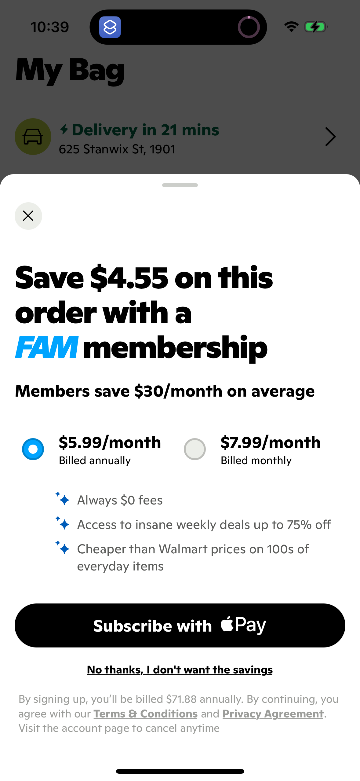
Gopuff1179 × 2556opens the full image 
Color Widgets1179 × 2556opens the full image 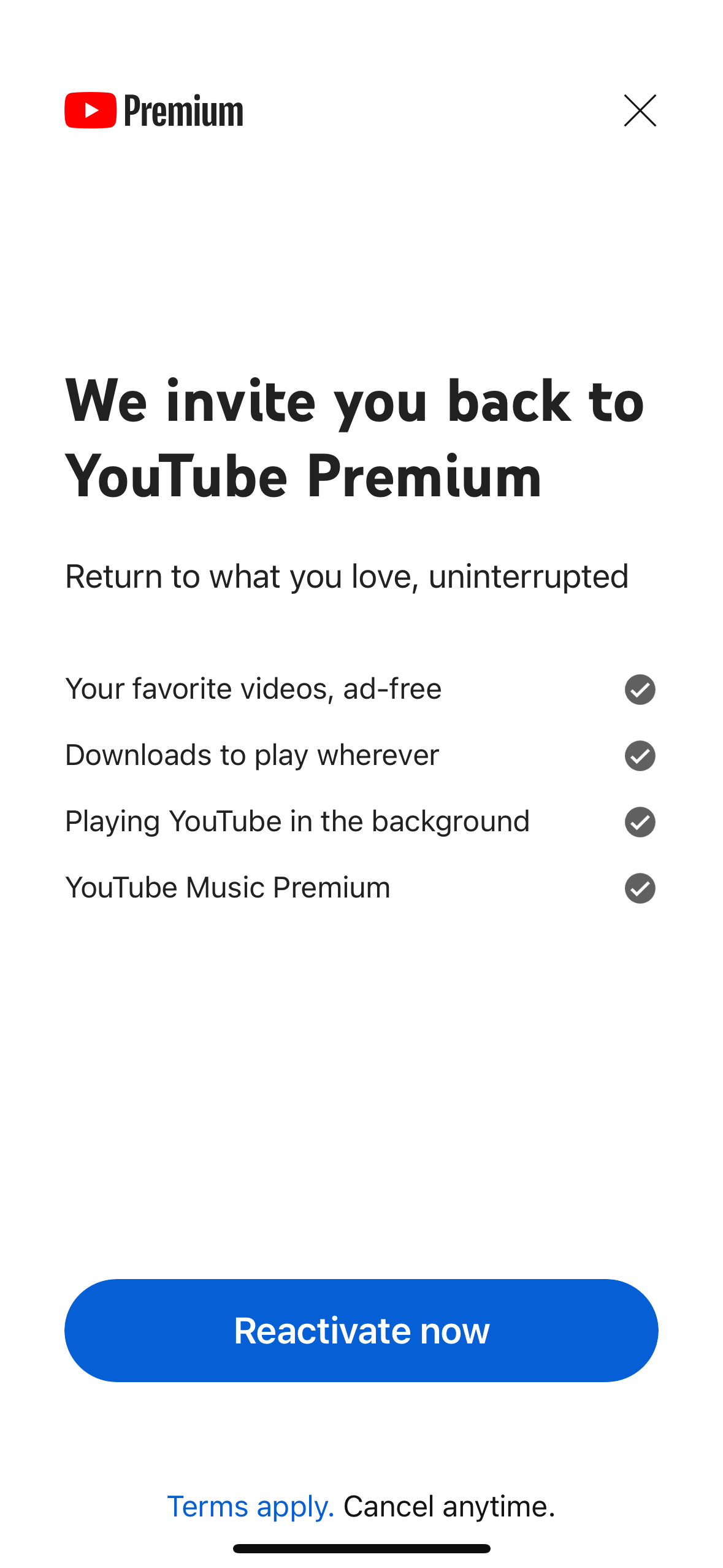
Youtube1179 × 2556opens the full image 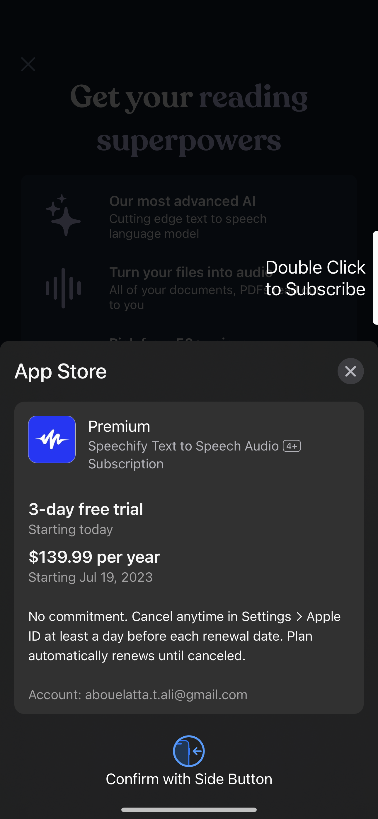
Speechify1290 × 2796opens the full image
The numbers
| # | Stat | Computed from |
|---|---|---|
| [1] | 78 cancel/keep CTAs: 40 dismiss (18 apps), 18 secondary (14 apps), 13 unknown, 7 primary (6 apps) | cancel_flow_cta_roles |
| [2] | DoorDash A/B made 'Select Reason' button solid to reduce abandonment | qualitative / doordash experiment |
Methodology
Universe: 78 cancel/keep/pause/resubscribe CTA buttons in the paywall universe, July 2026. Method: count by cta_role and distinct apps. Caveat: 13 buttons have unknown role and role labels are derived from styling, not intent.
Sources
- [1]
Lazyweb Research analysis of 78 cancel/keep/pause/resubscribe CTA buttons (paywall universe), July 2026
cta_role split for cancel-family buttons across distinct apps.
- [2]
Lazyweb Research analysis of DoorDash cancel-flow experiment, July 2026
A/B changing reason button from grayed-out to solid to ease progression.
Source: Lazyweb Research — proprietary analysis of real, in-market app screens. Cite as Lazyweb Research, 2026-07-07.