Design-system and theme benchmarks
11 data-backed questions on Design-system and theme benchmarks, from Lazyweb Research — each answer cites proprietary analysis of real, in-market app screens.
- Questions
- 11
- With charts
- 9
- With real screens
- 11
- By Ali Abouelatta
- Data as of July 2026
All research categoriesResearch categories35
11 questions
Every question in this category
- Q 01
What percentage of products default to dark mode?
51.3% of 520 audited design systems ship a dark default versus 48.7% light — effectively a coin flip. The split only becomes decision-useful once you cut by platform: mobile is 71% dark while web is…
- Q 02
Do mobile and web apps default to different themes?
Yes, sharply. 71.0% of 259 audited mobile design systems default to dark, while 68.2% of 261 web design systems default to light. This platform split is the single largest divergence in the whole ben…
- Q 03
Which app categories default to dark mode and which default to light?
Dark defaults concentrate in Entertainment (38 of 42 systems, 90%), Music (19 of 24, 79%) and Developer Tools (13 of 18). Light dominates Food & Drink (33 of 40, 83%), Medical (17 of 19) and Lifestyl…
- Q 04
What theme do finance and fintech apps launch with?
Finance is a near-even split: 22 of 42 audited Finance design systems default to light and 20 default to dark. Unlike Entertainment (90% dark), there is no fintech consensus — theme is a brand decisi…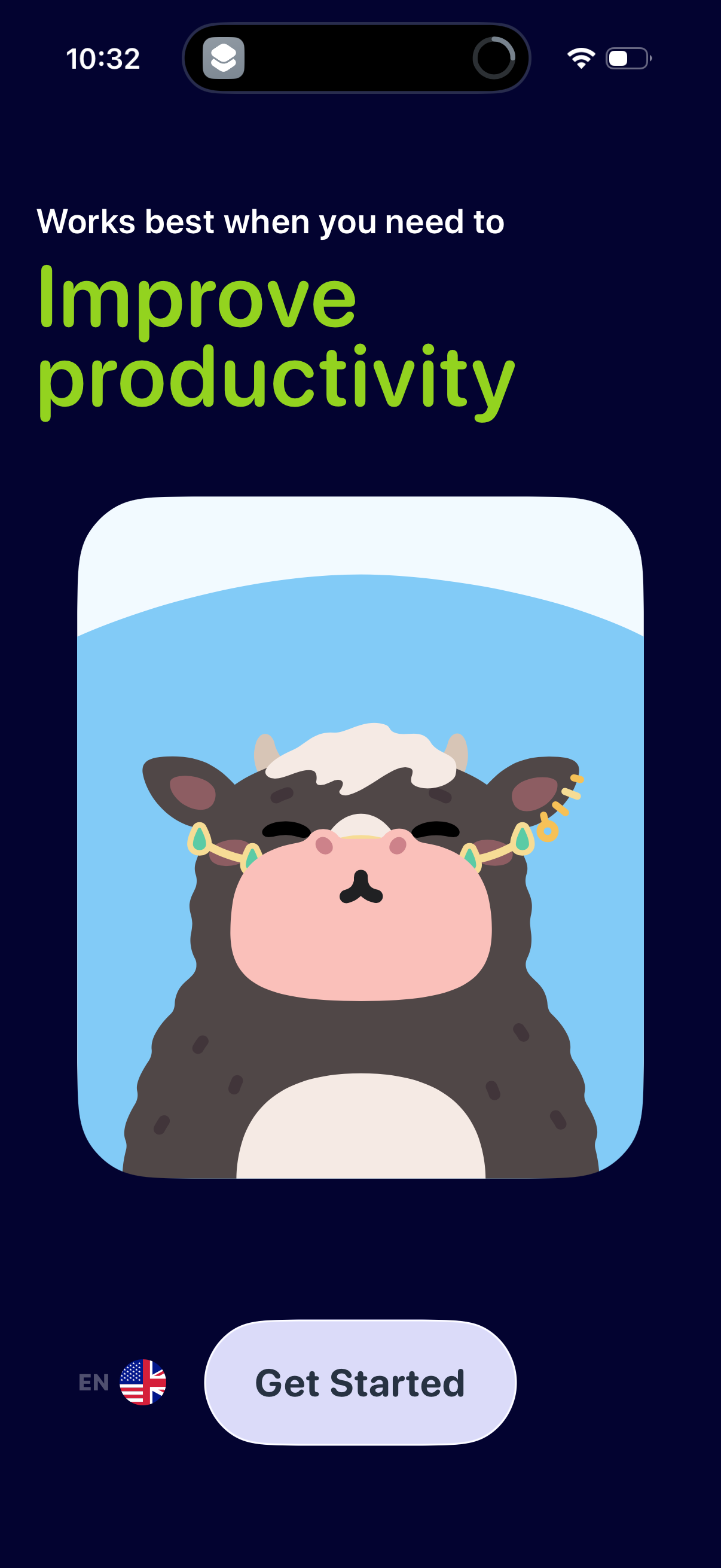
- Q 05
What theme do health and fitness apps default to?
Health & Fitness is the largest single category in the benchmark (71 systems) and splits almost evenly: 39 dark to 32 light. At 55% dark it leans slightly darker than the 51% overall census but nowhe…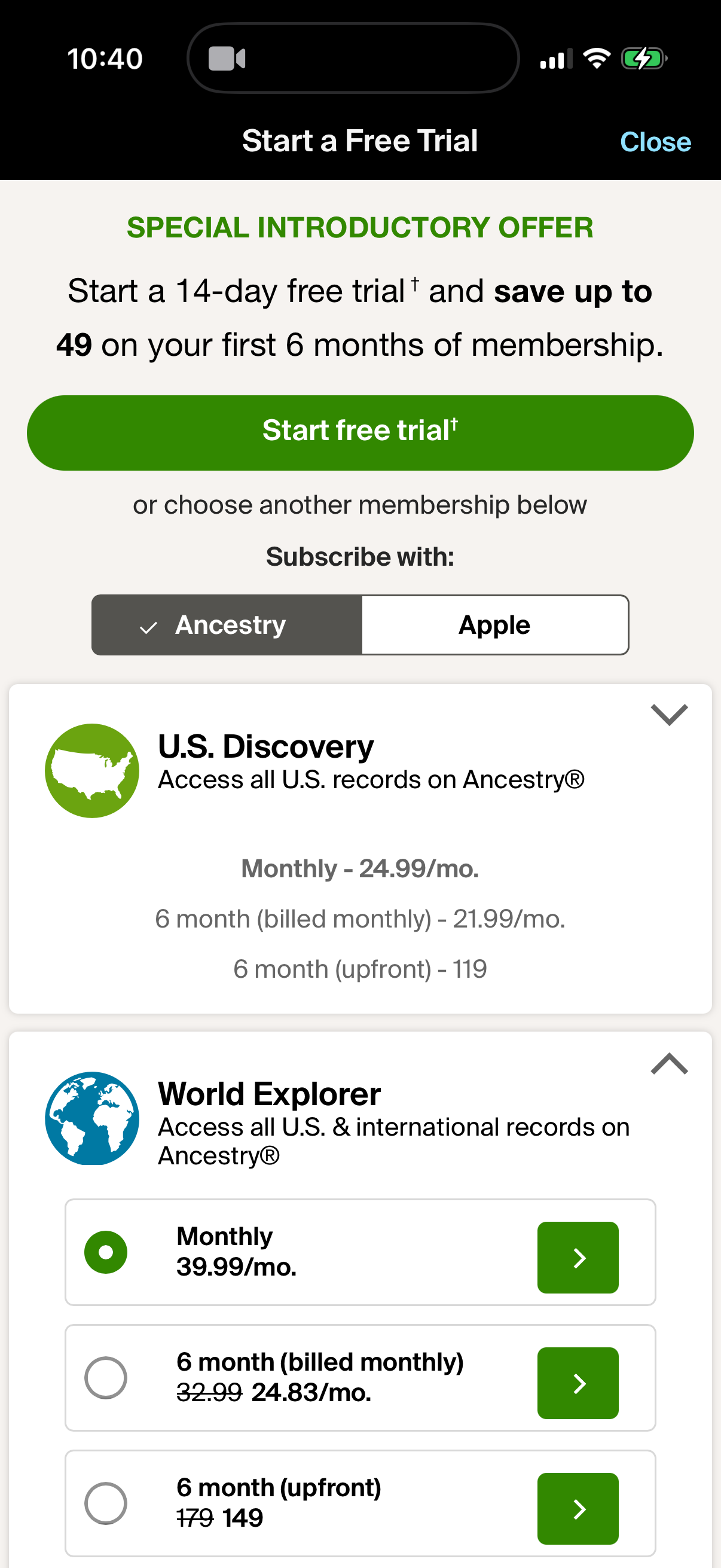
- Q 06
What is the most common primary brand color in modern design systems?
Blue is the single most common primary brand hue: 34.1% of 519 audited design systems with a brand color use it. Add neutral black/gray marks (18.9%) and just those two buckets cover 53% of all produ…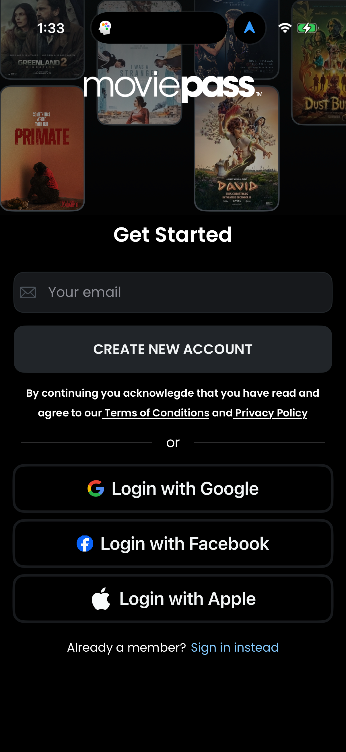
- Q 07
What primary brand colors dominate finance and entertainment design systems?
Blue leads every category, but the second color diverges: in Finance, green ties for second (17 blue, 9 neutral, 9 green of 42) — the money-green pattern. In Entertainment, red jumps to second (15 bl…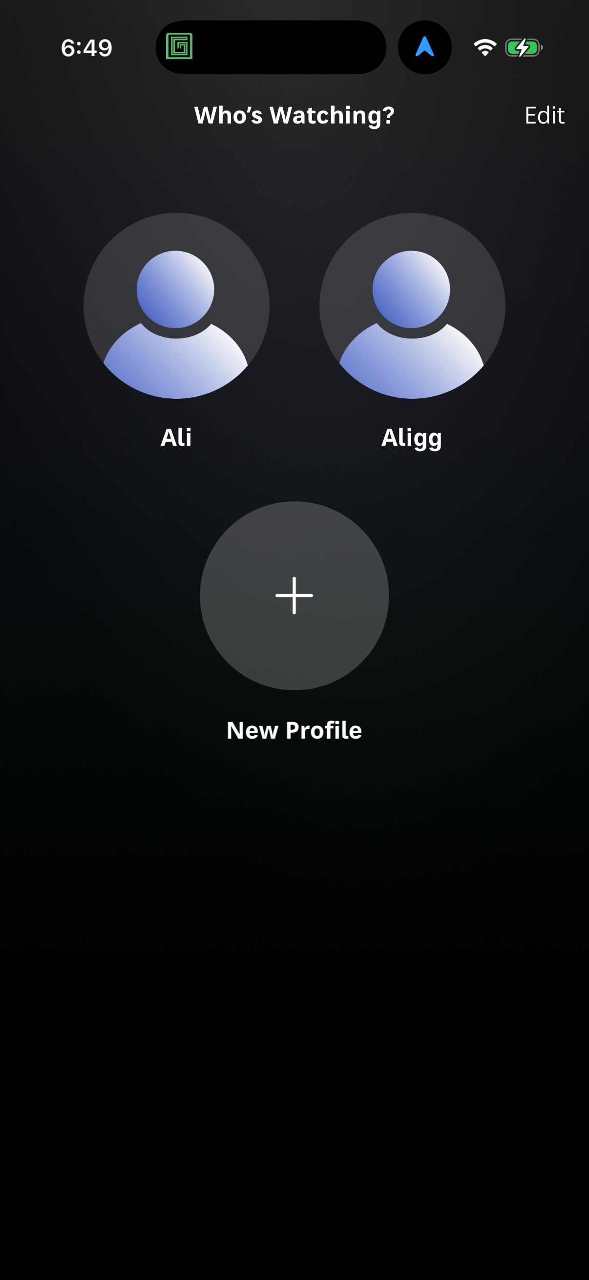
- Q 08
Do most products use a system font or a custom typeface?
The platform system stack wins, but only just: 56.4% of 488 audited design systems with a primary font use a native stack (SF Pro, system-ui, Roboto, etc.) versus 43.6% on a custom/branded typeface.…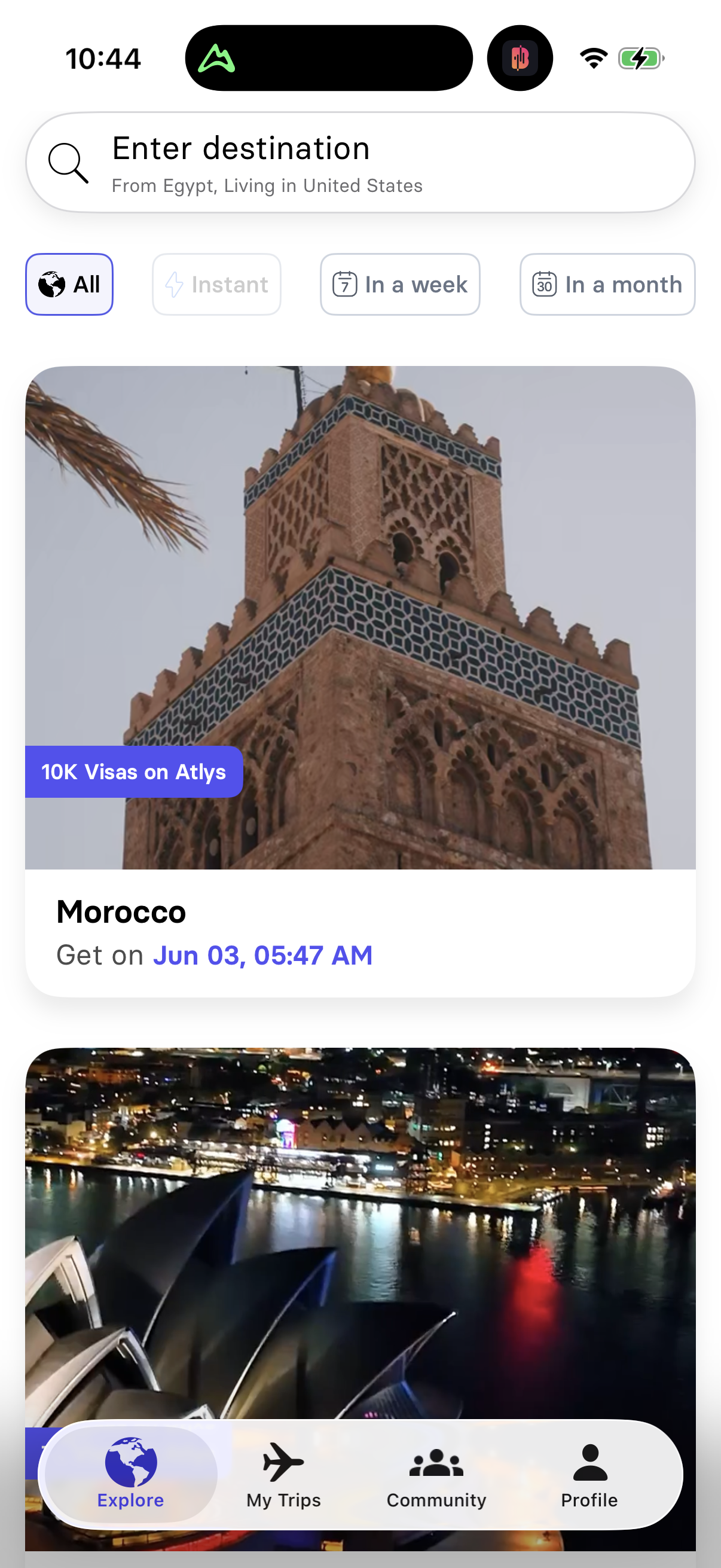
- Q 09
What base font size do modern products use for body text?
16px is the overwhelming default: 73.0% of 518 audited design systems set a 16px base body size. The only meaningful runners-up are 17px (10.4%, the iOS body size) and 14px (7.9%). Anything below 14p…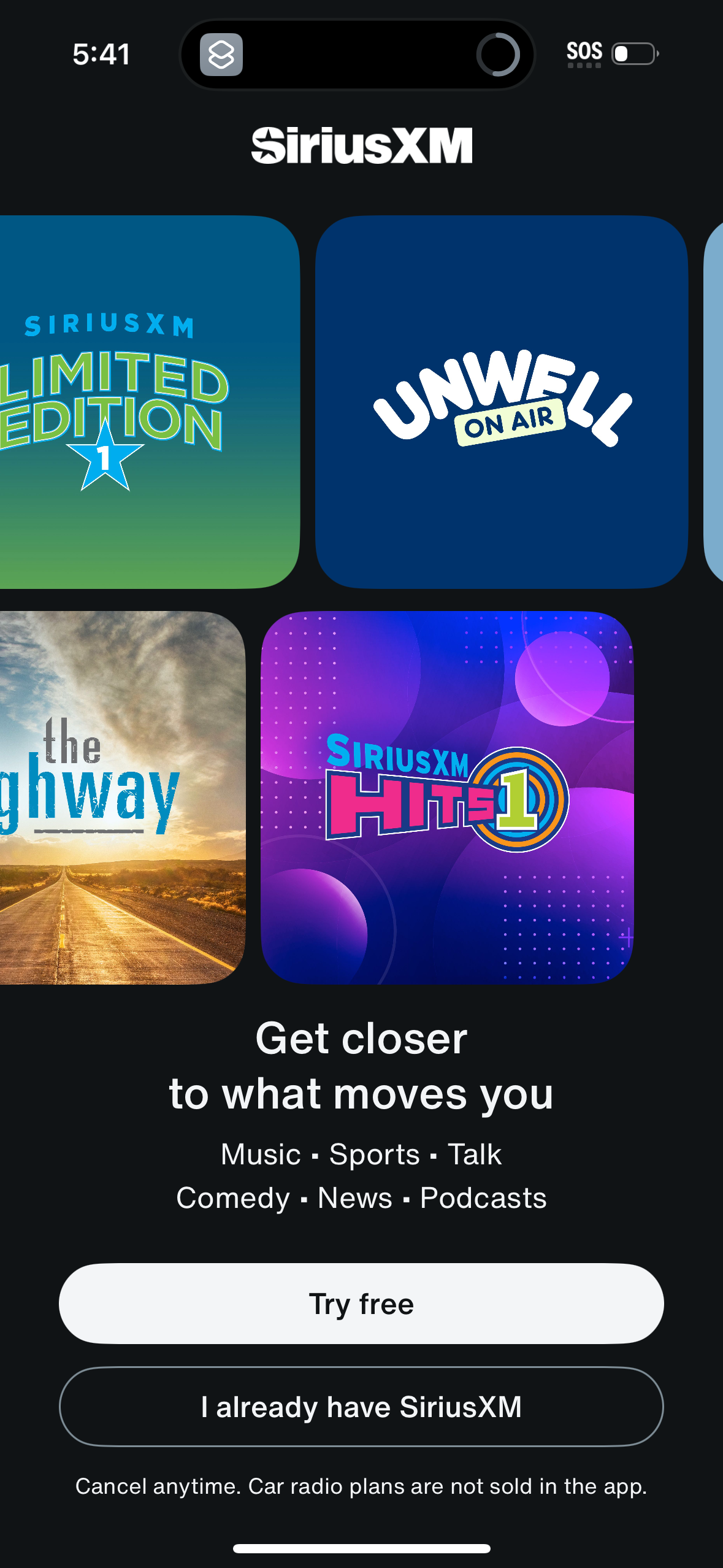
- Q 10
What corner radius do modern products use for primary buttons?
Fully-rounded pill buttons are the single largest bucket: 32.3% of 514 audited design systems use a 40+px (pill/full-round) primary button, and another 27.0% sit in the 7-12px 'rounded' range. Sharp…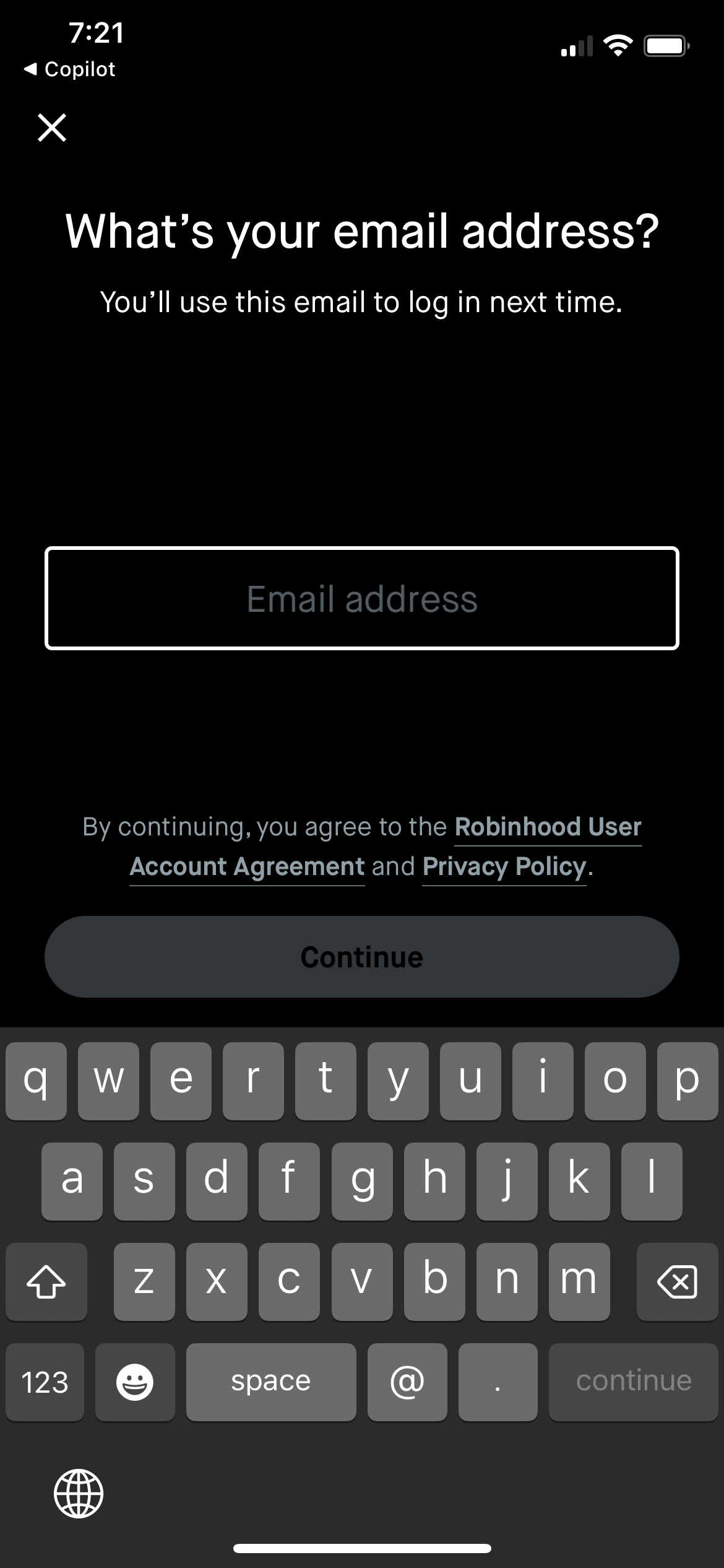
- Q 11
What are the default design-token values for a modern product in 2026?
Across 520 audited design systems, the modal modern product ships: 16px base body text (73%), a system or Inter-class sans (56% system stack), a blue primary brand color (34%), and either a pill or 7…