
Your landing page’s weakest score is CTA.
How Stytch (Device Fingerprinting / Agent Detection) ranks
- 1.
Castle79
- 2.
Fingerprint78
- 3.
Stytch (Device Fingerprinting / Agent Detection)73
- 4.
Switchfrog73
- 5.
Kasada73
- 6.
HUMAN Security65
CTA
64FairCopy, size, verb, cost-feel — does the primary CTA earn the click?
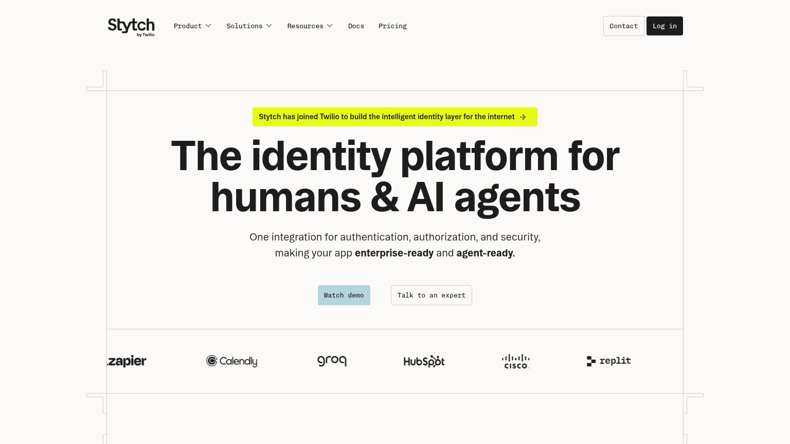
Problems
- passive verb — watch, not do
- weak visual contrast on desktop
- no path into the product itself
Mobile web
72FairThe phone experience as a first-class citizen.
 1234
- Headline wraps five lines — "The identity platform for humans & AI agents" scales down too little and eats over half the first viewport in five oversized lines.
- Watch demo pushed low — The primary "Watch demo" button sits at the very bottom edge of the fold, below headline, banner, and subhead — barely inside the first viewport.
- Twilio announcement banner — The yellow acquisition banner is the first content element, adding a competing message before the value statement.
- Log in beside Menu — Two header buttons compete for attention; "Log in" is a returning-user action given equal weight to the collapsed menu.
Information hierarchy
76FairDoes the design help or inhibit what the page is trying to say?
What works
What to improve
Value props
76FairTitle, subtitle, hero — do they sell the product's true value?
Stytch (Device Fingerprinting / Agent Detection)’s headline
The identity platform for humans & AI agents
One integration for authentication, authorization, and security, making your app enterprise-ready and agent-ready.
Working
Could improve
Trust
76FairProof that the product is real, competent, and safe to try.
How Stytch (Device Fingerprinting / Agent Detection) compares
Trust read