
Your landing page’s weakest score is Information hierarchy.
How Fingerprint ranks
78Growth scoreupdated
category scores
category scoresShowHide
Information hierarchy
68FairDoes the design help or inhibit what the page is trying to say?
 1234
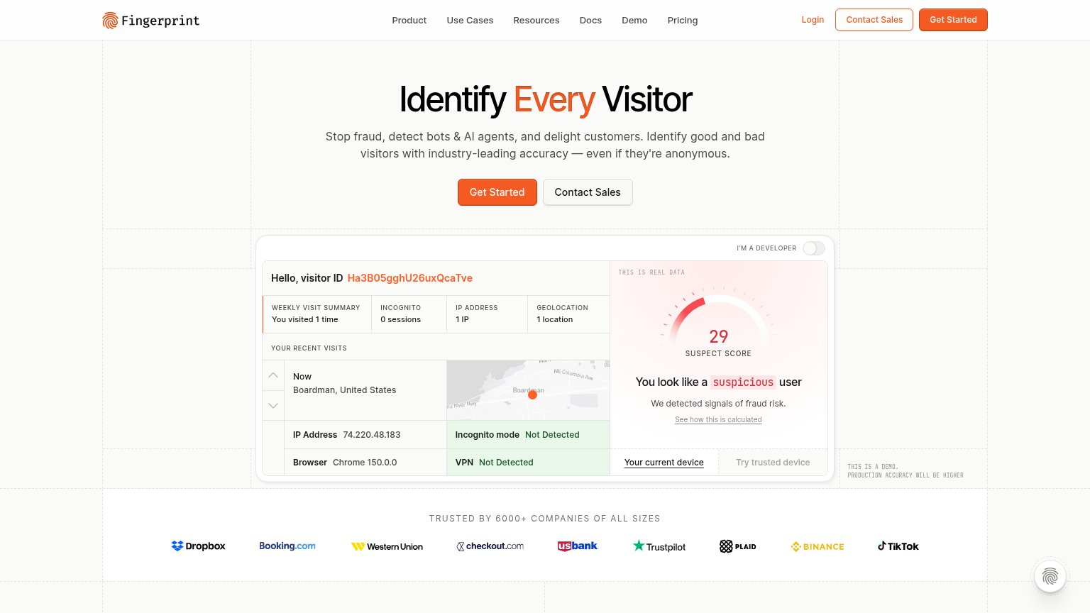
- Duplicate Get Started buttons — The nav's orange 'Get Started' duplicates the hero CTA at identical weight, splitting the scan path between two equal targets.
- Contact Sales secondary CTA — Styled at nearly the same size and border weight as 'Get Started', so the fold presents two peer actions instead of one primary; it also repeats in the nav.
- Live demo data panel — The visitor-ID card packs a suspect-score gauge, map, IP, browser, VPN and incognito rows into one dense block that competes with the headline for first attention.
- Six-item nav row — Product, Use Cases, Resources, Docs, Demo and Pricing plus Login offer seven exits before the visitor reaches the hero promise.
CTA
72FairCopy, size, verb, cost-feel — does the primary CTA earn the click?
Problems
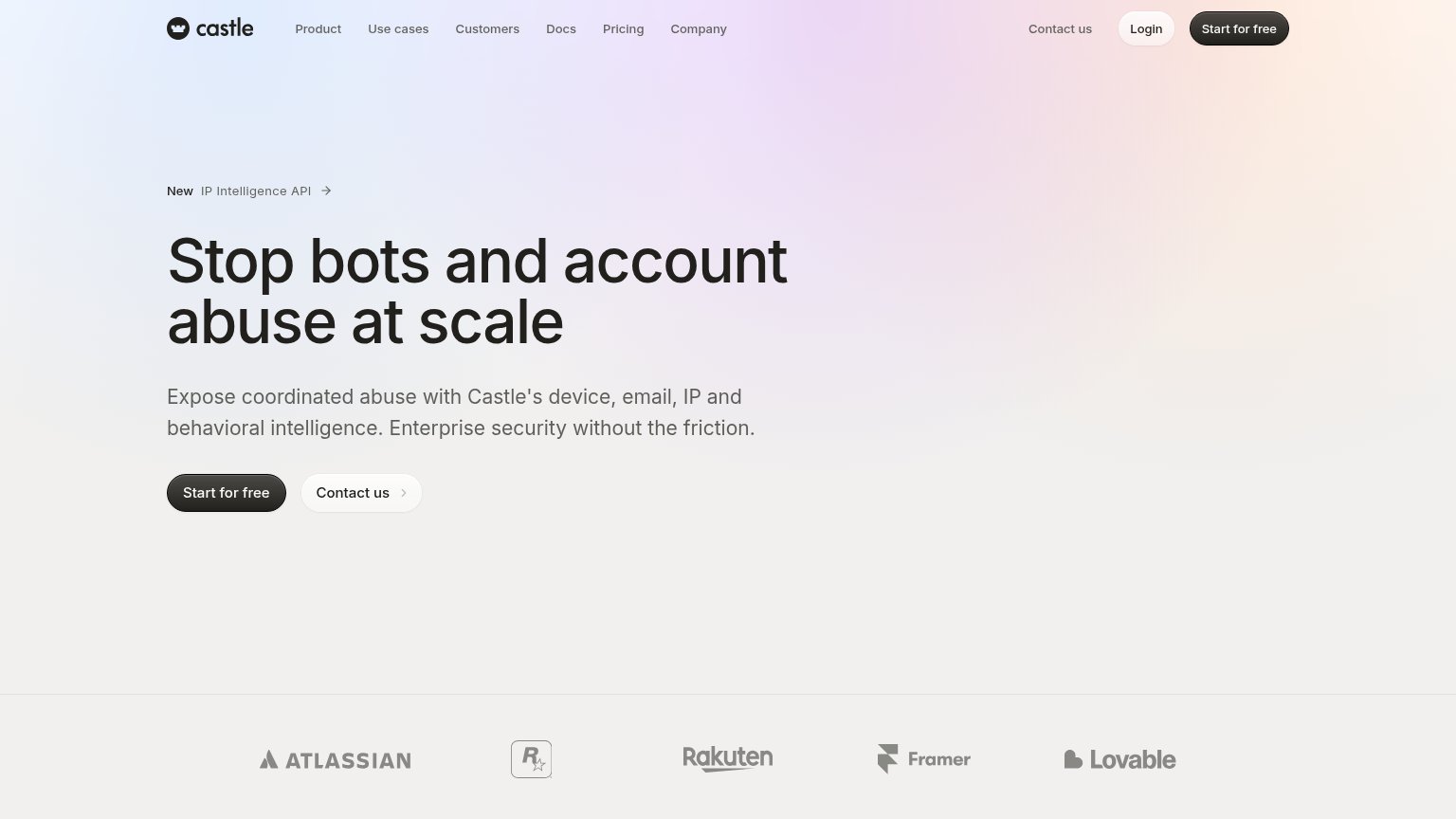
- generic label, no value named
- no echo of 'Identify Every Visitor'
- unclear what the click leads to
Mobile web
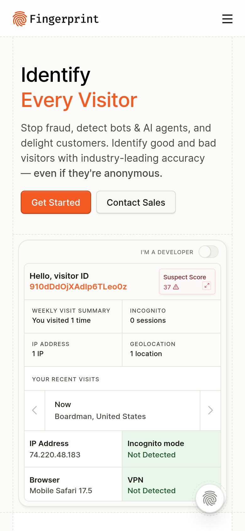
78FairThe phone experience as a first-class citizen.
What works
What to improve
Value props
86StrongTitle, subtitle, hero — do they sell the product's true value?
Fingerprint’s headline
Identify Every Visitor
Stop fraud, detect bots & AI agents, and delight customers. Identify good and bad visitors with industry-leading accuracy — even if they're anonymous.
Working
Could improve
Trust
86StrongProof that the product is real, competent, and safe to try.
How Fingerprint compares
Trust read