
Your landing page’s weakest score is Mobile web.
How Kasada ranks
Mobile web
64FairThe phone experience as a first-class citizen.
 1234
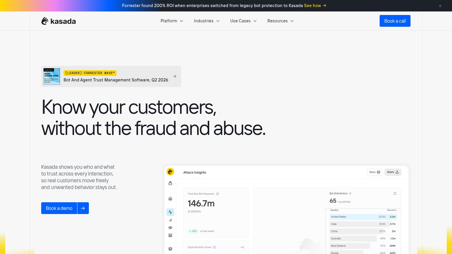
- Oversized hero headline — Barely scaled from desktop, wraps into six lines and pushes Book a demo below the fold.
- Book a demo button — Desktop-proportioned at under half the column width and sits below the first viewport.
- Forrester promo bar — Three lines of promo text eat the top of the viewport before the header appears.
- Forrester award card — Large badge card sits above the headline, delaying the value statement and CTA.
CTA
72FairCopy, size, verb, cost-feel — does the primary CTA earn the click?
Problems
- 'Book' feels like a meeting cost
- competes with nav's 'Book a call'
- no value payoff in the label
Trust
72FairProof that the product is real, competent, and safe to try.
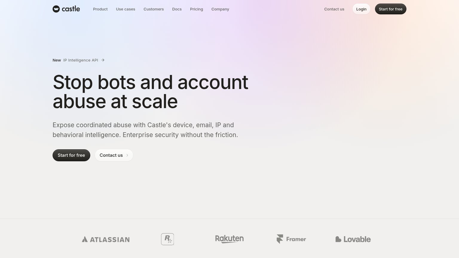
How Kasada compares
Trust read
Information hierarchy
78FairDoes the design help or inhibit what the page is trying to say?
What works
What to improve
Value props
78FairTitle, subtitle, hero — do they sell the product's true value?
Kasada’s headline
Know your customers, without the fraud and abuse.
Kasada shows you who and what to trust across every interaction, so real customers move freely and unwanted behavior stays out.
Working
Could improve