
Your landing page’s weakest score is CTA.
How Plum ranks
- 1.
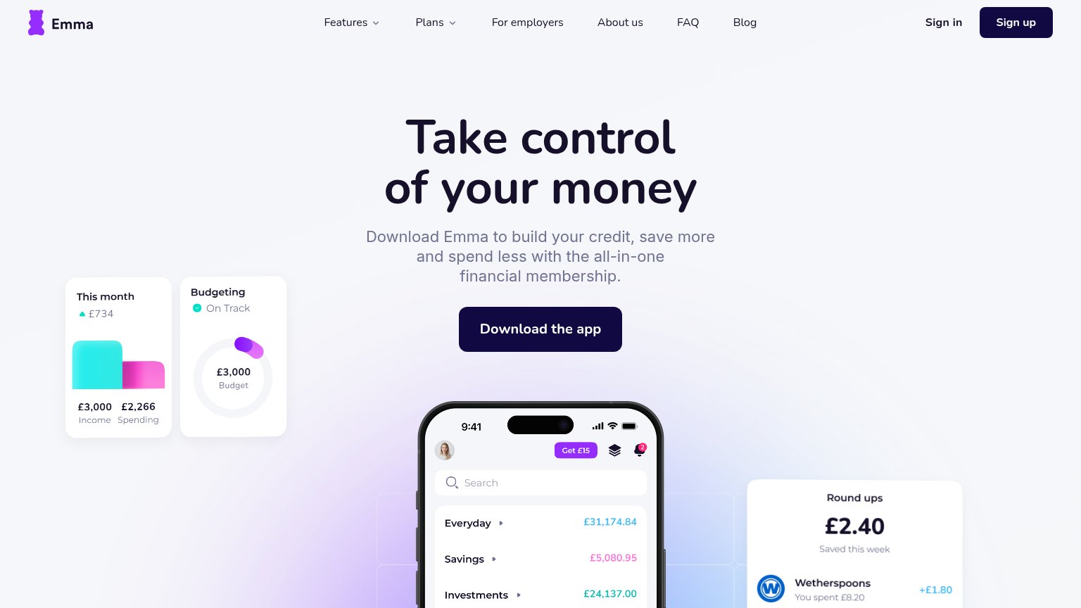
Emma73
- 2.
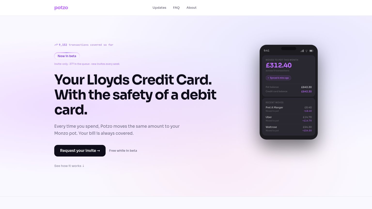
potzo.cc72
- 3.
Plum69
- 4.
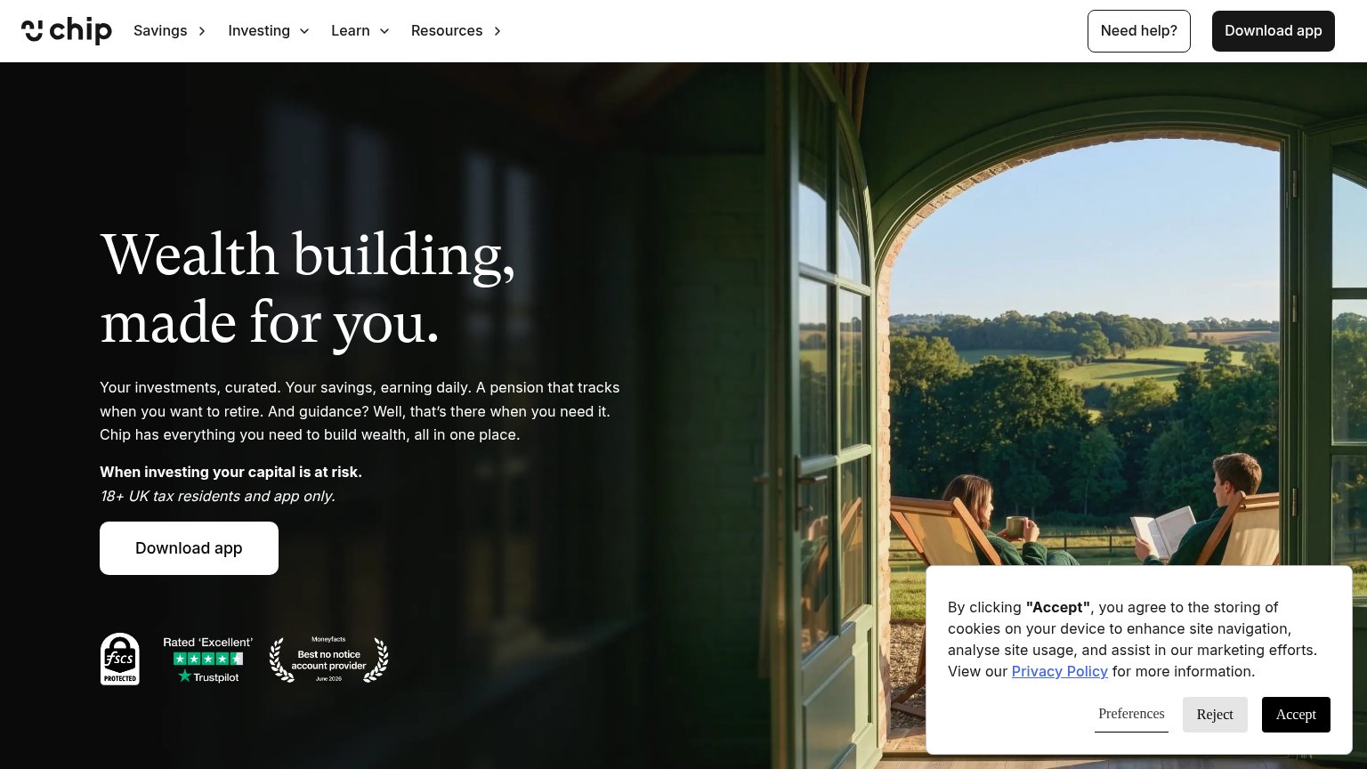
Chip66
CTA
58FairCopy, size, verb, cost-feel — does the primary CTA earn the click?
Problems
- no hero button on desktop fold
- no 'free' despite free signup
- labels split: Sign up vs Join now
- desktop CTA is nav-sized only
Value props
60FairTitle, subtitle, hero — do they sell the product's true value?
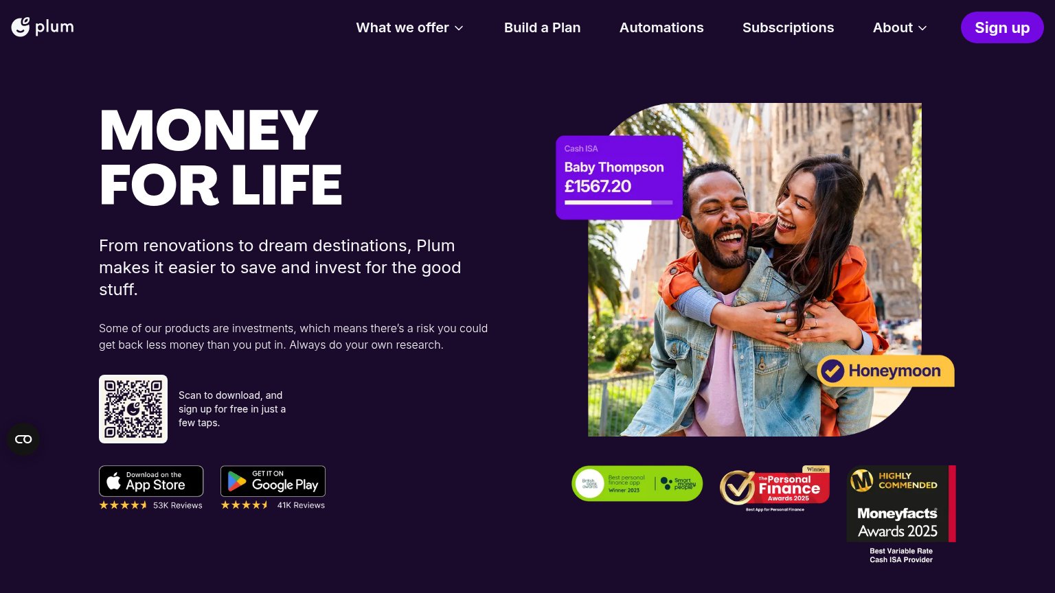
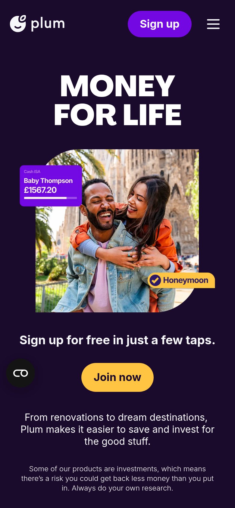
Plum’s headline vague
MONEY FOR LIFE
From renovations to dream destinations, Plum makes it easier to save and invest for the good stuff.
Working
- Hero UI shows a real goal: Honeymoon, £1567.20
- Subhead names outcomes: renovations, destinations
- Award badges and 53K reviews add proof
Could improve
- Headline is a slogan, sells nothing specific
- No numbers or rates in the copy
- 'The good stuff' is vague; name the mechanism
Information hierarchy
68FairDoes the design help or inhibit what the page is trying to say?
What works
What to improve
Trust
74FairProof that the product is real, competent, and safe to try.
How Plum compares
Trust read
Mobile web
84StrongThe phone experience as a first-class citizen.
What works
What to improve