
Your landing page’s weakest score is Trust.
Trust
62FairProof that the product is real, competent, and safe to try.
| Trust read | |
|---|---|
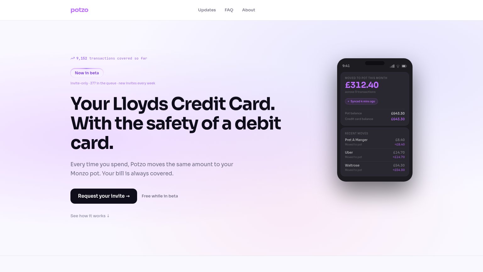
| Potzo Website | 9,152 transactions covered so far |
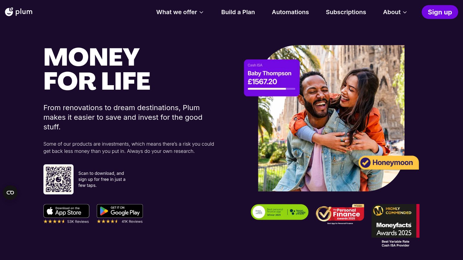
| App Store badge with 4.5-star rating and "53K Reviews" | |
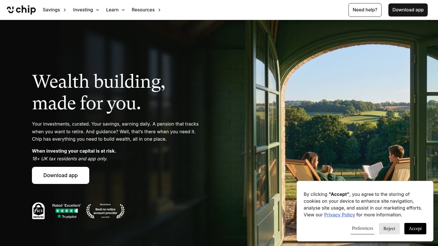
| FSCS Protected, Trustpilot 'Rated Excellent', and Moneyfacts 'Best no notice account provider June 2026' badge row under | |
| Detailed in-app phone mockup showing balances, credit score "580 / 710", and "Round ups £2.40 Saved this week" |
Mobile web
62FairThe phone experience as a first-class citizen.
 12
- Broken hero headline — "Lloyds Credit Card" line is missing on mobile, leaving "Potzo Website's" orphaned above "With the safety of a debit card."
- Badge and queue stack — Ticker, "Now in beta" badge, and invite-queue line stack three messages that push the CTA below the fold.
CTA
72FairCopy, size, verb, cost-feel — does the primary CTA earn the click?
How Potzo Website compares
Recommended rewrites
Value props
82StrongTitle, subtitle, hero — do they sell the product's true value?
Potzo Website’s headline
Your Lloyds Credit Card. With the safety of a debit card.
Every time you spend, Potzo moves the same amount to your Monzo pot. Your bill is always covered.
Working
Could improve
Information hierarchy
83StrongDoes the design help or inhibit what the page is trying to say?
What works
What to improve