
Your landing page’s weakest score is Value props.
How romeet-chatterjee.vercel.app ranks
- 1.
Dribbble69
- 2.
Behance63
- 3.
romeet-chatterjee.vercel.app61
- 4.
Layers53
61Growth scoreupdated
category scores
category scoresShowHide
Value props
54FairTitle, subtitle, hero — do they sell the product's true value?
romeet-chatterjee.vercel.app’s headline undersells
Romeet Chatterjee
AI Product Designer
Working
- "Real, shipped products" preempts skepticism
- Edge CRM card names user + outcome
- Work shown directly, not decorated
Could improve
- No top-level pitch beyond a job title
- Zero numbers or proof points anywhere
- Two fold cards are unlabeled dark images
Information hierarchy
58FairDoes the design help or inhibit what the page is trying to say?
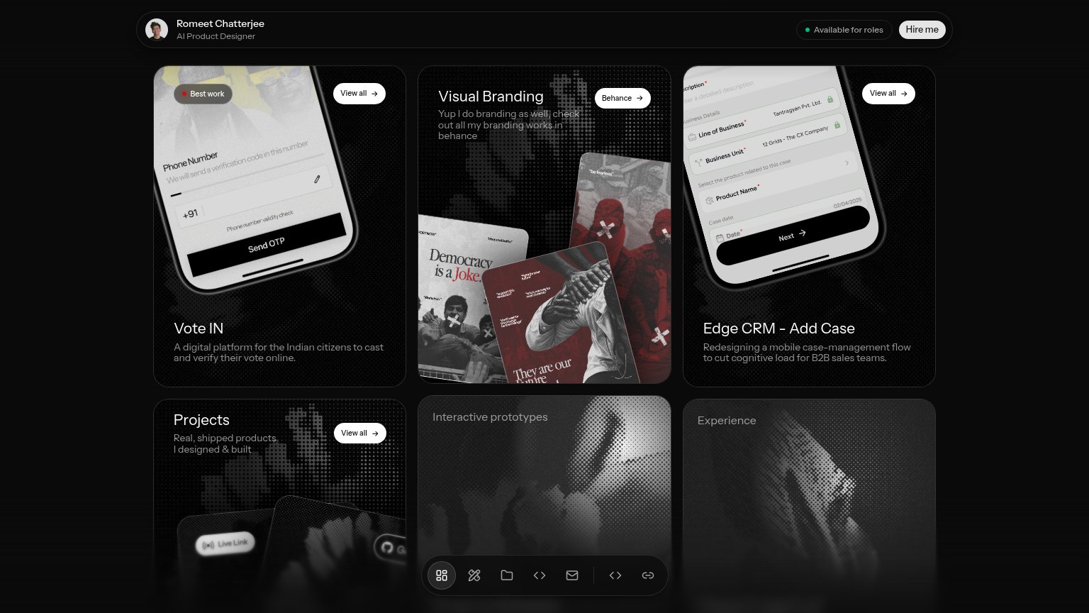 1234
- Identity top bar — Name and role render smaller than every project card title, burying the value prop.
- View all pill — Same-weight pill repeated on three cards, splitting attention from the single Hire me CTA.
- Floating icon dock — Seven unlabeled icons add exit paths and obscure the Interactive prototypes card beneath.
- Hire me button — Primary CTA is visually identical in weight to the four card pills, so it does not win the one-second scan.
Trust
58FairProof that the product is real, competent, and safe to try.
How romeet-chatterjee.vercel.app compares
Trust read
CTA
62FairCopy, size, verb, cost-feel — does the primary CTA earn the click?
How romeet-chatterjee.vercel.app compares
Recommended rewrites
Mobile web
72FairThe phone experience as a first-class citizen.
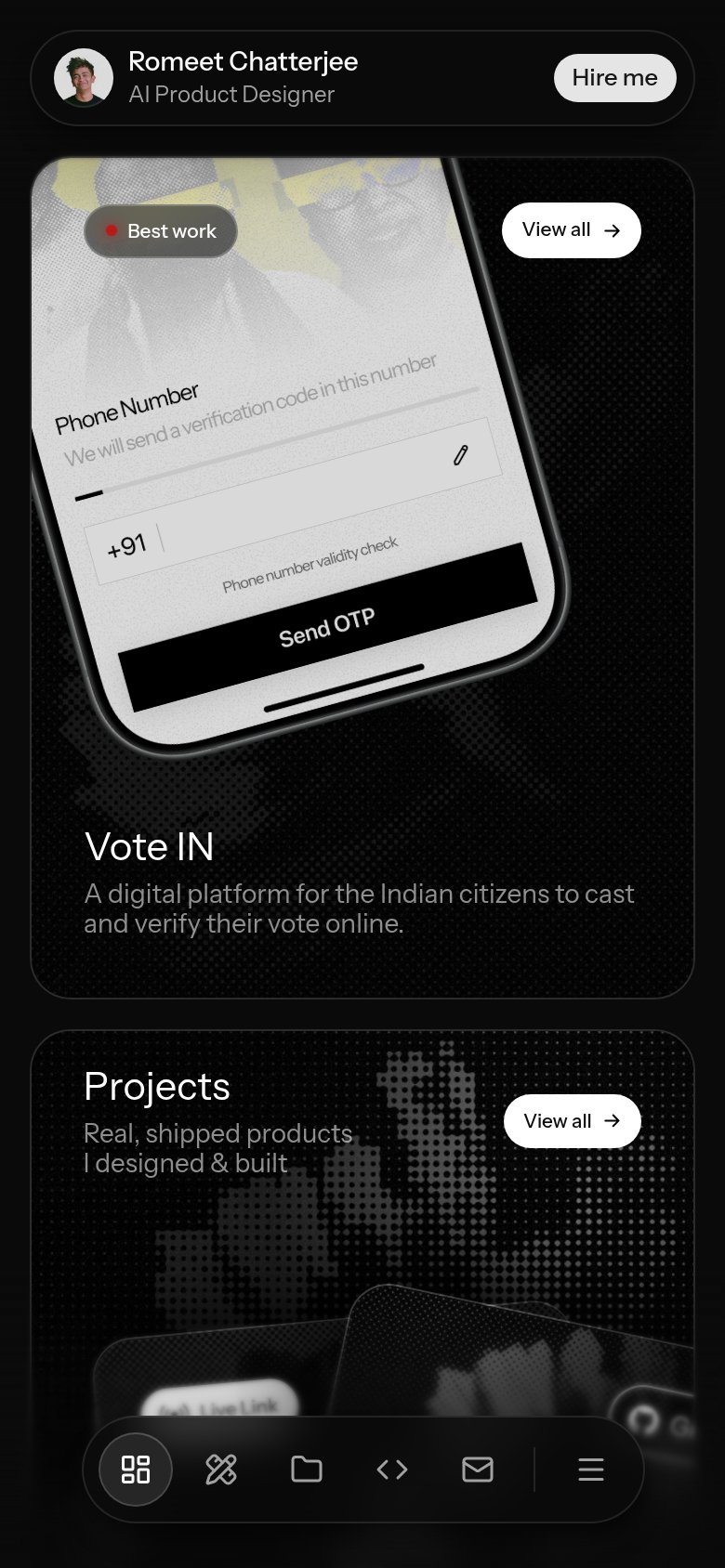
What works
What to improve