
Your landing page’s weakest score is Trust.
How Behance ranks
Trust
56FairProof that the product is real, competent, and safe to try.
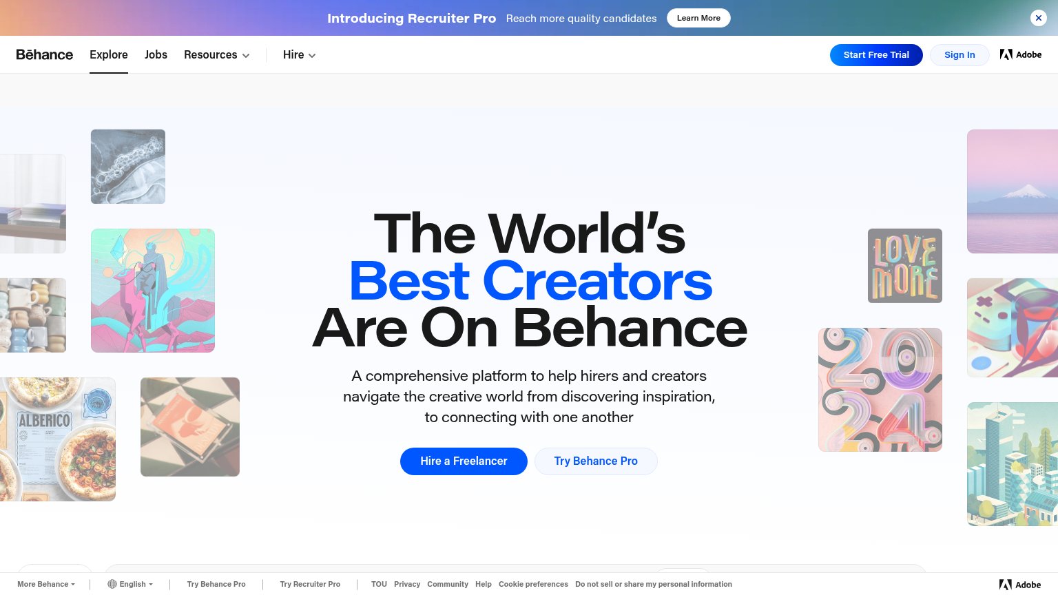
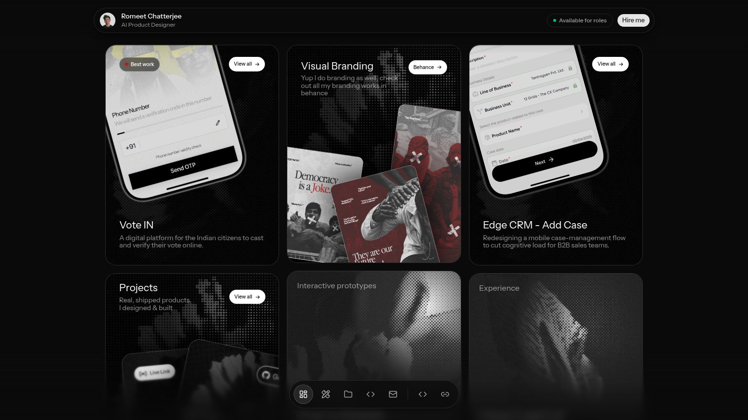
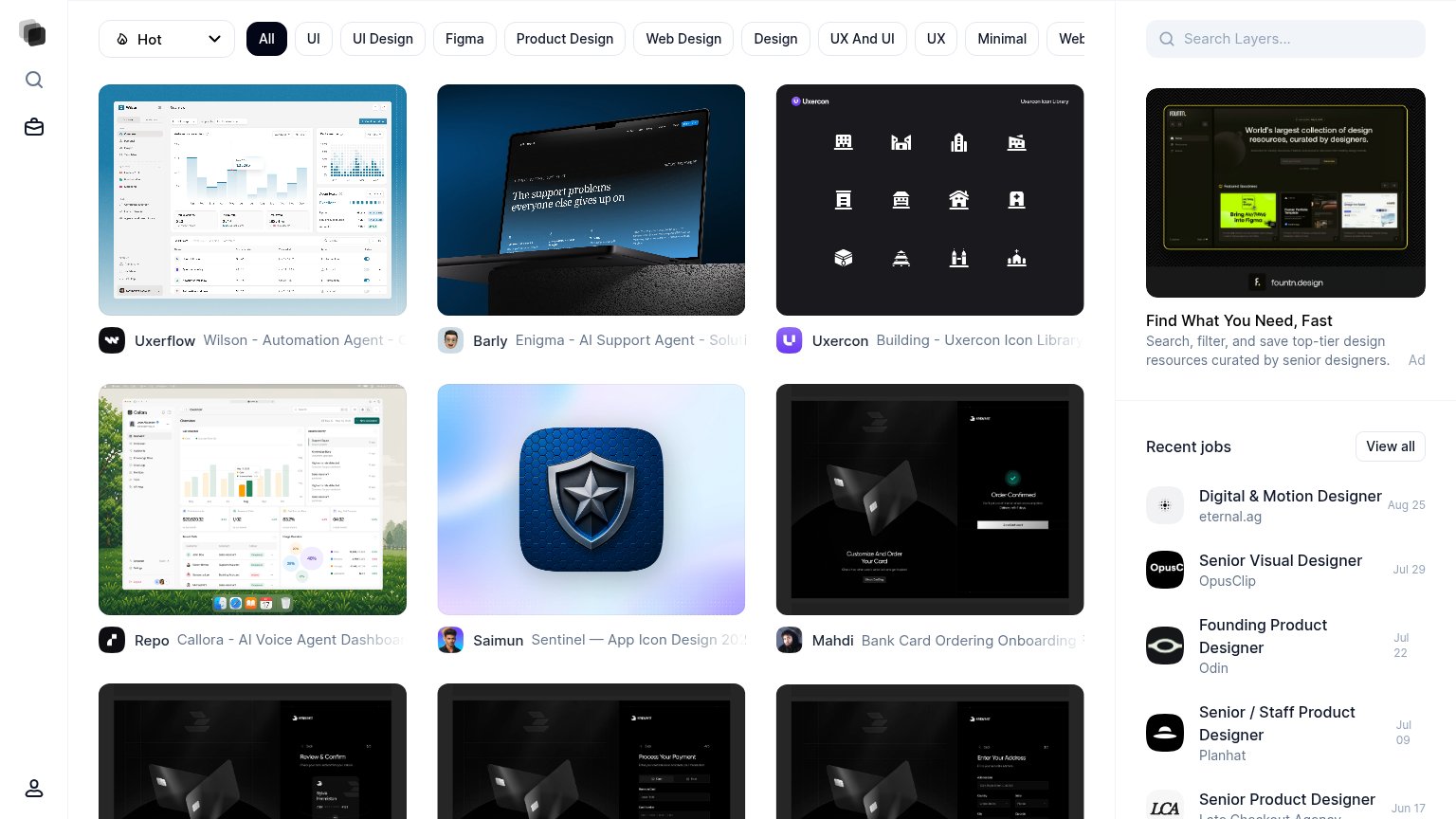
| Trust read | |
|---|---|
| Behance | Adobe wordmark in the header nav |
| "Vote IN" project card showing a real phone-verification UI with "Send OTP" button and "+91" validity check | |
| Hero image of real community design work attributed to "FOURMETA" | |
| Recent jobs rail listing named employers (OpusClip, Planhat, Odin) with real roles and dates |
Mobile web
62FairThe phone experience as a first-class citizen.
 1234
- Six-line hero headline — Desktop headline barely scaled down; it wraps into six lines and shoves the CTA to the very bottom of the fold.
- Google sign-in sheet — One-Tap overlay slides in directly under 'Hire a Freelancer', crowding the tap zone and competing for the first action.
- Recruiter Pro banner — Sticky promo bar spends the top strip of a cramped fold on a secondary product pitch.
- Hire a Freelancer button — Desktop-proportioned pill floats narrow in the phone column instead of a full-bleed, thumb-friendly bar.
Value props
63FairTitle, subtitle, hero — do they sell the product's true value?
Behance’s headline
The World's Best Creators Are On Behance
A comprehensive platform to help hirers and creators navigate the creative world from discovering inspiration, to connecting with one another
Working
Could improve
Information hierarchy
64FairDoes the design help or inhibit what the page is trying to say?
What works
What to improve
CTA
68FairCopy, size, verb, cost-feel — does the primary CTA earn the click?
How Behance compares
Recommended rewrites