
Your landing page’s weakest score is Trust.
How Dribbble ranks
69Growth scoreupdated
category scores
category scoresShowHide
Trust
48PoorProof that the product is real, competent, and safe to try.
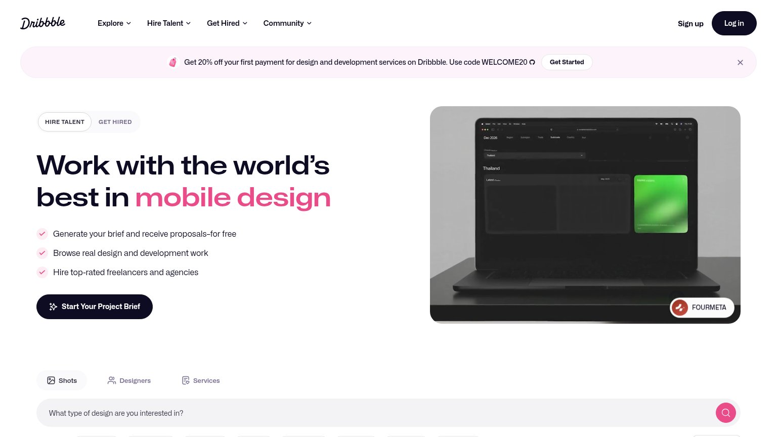
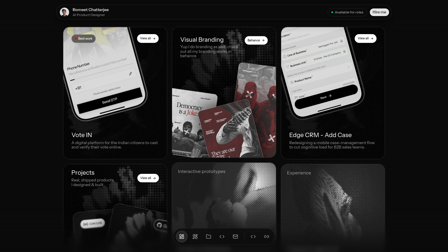
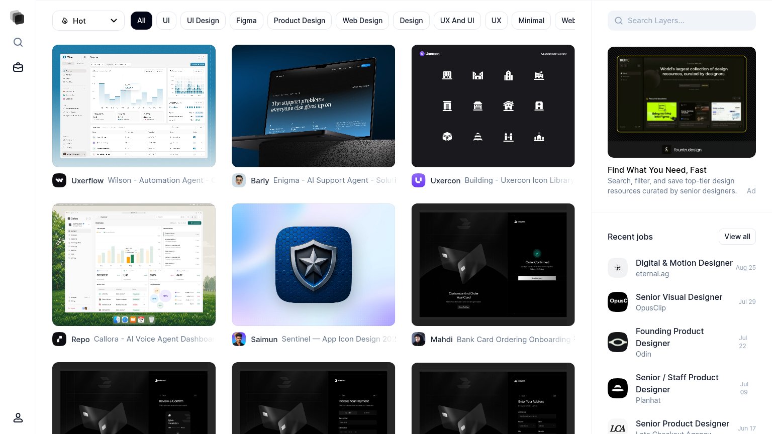
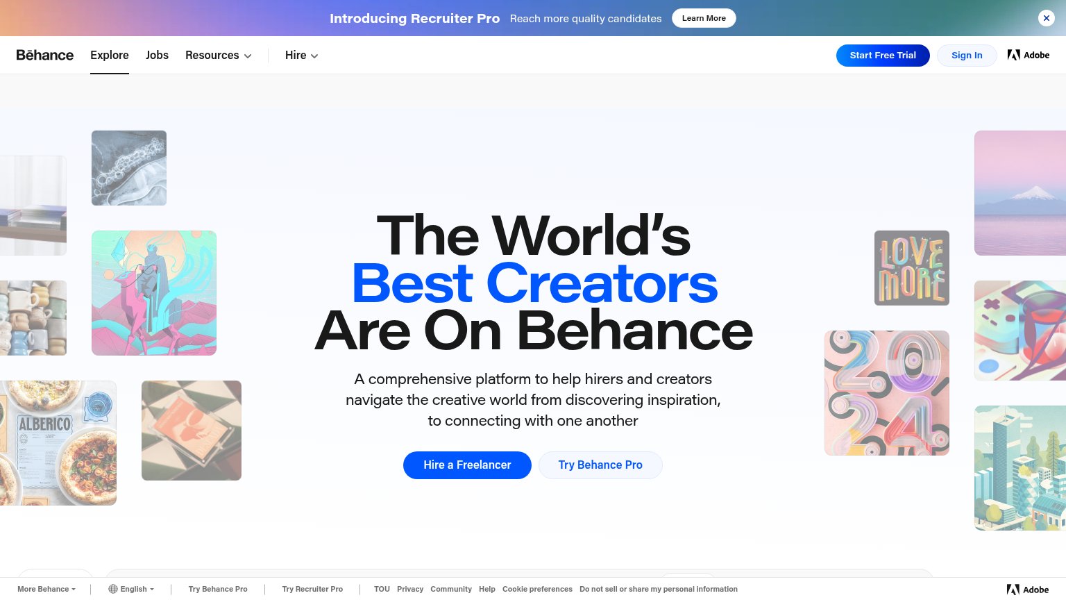
| Trust read | |
|---|---|
| Dribbble | Hero image of real community design work attributed to "FOURMETA" |
| "Vote IN" project card showing a real phone-verification UI with "Send OTP" button and "+91" validity check | |
| Adobe wordmark in the header nav | |
| Recent jobs rail listing named employers (OpusClip, Planhat, Odin) with real roles and dates |
Information hierarchy
68FairDoes the design help or inhibit what the page is trying to say?
1234- Log in pill — Dark pill matches the primary CTA's weight exactly, splitting attention to the top-right corner.
- Promo banner CTA — "Get Started" injects a second call to action above the hero, competing with Start Dribbble's Project Brief.
- Search and tabs — Full-width search plus Shots/Designers/Services tabs open a browsing path that diverts from the brief CTA.
- Laptop hero shot — Dark screenshot with tiny illegible UI conveys little about the design quality Dribbble is selling.
CTA
72FairCopy, size, verb, cost-feel — does the primary CTA earn the click?
How Dribbble compares
Recommended rewrites
Value props
78FairTitle, subtitle, hero — do they sell the product's true value?
Dribbble’s headline
Work with the world's best in mobile design
Generate your brief and receive proposals–for free · Browse real design and development work · Hire top-rated freelancers and agencies
Working
Could improve
Mobile web
79FairThe phone experience as a first-class citizen.

What works
What to improve