Your landing page’s weakest score is Value props.
How her labs ranks
- 1.
Fireflies.ai76
- 2.
Qatalog76
- 3.
Guru71
- 4.
her labs65
- 5.
Dashworks61
65Growth scoreupdated
category scores
category scoresShowHide
 Lazyweb TeamAI Growth PMTurn this score into growth.Analyze your site and propose fixes across conversion and trustBenchmark your Growth Score against similar companiesLearn from growth experiments across 10,000+ top productsStart Team trial →
Score over time
Value props
47PoorTitle, subtitle, hero — do they sell the product's true value?
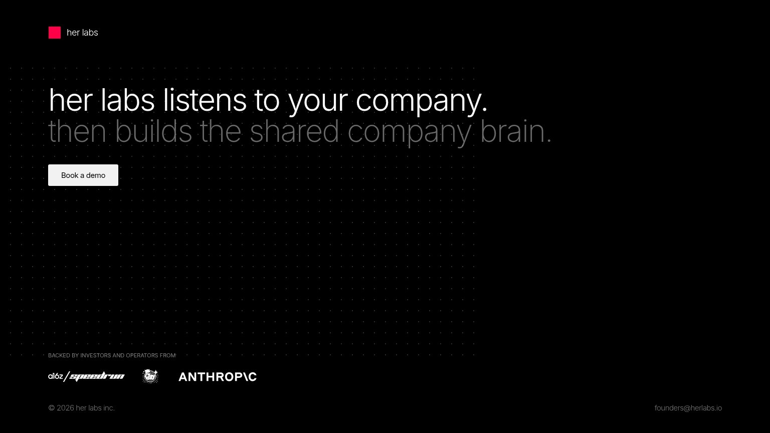
her labs’s headline vague
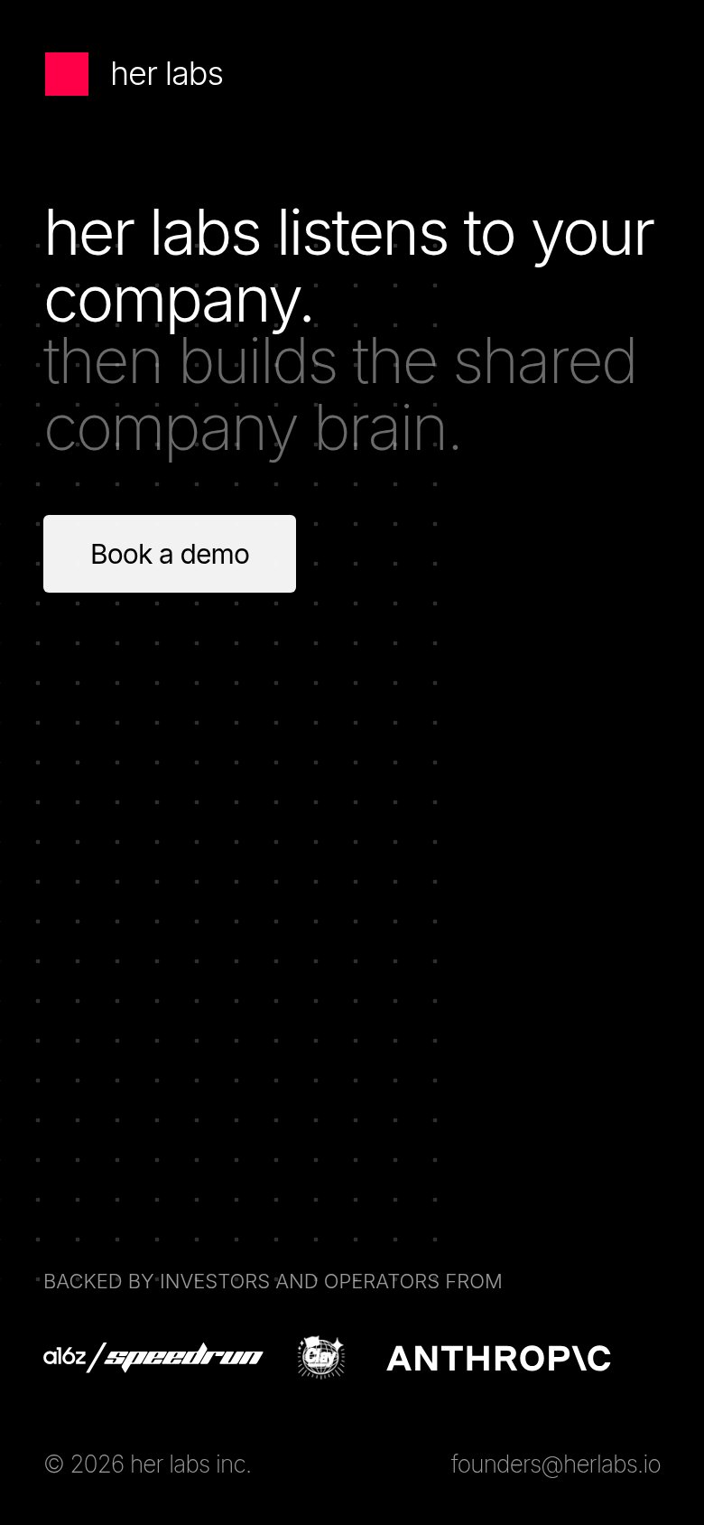
her labs listens to your company.
then builds the shared company brain.
Working
- Memorable two-beat rhythm in the hero
- 'Company brain' hints at real outcome
- Strong investor logos back the claim
Could improve
- No concrete mechanism for 'listens'
- Zero numbers or specific outcomes
- Empty fold — no product demonstration
Trust
48PoorProof that the product is real, competent, and safe to try.
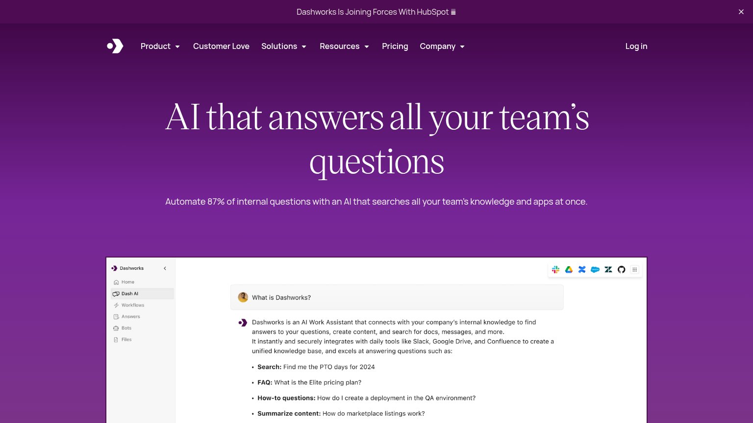
| Trust read | |
|---|---|
| her labs | "BACKED BY INVESTORS AND OPERATORS FROM" logo strip (a16z speedrun, Clay, Anthropic) |
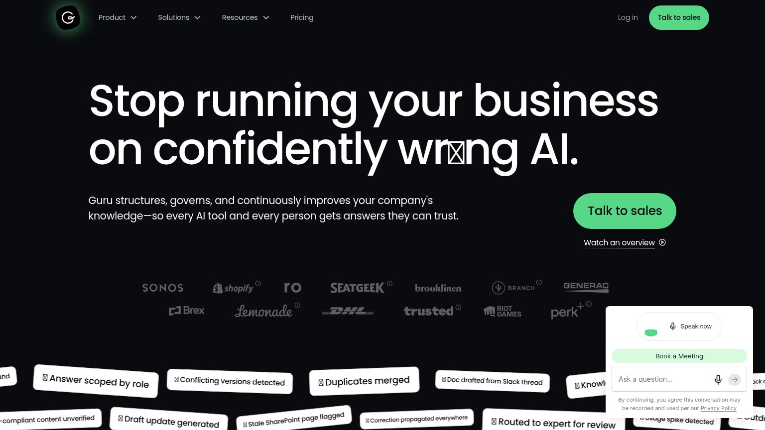
| Customer logo wall: Sonos, Shopify, SeatGeek, Brooklinen, DHL, Brex, Riot Games, Lemonade | |
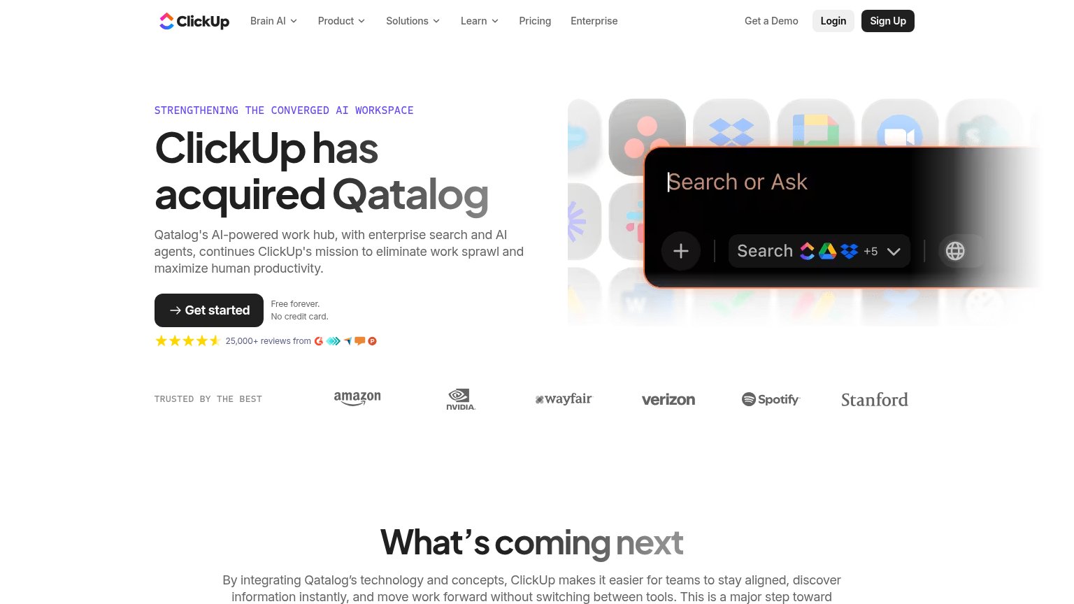
| Announcement bar: "Dashworks Is Joining Forces With HubSpot" | |
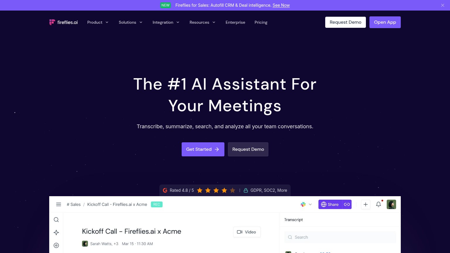
| G2 badge "Rated 4.8 / 5" with "GDPR, SOC2, More" compliance markers | |
| "25,000+ reviews from" with 4.5-star rating and G2/review-site badges under the Get started CTA |
CTA
68FairCopy, size, verb, cost-feel — does the primary CTA earn the click?
Problems
- 'Book' frames click as sales call
- small footprint vs huge headline
- no zero-commitment path on fold
Information hierarchy
80StrongDoes the design help or inhibit what the page is trying to say?
123- Second headline line — "then builds the shared company brain." is set in such low-contrast gray that the actual product payoff is nearly unreadable.
- Book a demo button — Tiny footprint relative to the oversized headline, so the only action on the page carries the least visual weight.
- Clay logo mark — Rendered too small to identify, weakening the credibility the investor row exists to deliver.
Mobile web
80StrongThe phone experience as a first-class citizen.
 12
- Book a demo button — Desktop-proportioned button floats at under half the column width instead of a full-bleed thumb target.
- Gray subheadline text — "then builds the shared company brain." is so low-contrast against the black background it nearly vanishes on a phone screen.