
Your landing page’s weakest score is CTA.
How Guru ranks
CTA
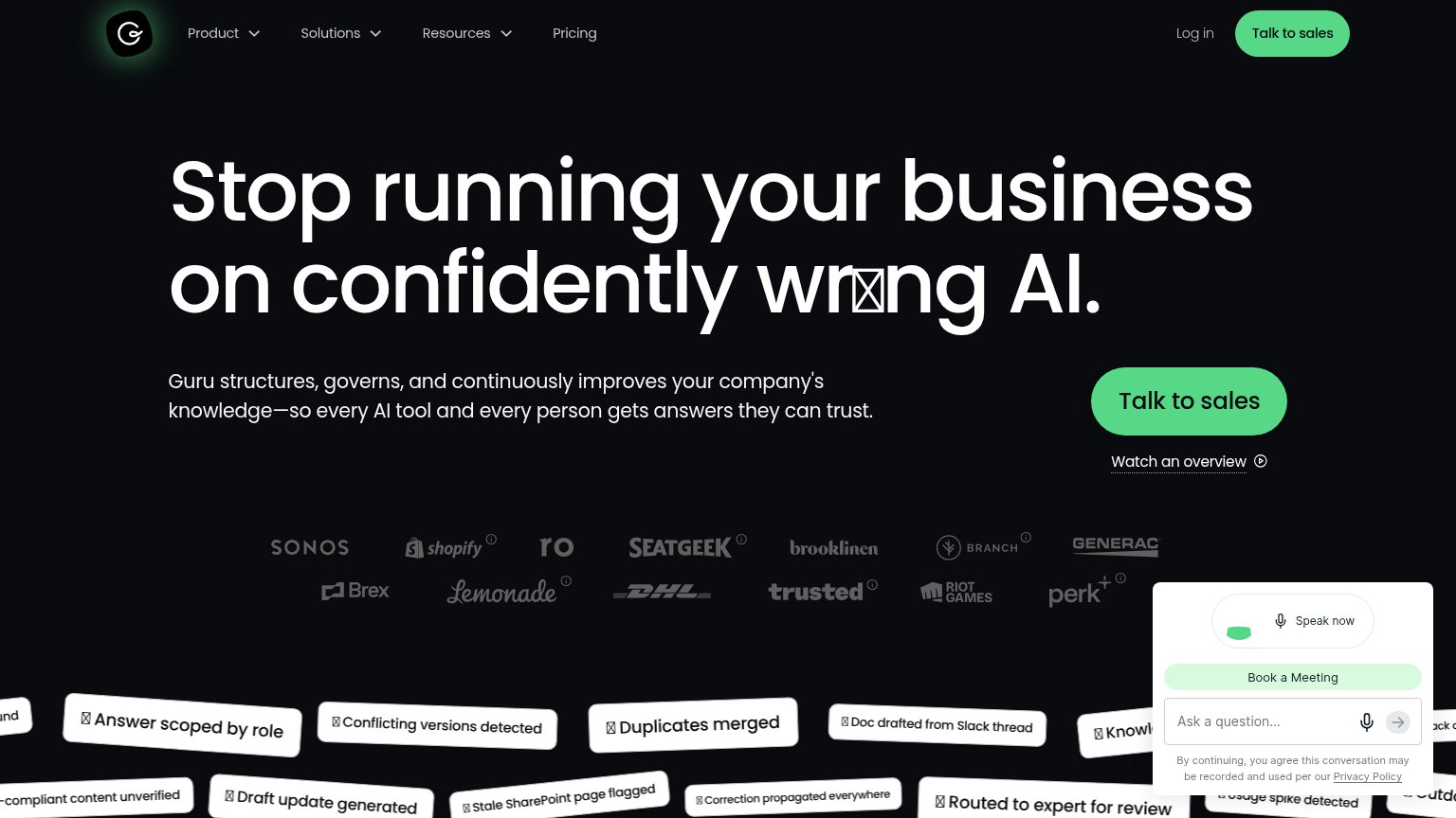
64FairCopy, size, verb, cost-feel — does the primary CTA earn the click?


Problems
- high-cost sales-call feel
- no self-serve or product path
- chat widget competes in same corner
Mobile web
66FairThe phone experience as a first-class citizen.
 1234
- Hero headline — Barely scaled down from desktop — wraps into six cramped lines that eat half the mobile fold.
- Broken 'wrong' glyph — A tofu box renders mid-word in the headline, undermining trust on a page selling AI accuracy.
- Ask Peter Rubin bubble — Chat bubble with no conversion CTA floats over the customer logo strip, obscuring social proof.
- Talk to sales button — Under half the column width; mobile primary CTAs convert better near full-bleed.
Trust
70FairProof that the product is real, competent, and safe to try.
How Guru compares
Trust read
Information hierarchy
73FairDoes the design help or inhibit what the page is trying to say?
What works
What to improve
Value props
81StrongTitle, subtitle, hero — do they sell the product's true value?
Guru’s headline
Stop running your business on confidently wrong AI.
Guru structures, governs, and continuously improves your company's knowledge—so every AI tool and every person gets answers they can trust.
Working
Could improve