
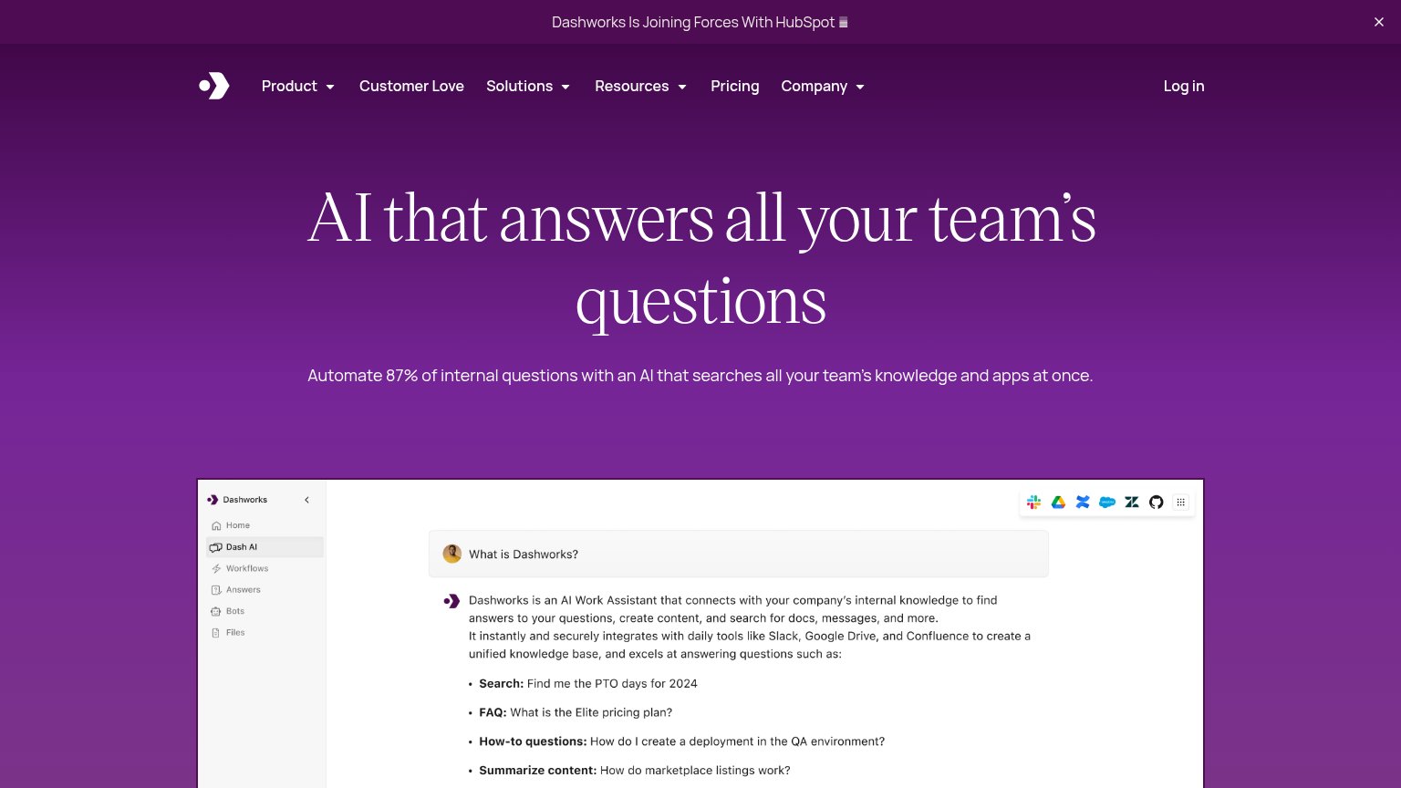
Your landing page’s weakest score is CTA.
How Dashworks ranks
- 1.
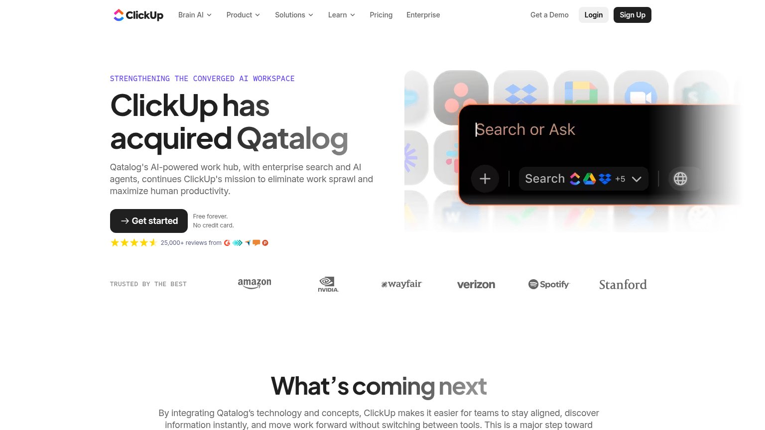
Qatalog76
- 2.
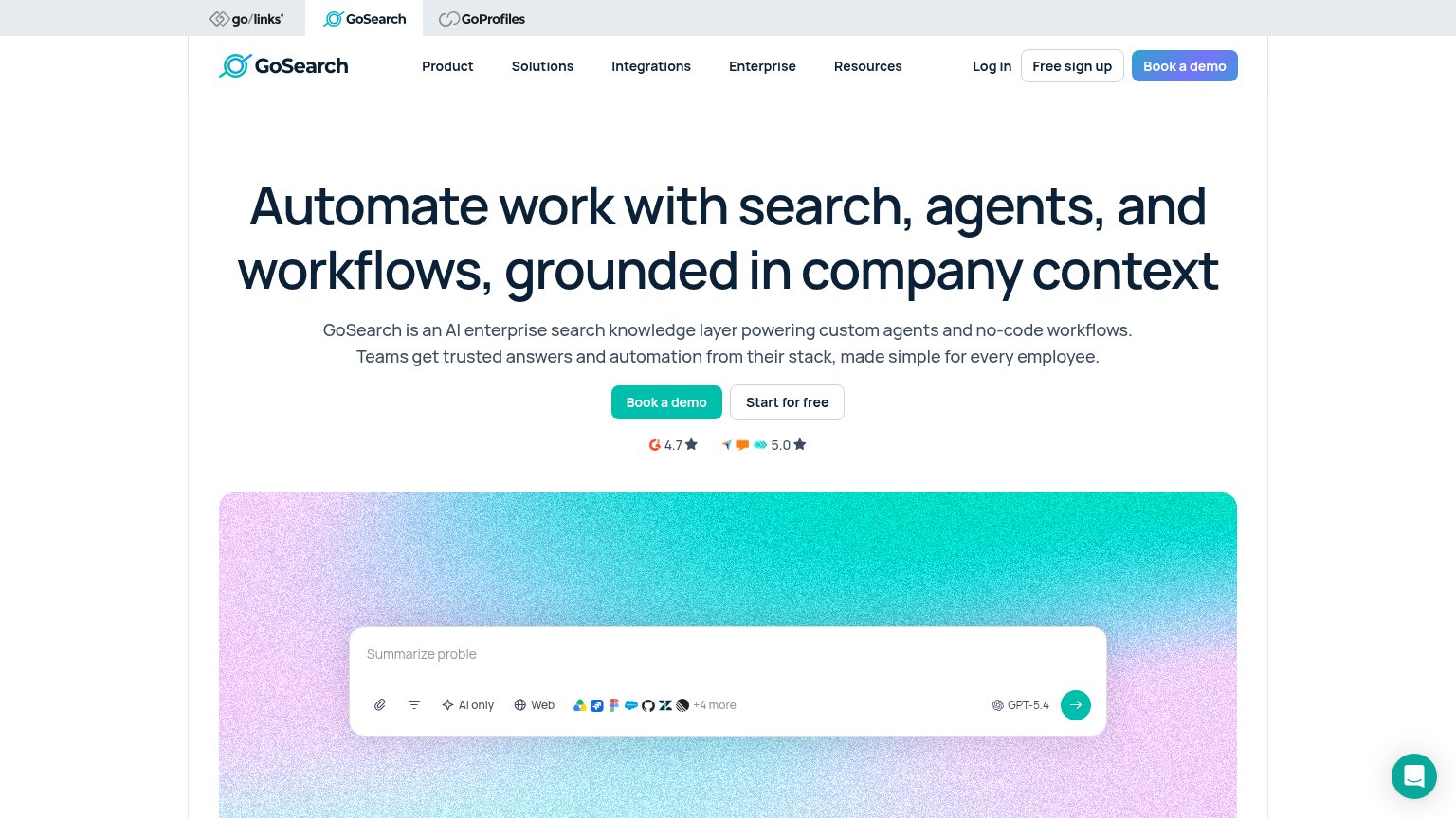
GoSearch67
- 3.
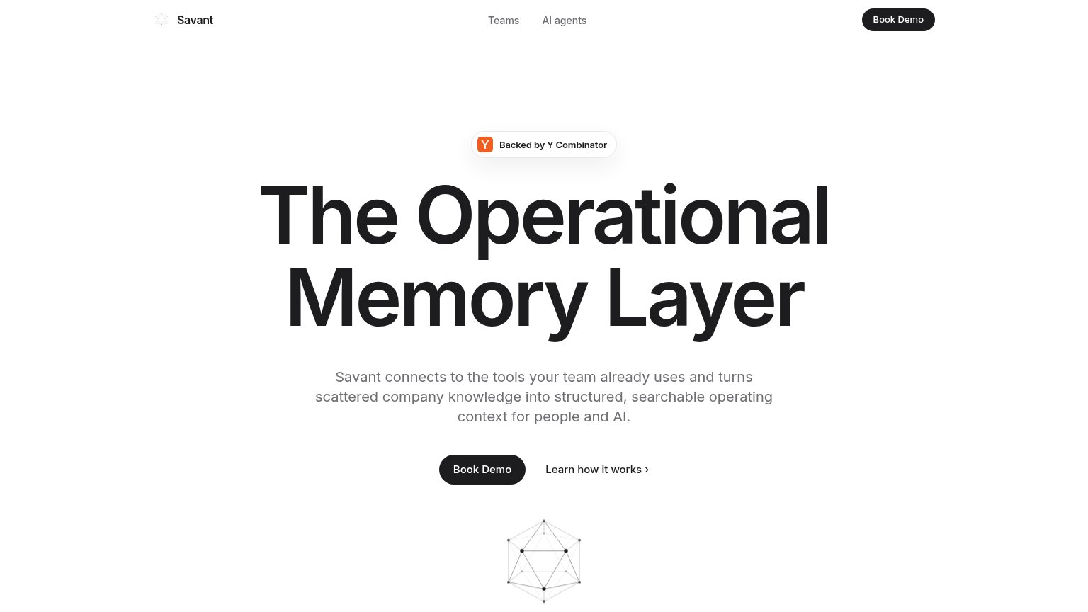
Savant65
- 4.
Dashworks61
CTA
44PoorCopy, size, verb, cost-feel — does the primary CTA earn the click?
Problems
- no CTA anywhere above the fold
- only clickable action is 'Log in'
- screenshot input is not interactive
- hero space spent on static image
Mobile web
56FairThe phone experience as a first-class citizen.
 123
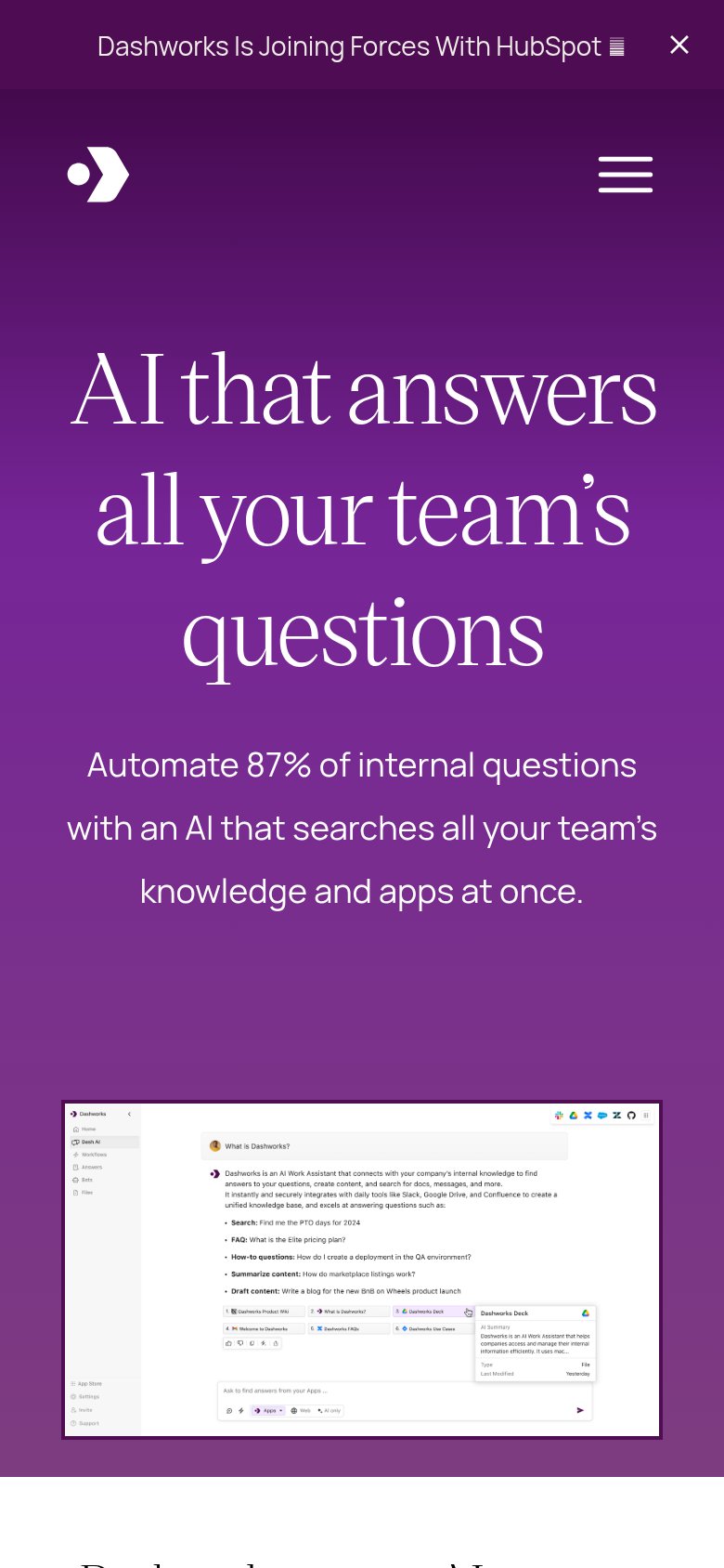
- Hero headline — Oversized three-line serif headline consumes over half the viewport, leaving no room for a CTA in the first fold.
- Product screenshot — Full desktop app UI shrunk to phone width — every label and message inside is illegibly small.
- HubSpot announcement bar — Sticky promo bar with no conversion CTA eats the top of the viewport and pushes the hero down.
Information hierarchy
58FairDoes the design help or inhibit what the page is trying to say?
What works
What to improve
Trust
63FairProof that the product is real, competent, and safe to try.
How Dashworks compares
Trust read
Value props
85StrongTitle, subtitle, hero — do they sell the product's true value?
Dashworks’s headline
AI that answers all your team's questions
Automate 87% of internal questions with an AI that searches all your team's knowledge and apps at once.
Working
Could improve