Your landing page’s weakest score is Trust.
How Flip Labs ranks
- 1.
Flip Labs76
- 2.
Albert72
- 3.
Plum69
- 4.
Bright Money38
76Growth scoreupdated
category scores
category scoresShowHide
 Lazyweb TeamAI Growth PMTurn this score into growth.Analyze your site and propose fixes across conversion and trustBenchmark your Growth Score against similar companiesLearn from growth experiments across 10,000+ top productsStart Team trial →
Score over time
Trust
58FairProof that the product is real, competent, and safe to try.
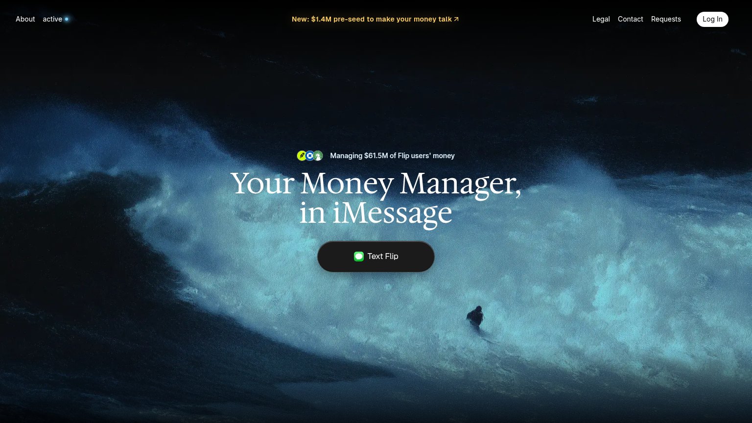
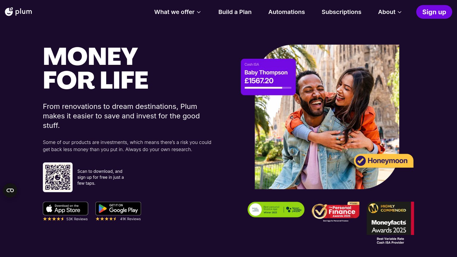
| Trust read | |
|---|---|
| Flip Labs | Managing $61.5M of Flip users' money |
| No visible trust signal identified. | |
| App Store badge with 4.5-star rating and "53K Reviews" | |
| No visible trust signal identified. |
Value props
74FairTitle, subtitle, hero — do they sell the product's true value?
Flip Labs’s headline sells
Your Money Manager, in iMessage
Managing $61.5M of Flip users' money
Working
- 'in iMessage' is a concrete differentiator
- $61.5M managed is credible proof
- Broker/bank icons signal real accounts
Could improve
- No outcome — what does the manager do?
- Surfer hero decorates, doesn't demo
- 'Money Manager' stays a category label
Information hierarchy
81StrongDoes the design help or inhibit what the page is trying to say?
1234- Yellow funding banner — Brightest element on the fold; it out-contrasts the Text Flip CTA and routes first attention to a press link.
- Text Flip button — Dark charcoal pill against a dark ocean scene reads as part of the backdrop instead of the one action.
- Right nav cluster — Legal, Contact, and Requests sit at equal weight beside Log In, adding four exits before the CTA.
- 'active' nav item — Cryptic lowercase label with a dot communicates nothing and spends scan attention in the prime top-left slot.
CTA
84StrongCopy, size, verb, cost-feel — does the primary CTA earn the click?
Problems
- no 'free' despite frictionless offer
- no payoff hint after the text
Mobile web
85StrongThe phone experience as a first-class citizen.
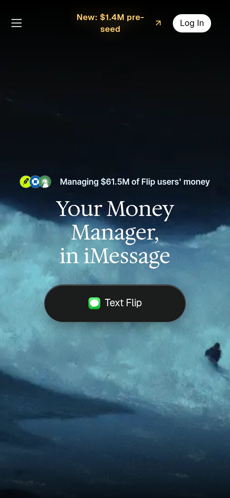 12
- Pre-seed announcement banner — Wraps to two cramped lines and its arrow icon floats detached from the text, making the header look broken.
- Text Flip button — Sits at roughly 60% width; a near-full-bleed button would be a larger, easier thumb target.