
Your landing page’s weakest score is Mobile web.
How Bright Money ranks
- 1.
Flip Labs76
- 2.
Albert72
- 3.
Plum69
- 4.
Bright Money38
38Growth scoreupdated
category scores
category scoresShowHide
Mobile web
28PoorThe phone experience as a first-class citizen.
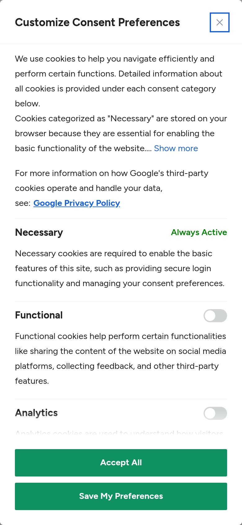 12
- Cookie legalese block — Multiple dense paragraphs of consent copy fill the fold — the first content a visitor reads is legal text, not the product pitch.
- Stacked consent buttons — Two full-width green buttons at the bottom demand a consent decision before any product action is possible.
Information hierarchy
32PoorDoes the design help or inhibit what the page is trying to say?
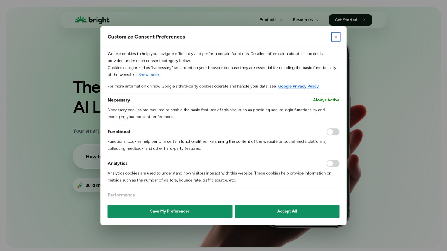 1234
- Consent preferences modal — Full-screen cookie modal buries the headline, subtitle, and hero CTA behind compliance copy on first paint.
- Truncated hero headline — The value proposition reads only 'The … AI L…' — the core message is unreadable at the fold.
- Two equal green buttons — 'Save My Preferences' and 'Accept All' share identical weight, forcing a decision with no clear default.
- Google Privacy Policy link — A prominent underlined outbound link inside the modal invites an exit before the product says anything.
Trust
35PoorProof that the product is real, competent, and safe to try.
How Bright Money compares
Trust read
Value props
42PoorTitle, subtitle, hero — do they sell the product's true value?
Bright Money’s headline
The … AI L…
Your smart …
Working
Could improve
CTA
55FairCopy, size, verb, cost-feel — does the primary CTA earn the click?
How Bright Money compares
Recommended rewrites