
Your landing page’s weakest score is CTA.
How Waii ranks
58Growth scoreupdated
category scores
category scoresShowHide
CTA
46PoorCopy, size, verb, cost-feel — does the primary CTA earn the click?
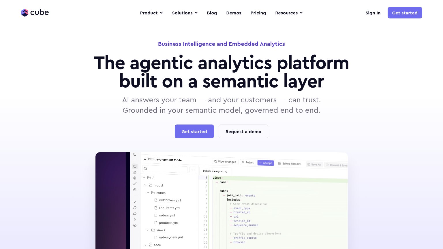
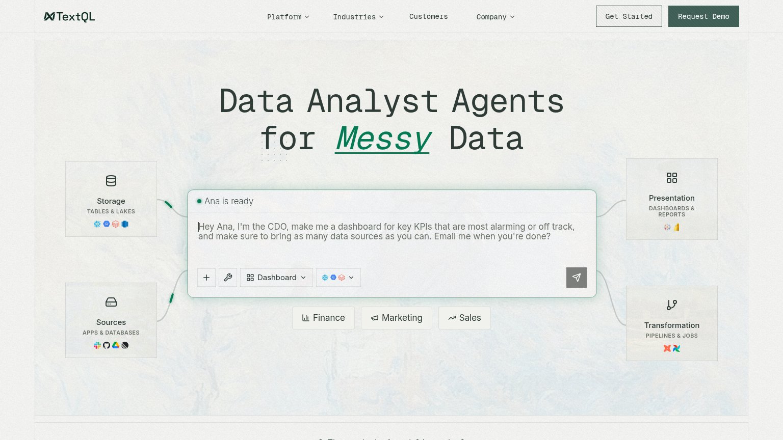
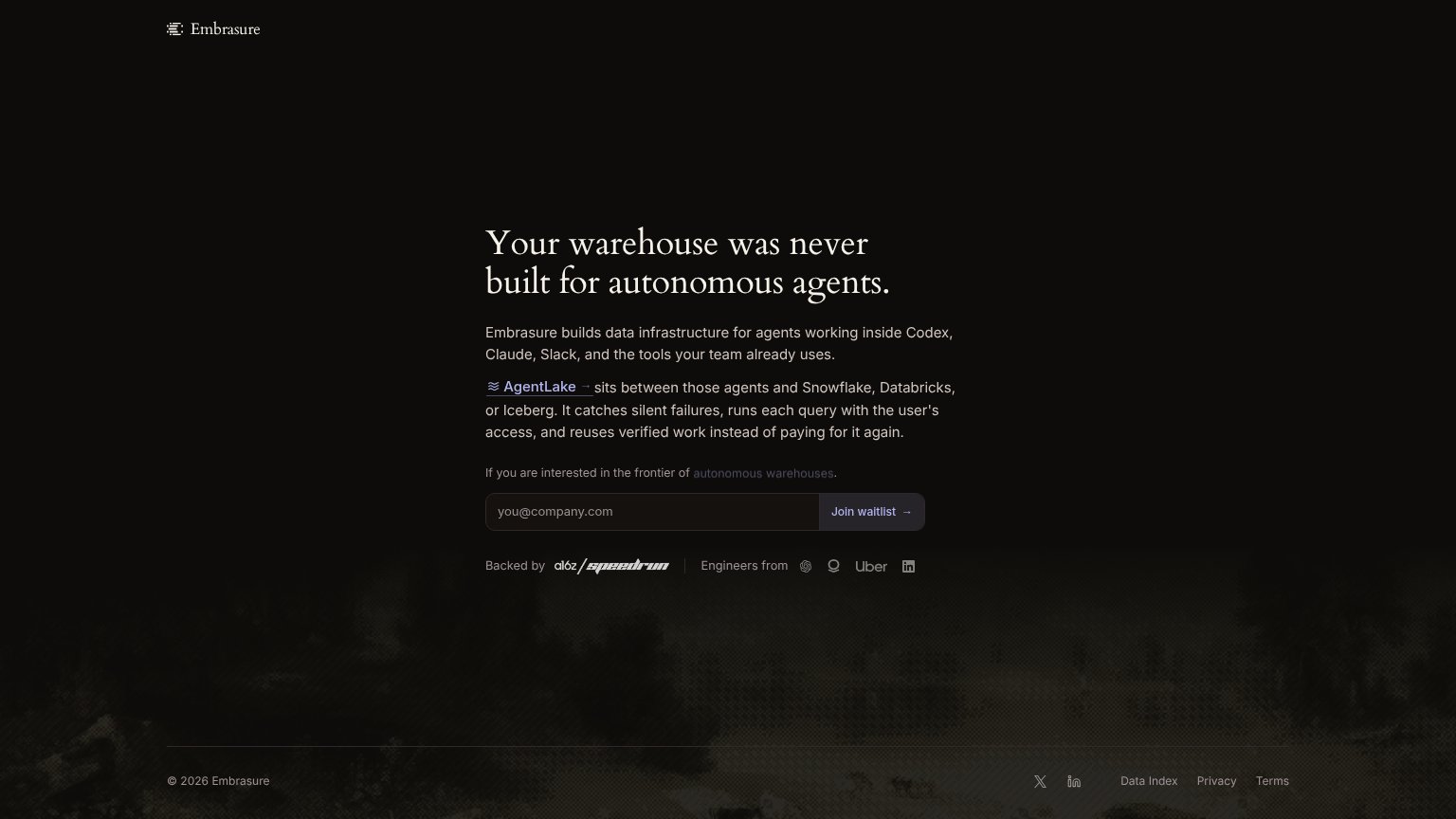
Problems
- no CTA in desktop fold
- 'Request' feels gated and costly
- buried third in mobile button stack
- no 'free' or value promise
Information hierarchy
54FairDoes the design help or inhibit what the page is trying to say?
 1234
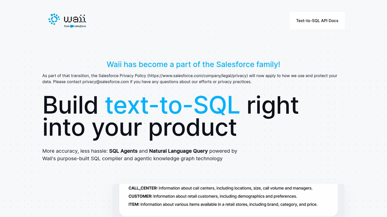
- Text-to-SQL API Docs — The only button in the desktop fold is an exit to docs — no Request Access CTA exists anywhere in the viewport.
- Salesforce announcement heading — Hero-weight blue announcement sits above the headline, so acquisition news outranks the value proposition in the scan path.
- Privacy notice paragraph — Dense legal text with a raw pasted URL interrupts the path between the banner and the headline.
- Schema table snippet — Product visual enters the fold decapitated mid-row, communicating nothing about what Waii outputs.
Mobile web
57FairThe phone experience as a first-class citizen.

What works
What to improve
Trust
62FairProof that the product is real, competent, and safe to try.
How Waii compares
Trust read
Value props
70FairTitle, subtitle, hero — do they sell the product's true value?
Waii’s headline
Build text-to-SQL right into your product
More accuracy, less hassle: SQL Agents and Natural Language Query powered by Waii's purpose-built SQL compiler and agentic knowledge graph technology
Working
Could improve