
Your landing page’s weakest score is Trust.
How TextQL ranks
Trust
44PoorProof that the product is real, competent, and safe to try.
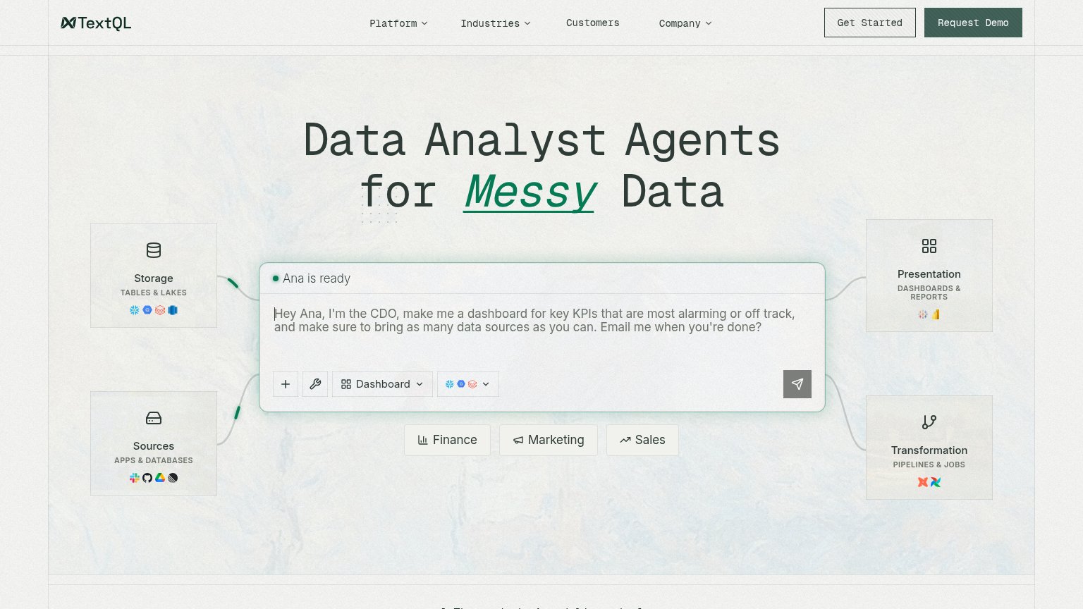
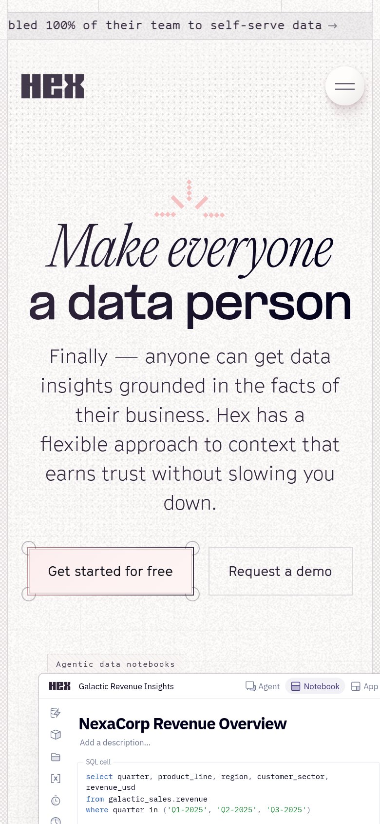
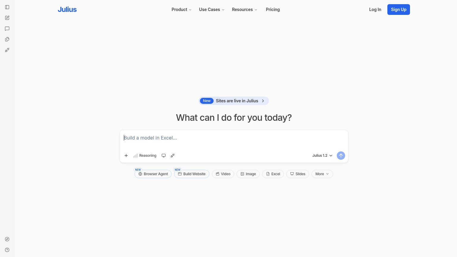
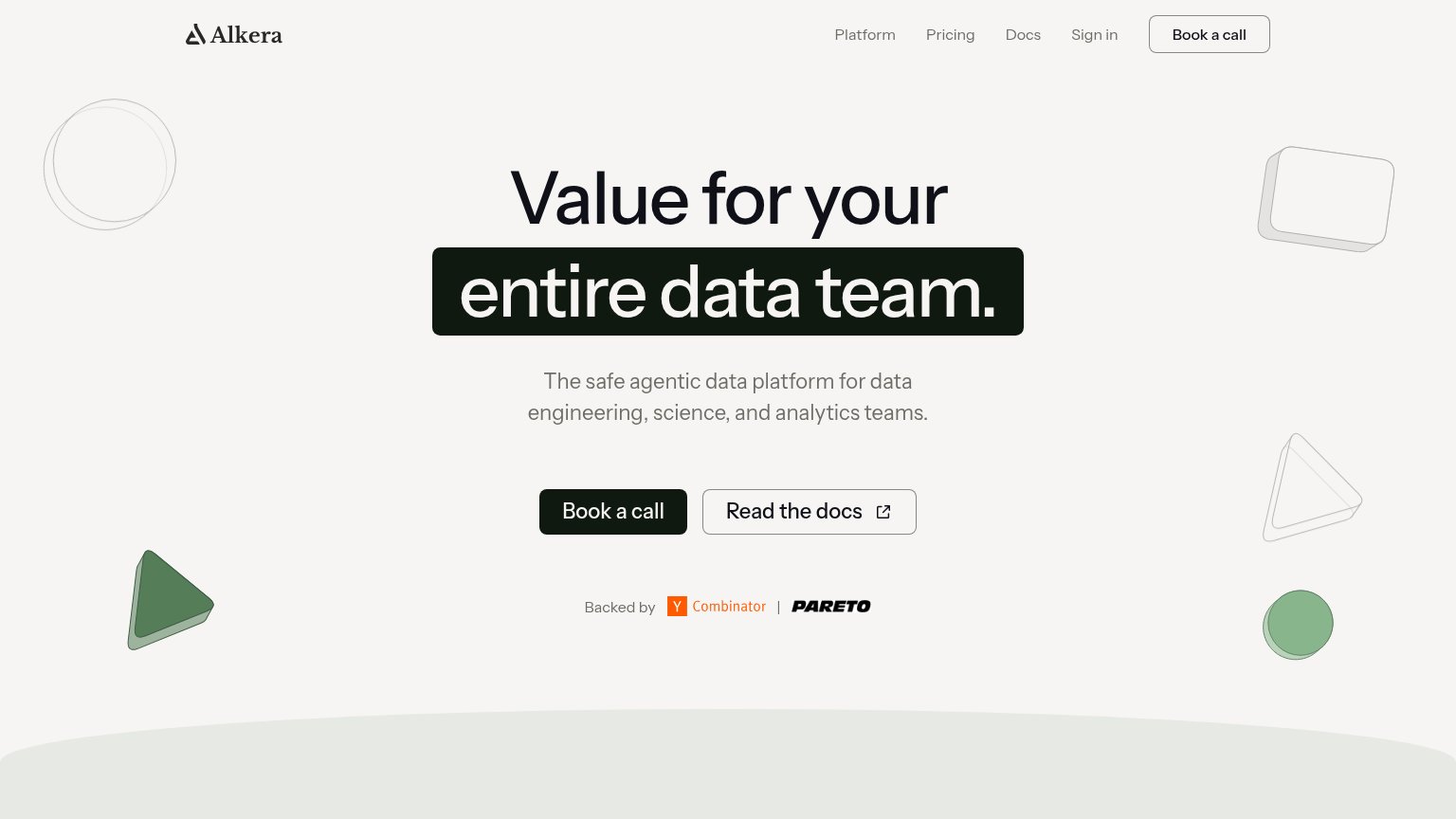
| Trust read | |
|---|---|
| TextQL | 'Ana is ready' agent prompt demo with integration icons (Snowflake, dbt, Tableau, Power BI) |
| "Backed by Y Combinator | Pareto" investor strip | |
| Live prompt interface with model selector "Julius 1.2" and capability chips (Browser Agent, Build Website, Video, Image, | |
| Embedded product demo notebook "Galactic Revenue Insights" showing real SQL cells, Agent/Notebook/App tabs, and an agent | |
| No visible trust signal identified. |
Mobile web
68FairThe phone experience as a first-class citizen.
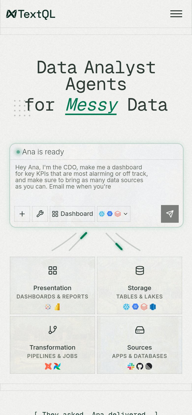 123
- Hamburger menu icon — Both desktop CTAs (Get Started, Request Demo) are hidden behind the hamburger, leaving no primary CTA in the mobile fold.
- Truncated prompt text — The sample prompt cuts off mid-sentence at "Email me when TextQL is" — the mobile text container clips the copy.
- Small send icon — The only tappable action in the fold is a desktop-proportioned icon button, not a thumb-friendly full-width CTA.
Information hierarchy
72FairDoes the design help or inhibit what the page is trying to say?
What works
What to improve
Value props
72FairTitle, subtitle, hero — do they sell the product's true value?
TextQL’s headline
Data Analyst Agents for Messy Data
Working
Could improve
CTA
74FairCopy, size, verb, cost-feel — does the primary CTA earn the click?
How TextQL compares
Recommended rewrites