
Your landing page’s weakest score is Mobile web.
How Wren AI ranks
72Growth scoreupdated
category scores
category scoresShowHide
Mobile web
62FairThe phone experience as a first-class citizen.
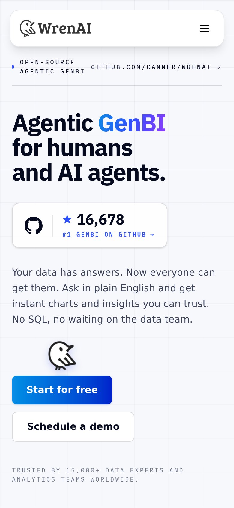 123
- Start for free CTA — Sits far below the first viewport and spans only half the column — small thumb target, invisible on landing.
- Bird mascot illustration — Decorative graphic inserted between the copy and the buttons pushes both CTAs further down the page.
- GitHub eyebrow row — Two cramped uppercase text blocks compete side by side with a tiny external-link tap target.
Information hierarchy
72FairDoes the design help or inhibit what the page is trying to say?
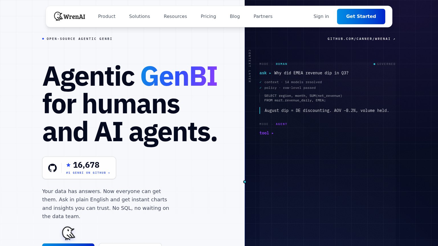 1234
- Cropped hero CTAs — The hero's primary action buttons sit at the fold line with only a sliver of blue visible, leaving the fold without a full-weight CTA in the scan path.
- GitHub stars badge — The "#1 GENBI ON GITHUB →" card is an outbound exit placed directly between the headline and the value prop, outranking any conversion action.
- Nav link row — Six equal-weight links plus "Sign in" dilute the lone visible "Get Started" button before the hero even loads.
- GitHub URL link — "GITHUB.COM/CANNER/WRENAI ↗" is a second outbound GitHub exit above the fold, duplicating the star badge's leak.
Value props
72FairTitle, subtitle, hero — do they sell the product's true value?
Wren AI’s headline
Agentic GenBI for humans and AI agents.
Your data has answers. Now everyone can get them. Ask in plain English and get instant charts and insights you can trust. No SQL, no waiting on the data team.
Working
Could improve
Trust
76FairProof that the product is real, competent, and safe to try.
How Wren AI compares
Trust read
CTA
78FairCopy, size, verb, cost-feel — does the primary CTA earn the click?
How Wren AI compares
Recommended rewrites