
Your landing page’s weakest score is Information hierarchy.
How PostHog ranks
72Growth scoreupdated
category scores
category scoresShowHide
Information hierarchy
62FairDoes the design help or inhibit what the page is trying to say?
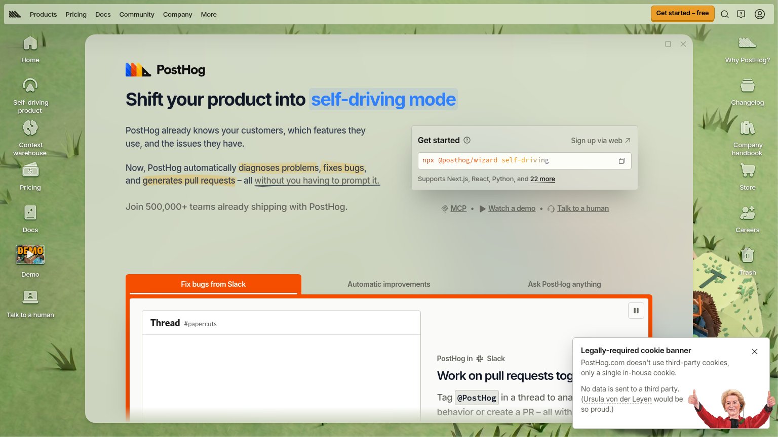 1234
- Left icon dock — Seven full-color desktop icons (mirrored by six more on the right) sit at equal weight with the hero and leak attention to Docs, Demo, Careers and Trash before the visitor reads the value prop.
- Get started panel — The primary conversion is a terminal command while the actual signup, "Sign up via web", is a small text link — non-CLI visitors have no obvious button to press.
- Cookie banner — The oversized banner with the Ursula von der Leyen illustration covers the Slack demo content and competes with the fold for attention.
- Top nav bar — Six nav links plus search, help and account icons crowd the same row as the sole styled CTA, diluting its prominence.
Mobile web
66FairThe phone experience as a first-class citizen.
 123
- Cookie banner — Dead blocker with no conversion CTA that covers the "Get started" signup block at the fold's bottom edge.
- Get started block — The primary signup module sits at the very bottom of the viewport and is obscured before it can be tapped.
- Body copy stack — Three consecutive paragraphs of desktop-length copy push the conversion module out of easy reach.
Trust
68FairProof that the product is real, competent, and safe to try.
How PostHog compares
Trust read
CTA
79FairCopy, size, verb, cost-feel — does the primary CTA earn the click?
How PostHog compares
Recommended rewrites
Value props
84StrongTitle, subtitle, hero — do they sell the product's true value?
PostHog’s headline
Shift your product into self-driving mode
PostHog already knows your customers, which features they use, and the issues they have. Now, PostHog automatically diagnoses problems, fixes bugs, and generates pull requests – all without you having to prompt it.
Working
Could improve