
Your landing page’s weakest score is Information hierarchy.
How LogRocket ranks
80Growth scoreupdated
category scores
category scoresShowHide
Information hierarchy
72FairDoes the design help or inhibit what the page is trying to say?
 1234
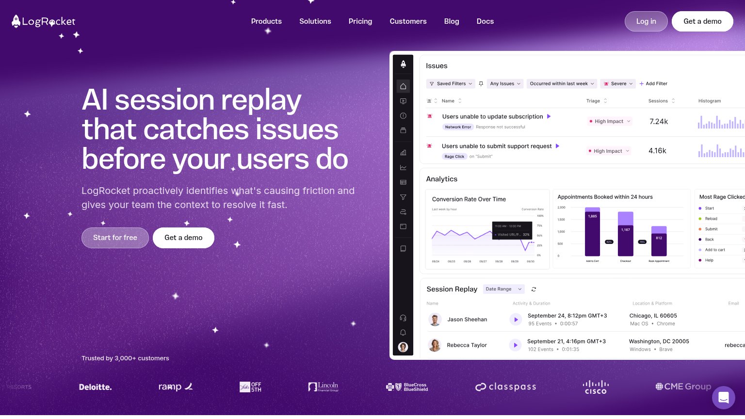
- Start for free button — The primary CTA is a translucent ghost button that blends into the purple background while secondary 'Get a demo' gets solid white — the visual weight is inverted.
- Nav Get a demo — A second white 'Get a demo' in the header duplicates the hero CTA at higher contrast, pulling the scan path away from the hero pair.
- Top navigation links — Six nav links plus 'Log in' create seven exit paths that all outrank the muted primary CTA in legibility.
- Dashboard screenshot right — The product panel is cropped at the viewport edge and stacks three dense modules with unreadable micro-text, adding processing load without a single focal takeaway.
CTA
80StrongCopy, size, verb, cost-feel — does the primary CTA earn the click?
Problems
- ghost style loses to 'Get a demo'
- nav pushes demo, not free start
- secondary matches primary's footprint
Mobile web
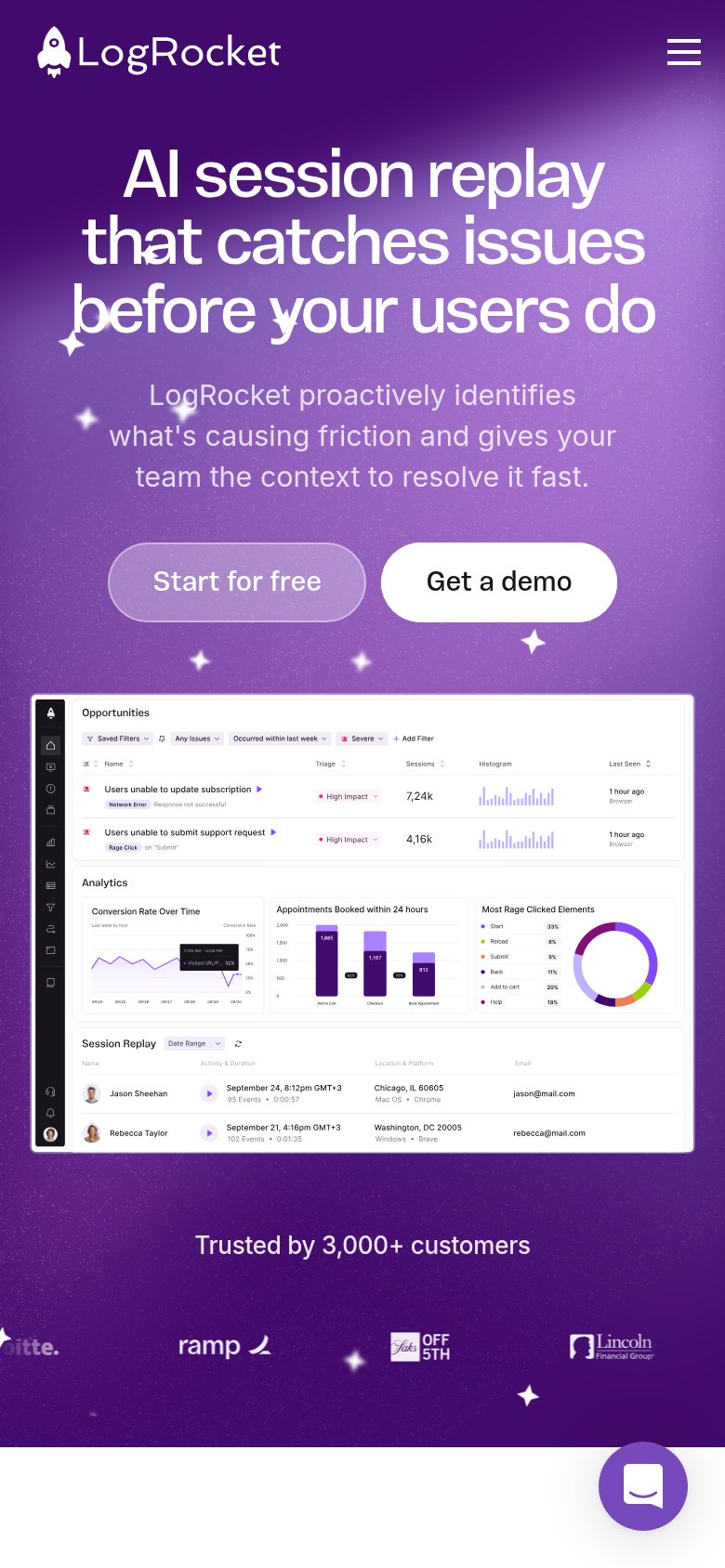
81StrongThe phone experience as a first-class citizen.
What works
What to improve
Value props
83StrongTitle, subtitle, hero — do they sell the product's true value?
LogRocket’s headline
AI session replay that catches issues before your users do
LogRocket proactively identifies what's causing friction and gives your team the context to resolve it fast.
Working
Could improve
Trust
84StrongProof that the product is real, competent, and safe to try.
How LogRocket compares
Trust read