
Your landing page’s weakest score is CTA.
How Dedrone (Axon) ranks
CTA
50FairCopy, size, verb, cost-feel — does the primary CTA earn the click?



Problems
- no hero CTA above the fold
- contact-sales click feels costly
- tiny nav-corner footprint
- no CTA visible on mobile fold
Trust
52FairProof that the product is real, competent, and safe to try.
| Trust read | |
|---|---|
| Dedrone (Axon) | "Dedrone is now part of AXON" top-bar banner |
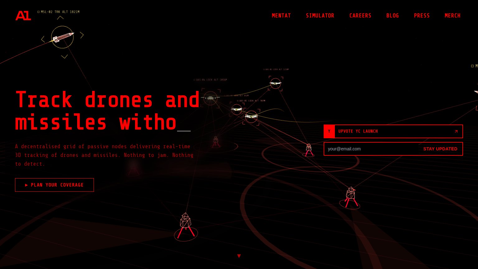
| Live 3D tracking visualization with annotations like "UAS-04 LOCK ALT 1036M" | |
| No visible trust signal identified. | |
| implicit context DroneShield may benefit from pre-existing familiarity among its target audience. | |
| Mobile copy: "Squarehead has developed sophisticated microphone arrays that enable passive detection of threats" | |
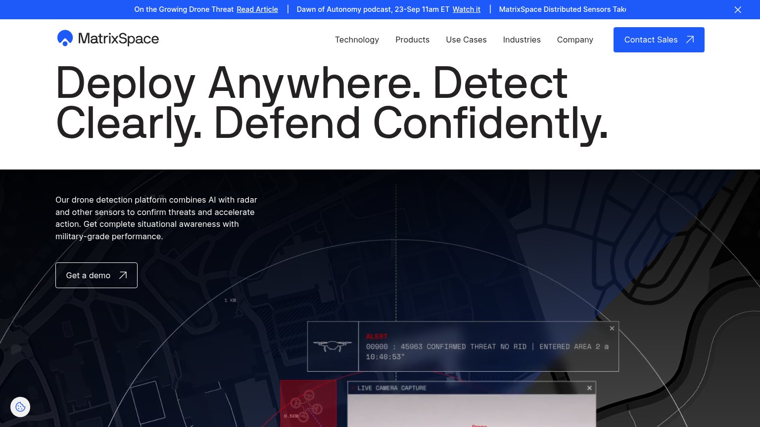
| Detection interface UI showing "ALERT 00900 : 45963 CONFIRMED THREAT NO RID | ENTERED AREA 2 @ 10:40:53" with live camer |
Value props
55FairTitle, subtitle, hero — do they sell the product's true value?
Dedrone (Axon)’s headline
THE GLOBAL LEADER IN AIRSPACE SECURITY
Working
Could improve
Mobile web
58FairThe phone experience as a first-class citizen.

What works
What to improve
Information hierarchy
68FairDoes the design help or inhibit what the page is trying to say?
What works
What to improve