What can product teams learn from Netflix landing page A/B tests?
Netflix's landing-page tests show three durable lessons: revisit old hypotheses when the context changes, isolate variables even after a winner, and avoid highlighting too many things at once. Ali's review covers seven experiments across timeline reminders, CTA copy, email input, free-trial removal, input contrast, and ad-tier messaging.
- By Ali Abouelatta
- 24 visuals
- 3 min read
- experimentation · conversion · landing pages · netflix
The evidence
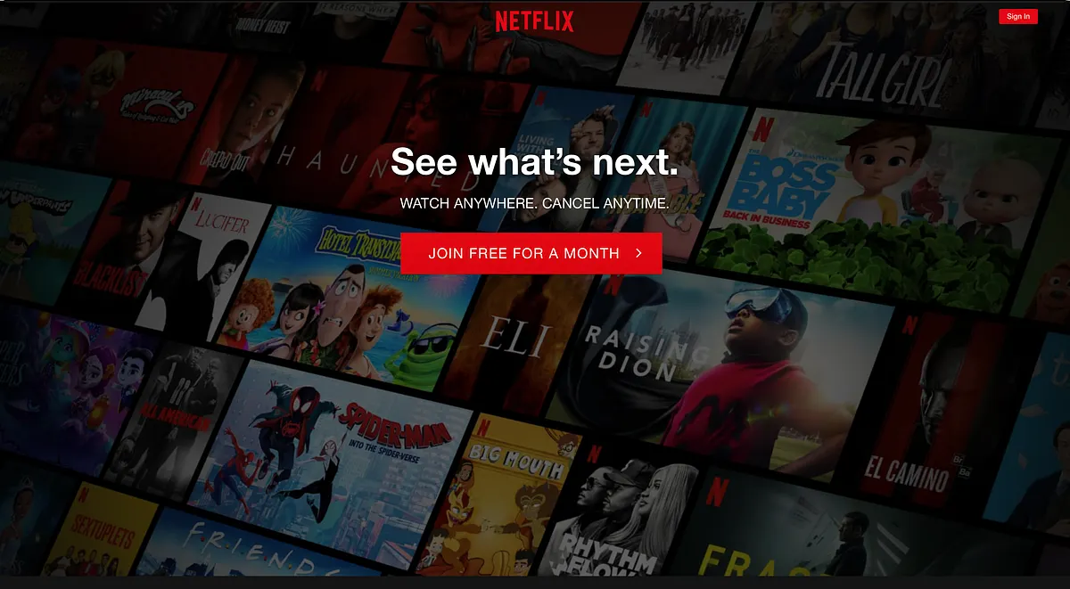
The visual evidence is a sequence of Netflix landing-page control and experiment screens, showing how small CTA, input, and highlight changes affected conversion strategy.
What changed
- Netflix tested timeline renewal reminders with and without email input.
- Netflix retested email input after earlier losing patterns when context changed.
- Netflix isolated whether gains came from email input or CTA copy.
- Netflix used transparent input and a single banner to control visual contrast.
Why it matters
- Winning patterns can become testable again when the product or offer changes.
- Adding more CTAs, banners, or highlighted value props can dilute the message instead of strengthening it.
Every visual
A summary graphic introduces the Netflix landing-page experiment review.1200 × 628opens the full image 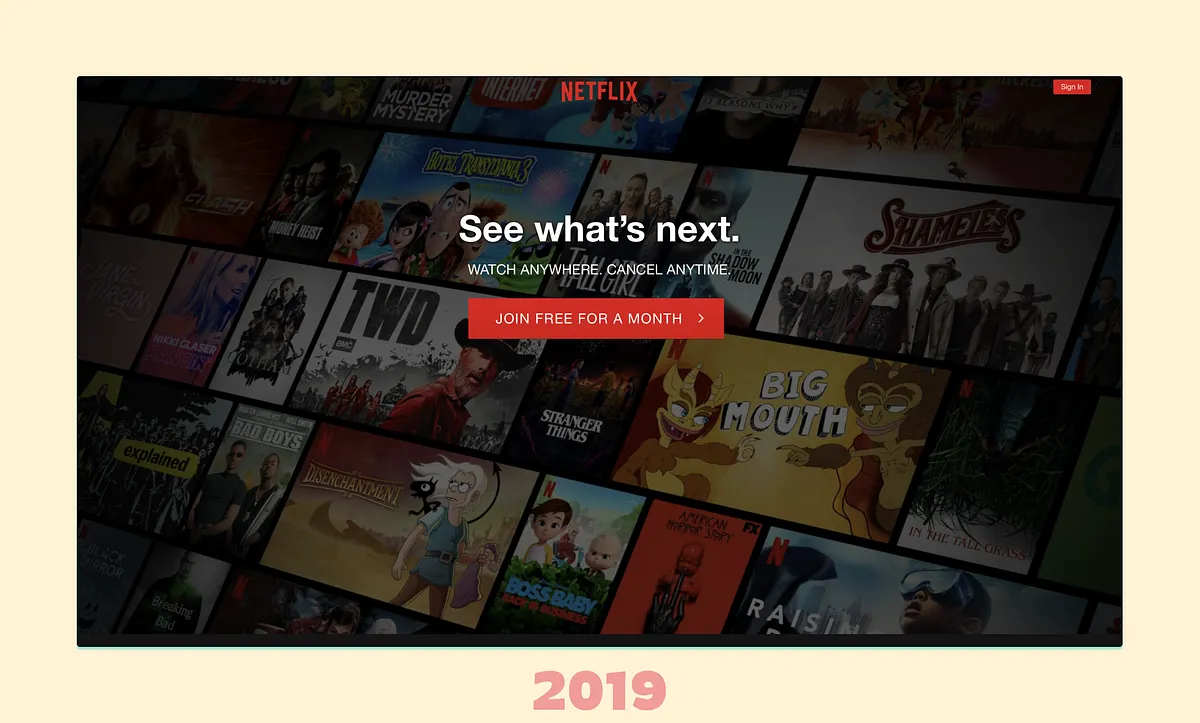
The 2019 Netflix landing page establishes the baseline for the experiment sequence.1200 × 723opens the full image 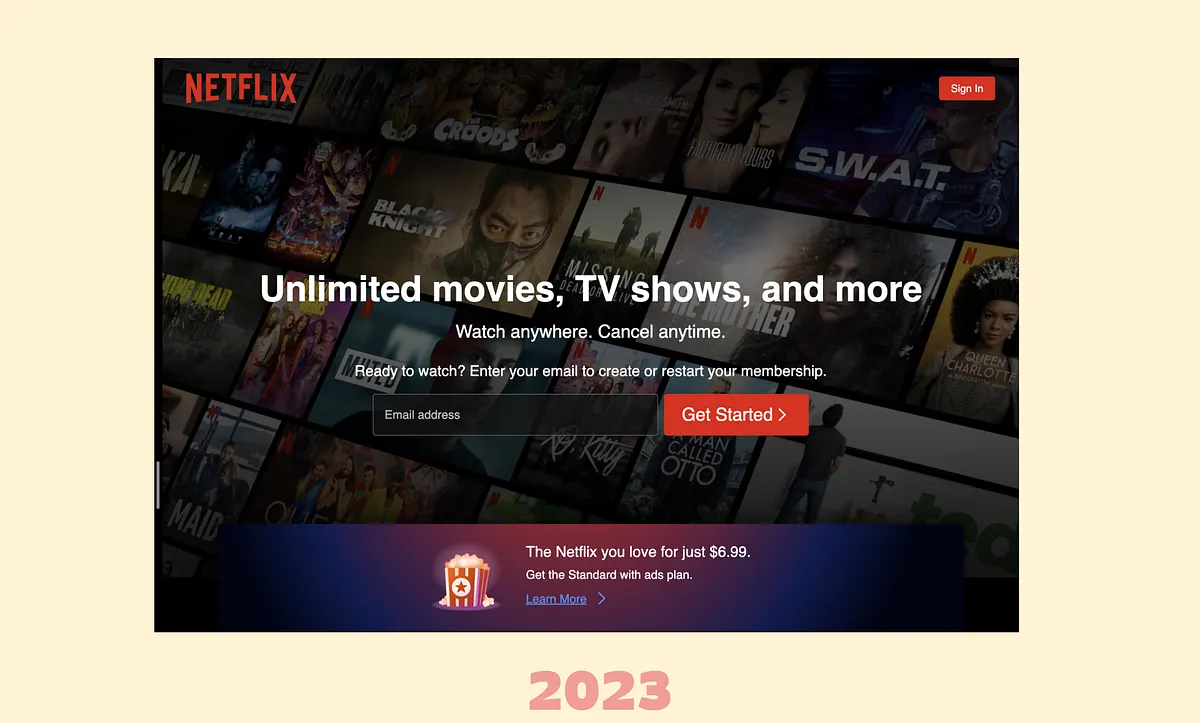
The 2023 Netflix landing page shows the later destination state after years of conversion testing.1200 × 723opens the full image 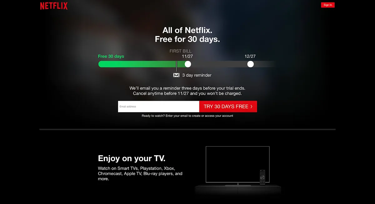
A timeline reminder variant adds email input to address cancellation anxiety before trial signup.1200 × 653opens the full image 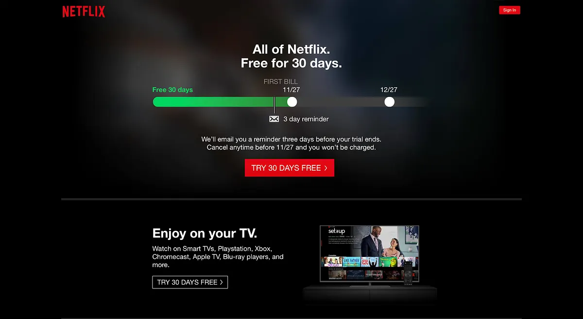
A timeline reminder variant removes the email field while preserving the cancellation-reminder message.1200 × 658opens the full image 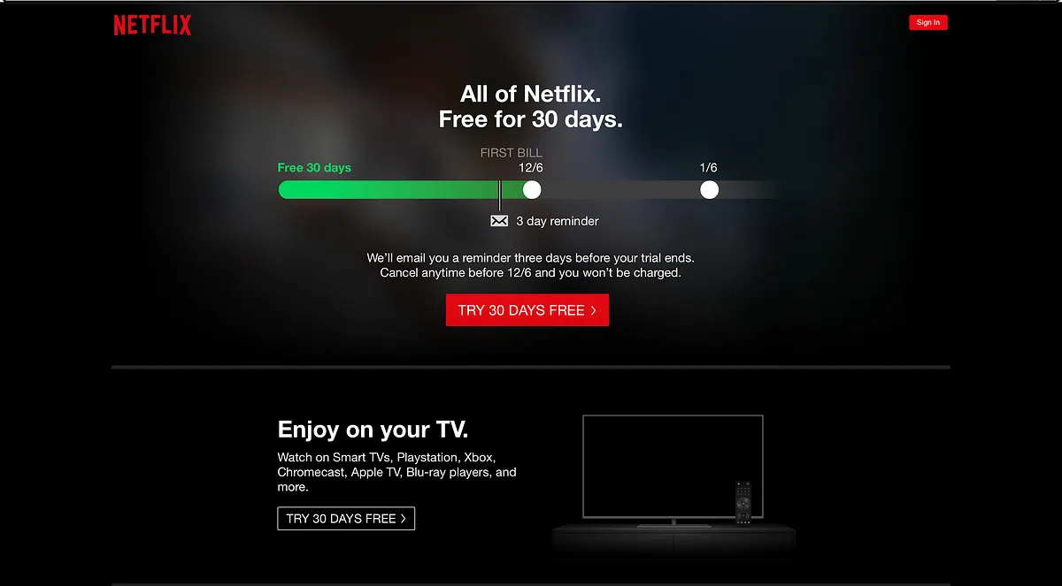
Netflix tests CTA copy on a timeline reminder page to learn which trial framing is strongest.1200 × 663opens the full image
Show 17 more visuals17 more visuals23
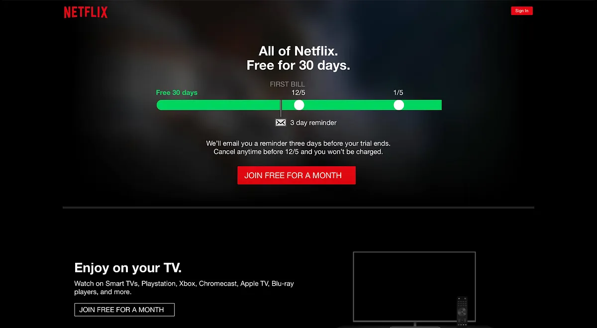
A Netflix CTA variant uses the phrase Join Free for a month, changing the user's interpretation of the trial offer.1200 × 659opens the full image 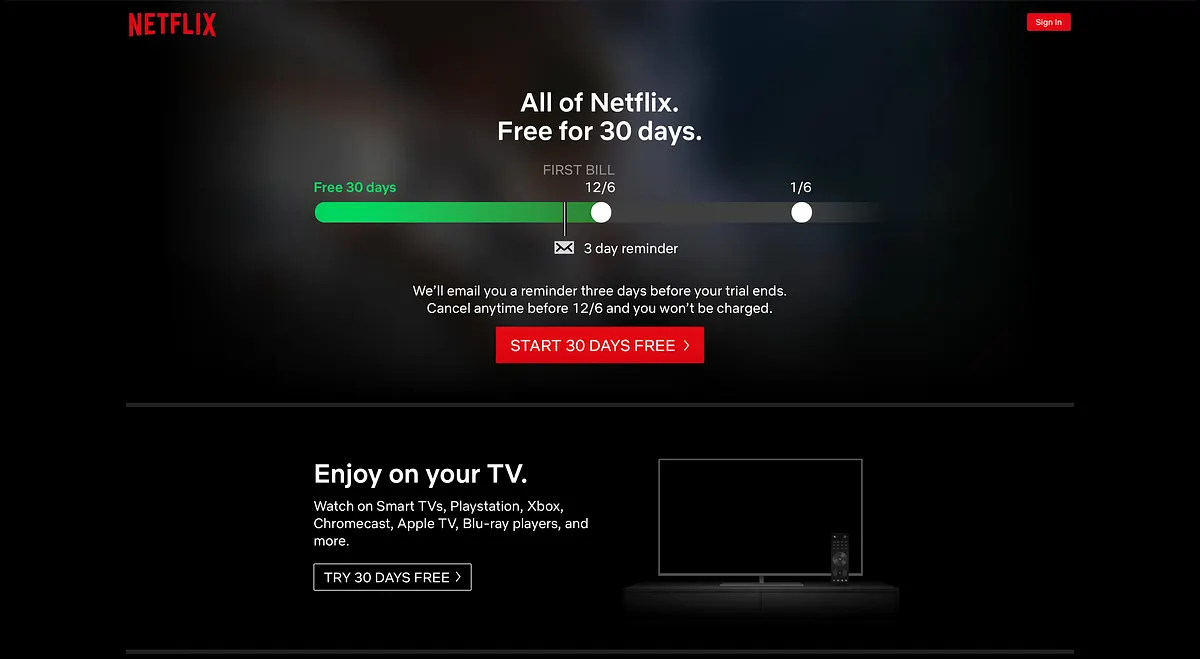
A Netflix CTA variant tests Start 30 days free against other free-trial wordings.1200 × 659opens the full image 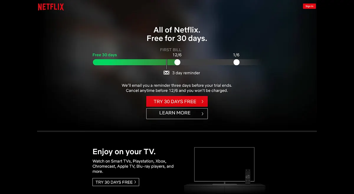
A Netflix CTA variant adds Learn More, creating extra choice and more page complexity.1200 × 658opens the full image 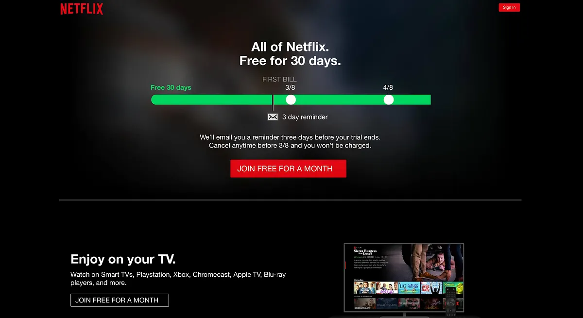
A control state keeps the timeline plus CTA pattern before Netflix revisits email input without the timeline.1200 × 655opens the full image 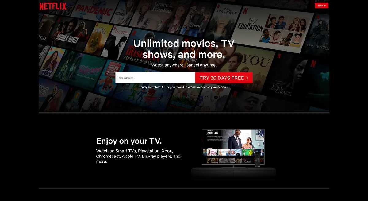
Netflix revisits an old email-input pattern after removing the renewal timeline from the page.1200 × 655opens the full image 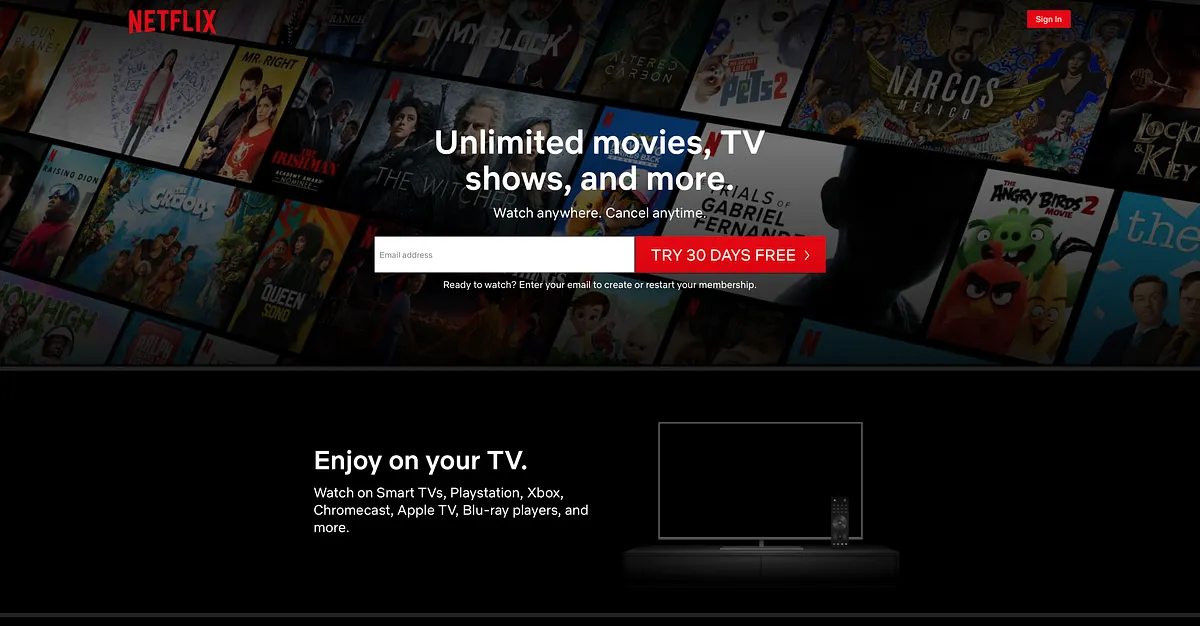
Netflix keeps the email input and CTA to isolate whether the input itself contributed to the prior result.1200 × 626opens the full image 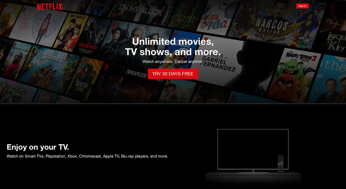
A Netflix variant removes the email input while keeping the primary CTA, testing whether simpler is better.1200 × 658opens the full image 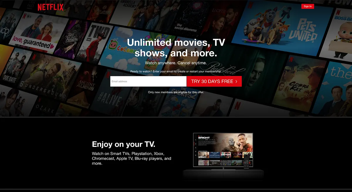
Netflix uses a free-trial CTA with email input as a control when testing the post-free-trial offer.1200 × 657opens the full image 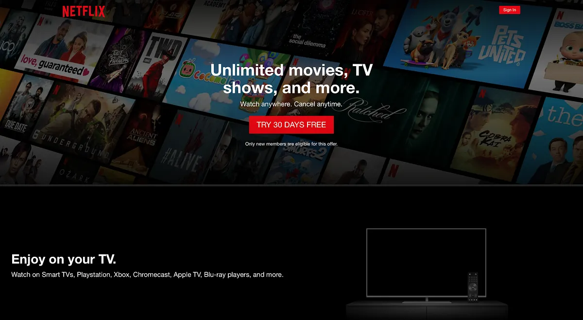
A Netflix variant removes email input but keeps the free-trial CTA, testing form friction separately.1200 × 658opens the full image 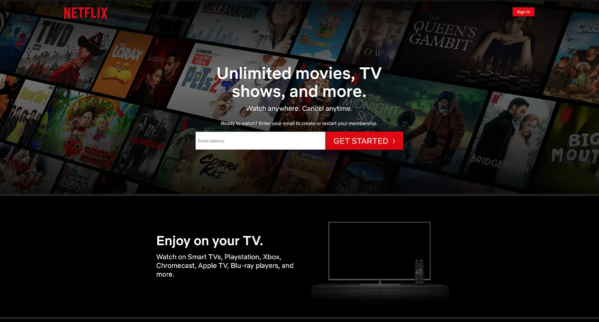
A Netflix variant changes CTA copy to Get Started while keeping email input, matching the newer offer context.1200 × 646opens the full image 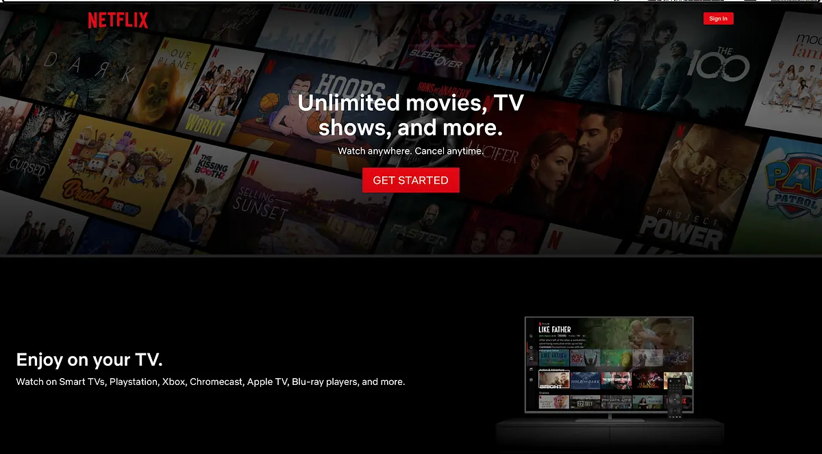
A Netflix variant uses Get Started without email input, testing CTA copy and form presence independently.1200 × 664opens the full image 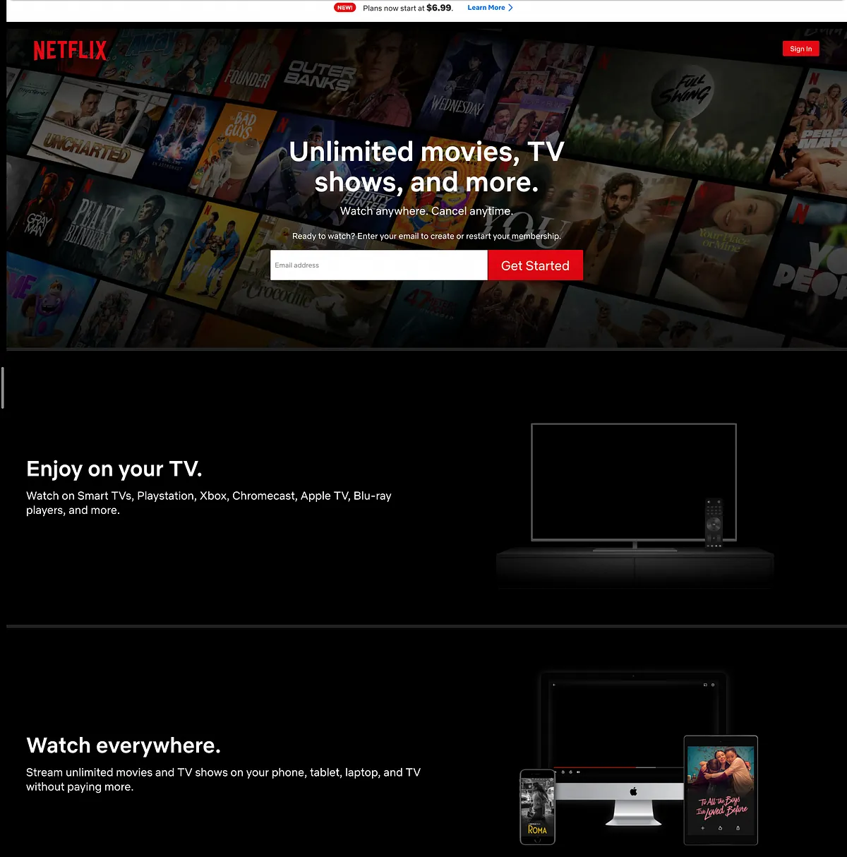
A Netflix control uses a high-contrast white email input near the ad-supported plan banner.1200 × 1214opens the full image 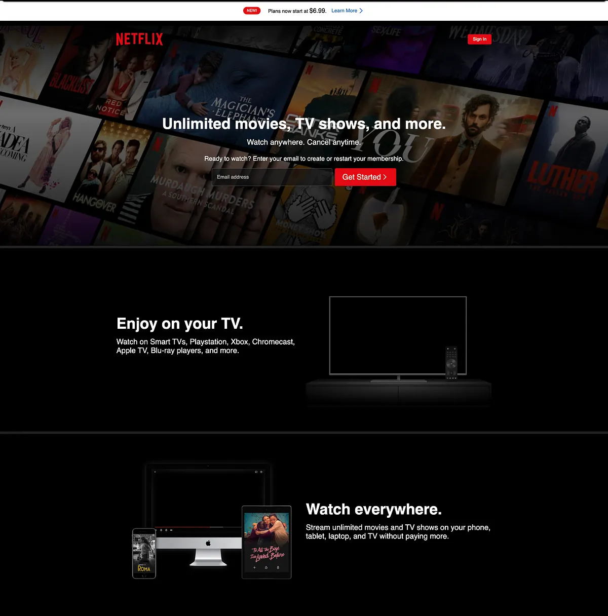
A Netflix variant makes the email input transparent so the lower-tier plan banner receives more visual contrast.1200 × 1216opens the full image 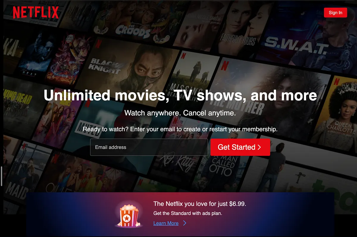
A Netflix variant uses a single bottom-of-page gradient banner to highlight the ad-supported tier.1200 × 797opens the full image 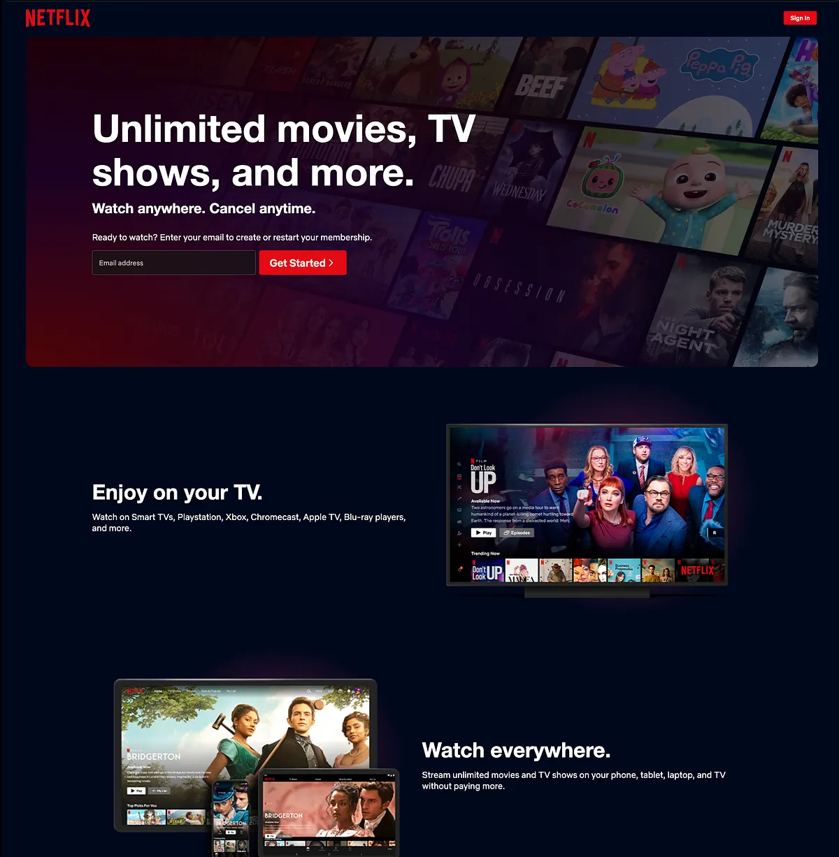
A Netflix variant places the gradient emphasis in the header, increasing the number of highlighted regions.1200 × 1226opens the full image 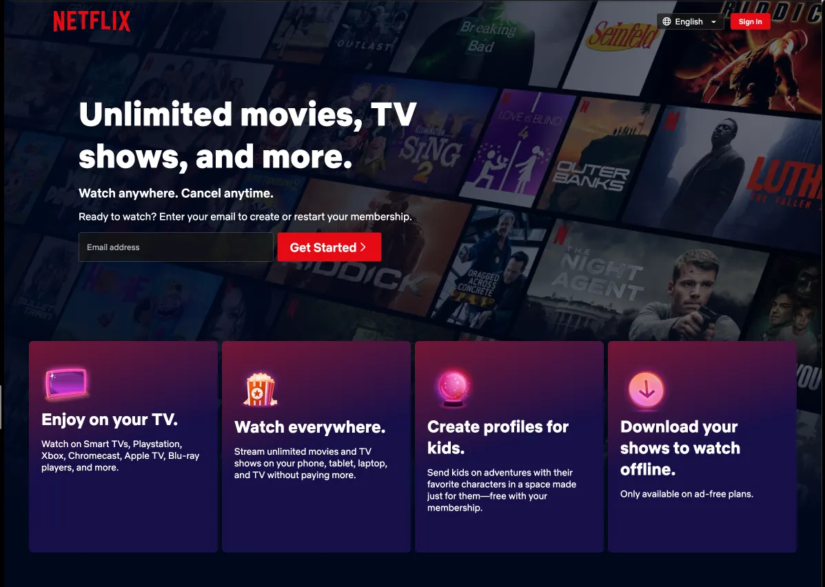
A Netflix variant highlights more value-proposition content, testing whether more emphasis helps or dilutes the page.1197 × 852opens the full image 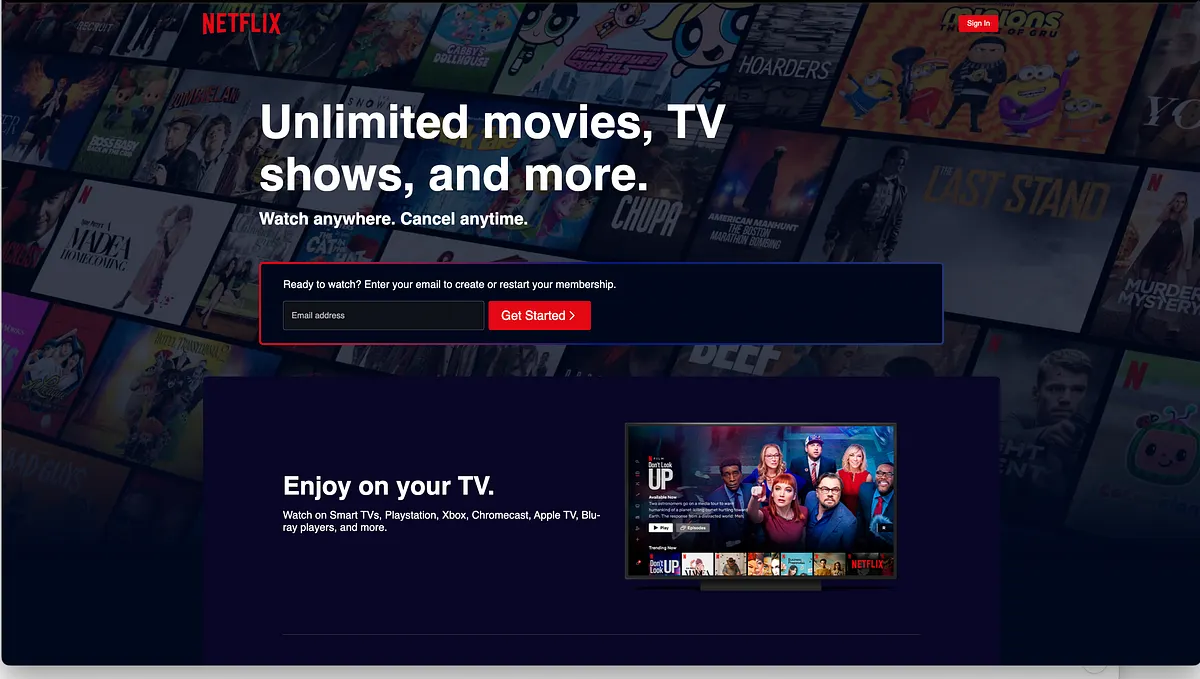
A Netflix variant highlights the input area, adding another contrast treatment to the conversion form.1200 × 679opens the full image
Sources
- [1]
Lazyweb Research: Netflix landing-page experiments
The issue reviews seven Netflix landing-page experiments from 2019-2023 and names winners and lessons.
Methodology
Product-experiment write-up by Ali Abouelatta, dated on June 13, 2023. Source links are listed below.