
Your landing page’s weakest score is CTA.
How Swisslog Healthcare ranks
- 1.
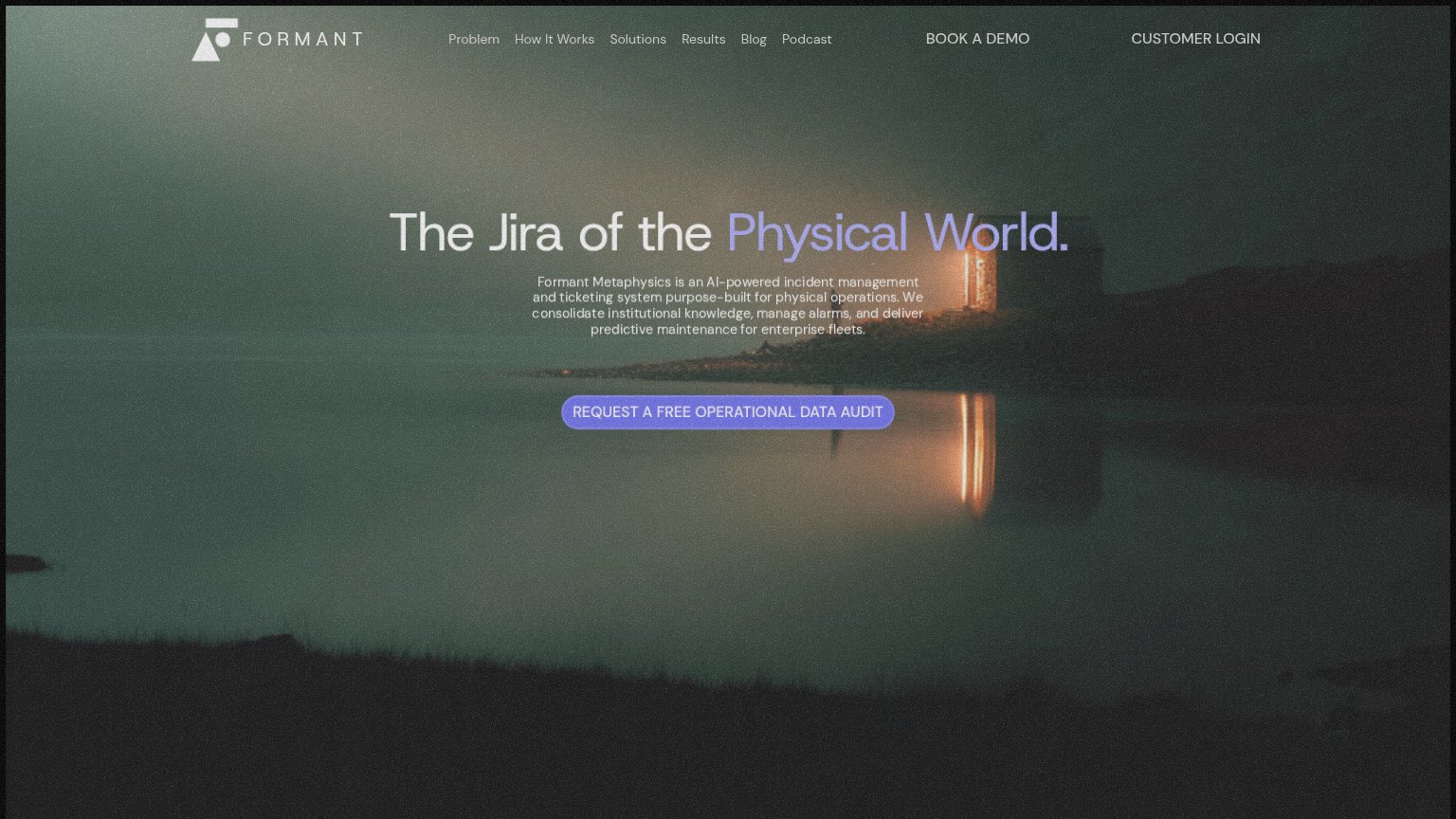
Formant65
- 2.
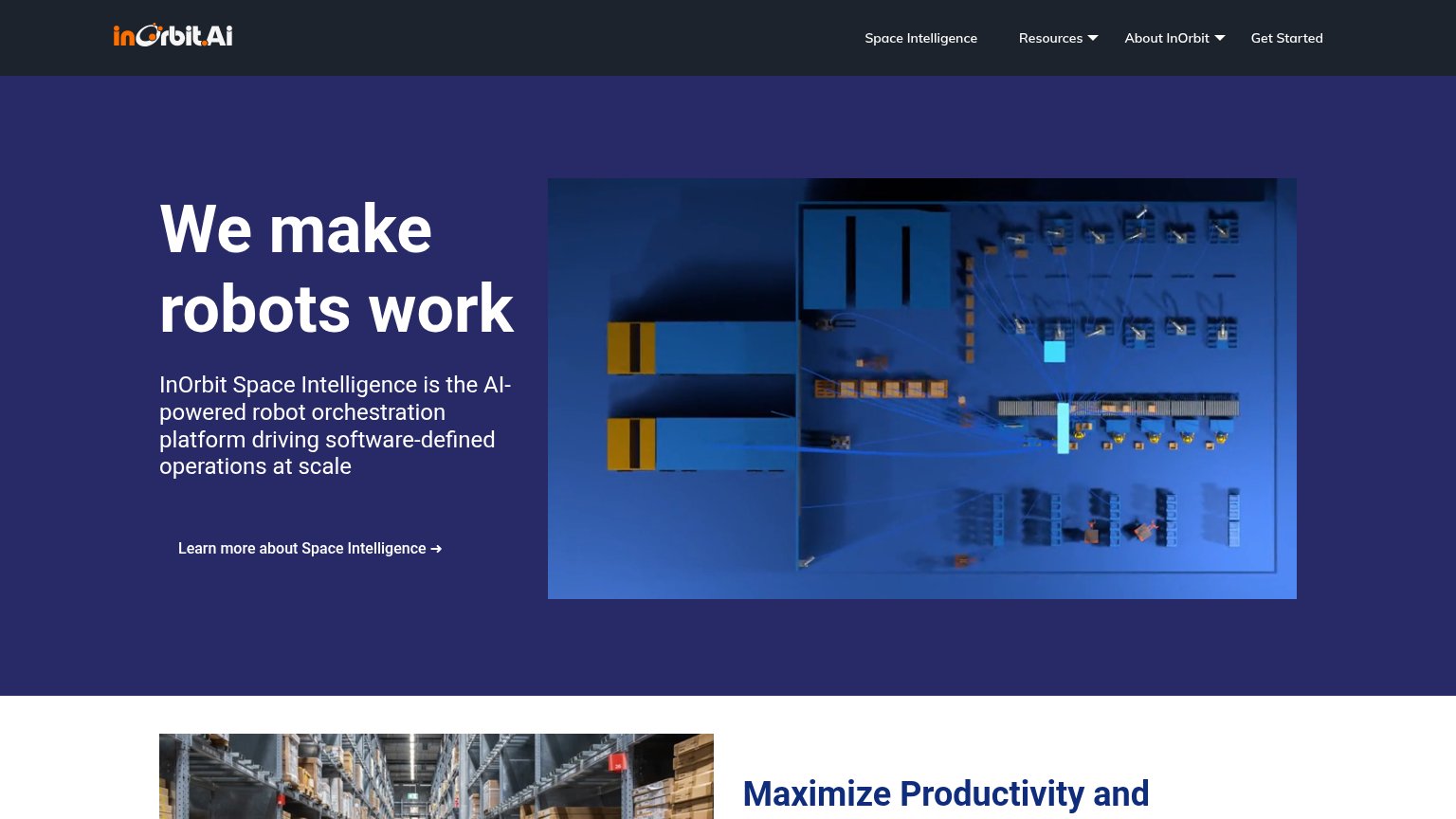
InOrbit55
- 3.
Coop54
- 4.
Swisslog Healthcare53
CTA
42PoorCopy, size, verb, cost-feel — does the primary CTA earn the click?
Problems
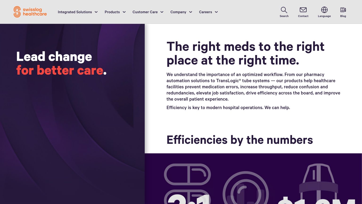
- no CTA anywhere above the fold
- hero has headline but no action
- "We can help." with no next step
- only nav and utility icons clickable
Trust
48PoorProof that the product is real, competent, and safe to try.
| Trust read | |
|---|---|
| Swisslog Healthcare | "Efficiencies by the numbers" stat section with partially visible figures (3:1, $1.2M) |
| "Backed by a16z speedrun" | |
| Hero top-down warehouse visualization showing robots and orchestration routing paths | |
| No visible trust signal identified. |
Information hierarchy
52FairDoes the design help or inhibit what the page is trying to say?
What works
What to improve
Mobile web
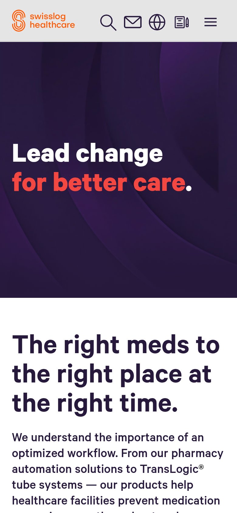
56FairThe phone experience as a first-class citizen.
What works
What to improve
Value props
66FairTitle, subtitle, hero — do they sell the product's true value?
Swisslog Healthcare’s headline
Lead change for better care.
The right meds to the right place at the right time.
Working
Could improve