
Your landing page’s weakest score is Mobile web.
How Nix Biosensors ranks
Mobile web
36PoorThe phone experience as a first-class citizen.
 12
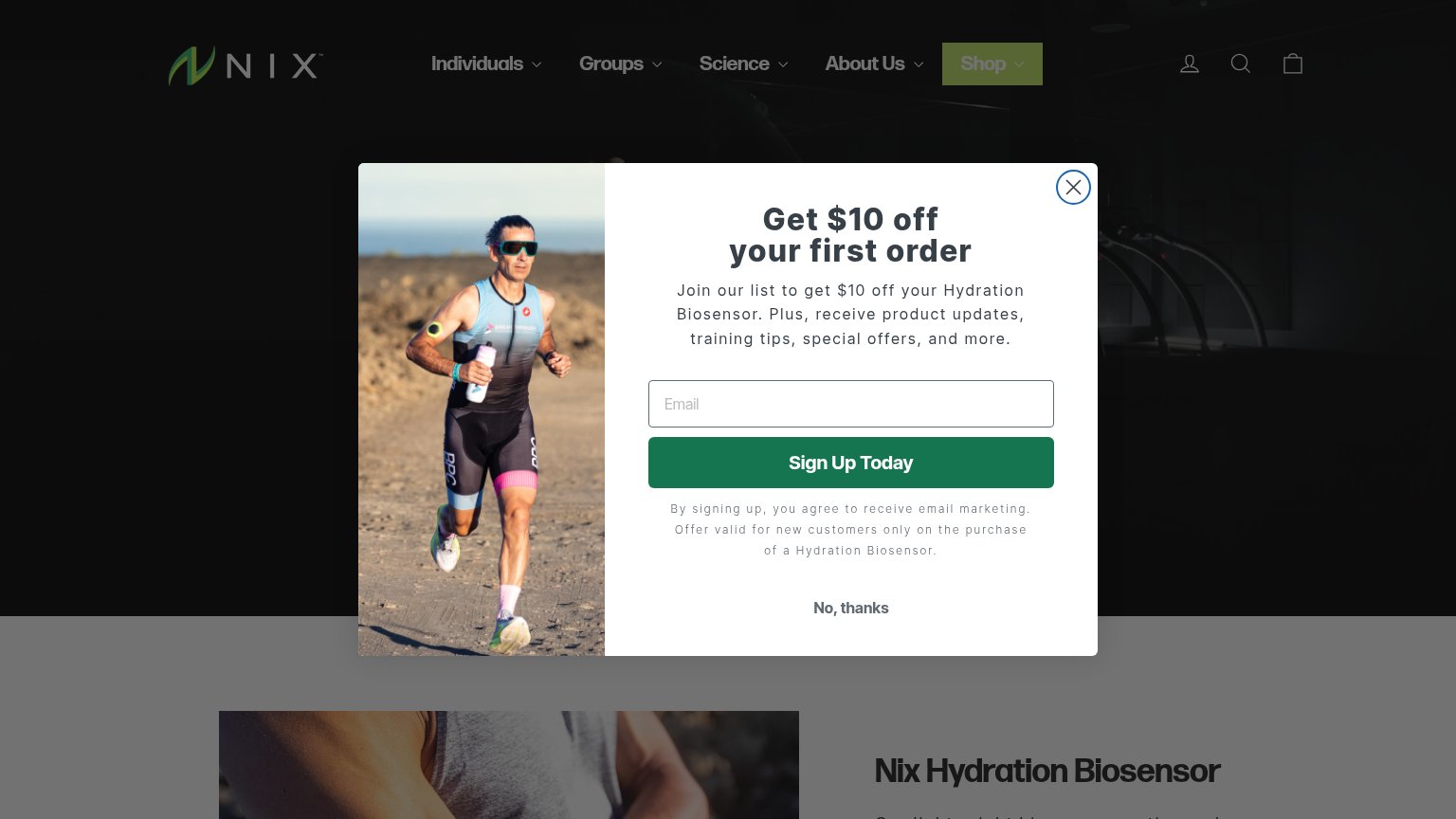
- No, thanks button — The only escape sits at the very bottom, below a long disclaimer, forcing a scroll of attention before dismissal.
- Popup disclaimer paragraph — Five lines of legal copy wedged between the signup button and the dismiss action add friction inside the overlay.
Trust
42PoorProof that the product is real, competent, and safe to try.

| Trust read | |
|---|---|
| Nix Biosensors | Photo of a runner wearing the Nix biosensor on his upper arm in the popup |
| No visible trust signal identified. | |
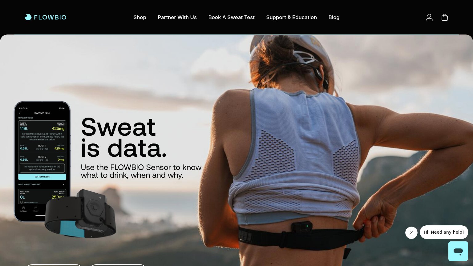
| Hero device render with hydration readouts: "SUGGESTED INTAKE — WATER 25.4 OZ / ELECTROLYTES 425 MG" | |
| App screenshot showing a "Recovery Plan" with specific fluid and sodium data (1.19L, 425mg) next to the physical sensor | |
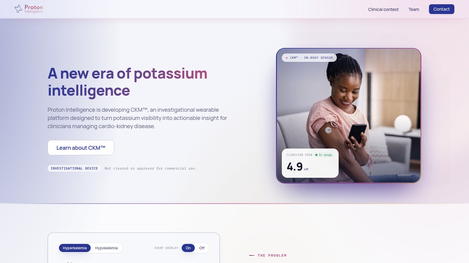
| "CLINICIAN VIEW · In range 4.9 mM" sensor reading UI on the hero image | |
| No visible trust signal identified. |
Value props
44PoorTitle, subtitle, hero — do they sell the product's true value?
Nix Biosensors’s headline
Nix Hydration Biosensor
continuously measures fluid
Working
Could improve
Information hierarchy
46PoorDoes the design help or inhibit what the page is trying to say?
What works
What to improve
CTA
62FairCopy, size, verb, cost-feel — does the primary CTA earn the click?
How Nix Biosensors compares
Recommended rewrites