
Your landing page’s weakest score is CTA.
How FLOWBIO ranks
CTA
56FairCopy, size, verb, cost-feel — does the primary CTA earn the click?
Problems
- generic label, no product payoff
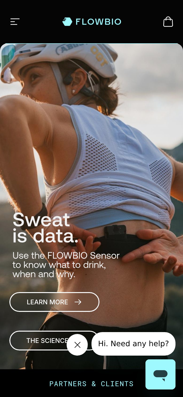
- buttons clipped below desktop fold
- ghost outline, low visual weight
- no purchase path in hero
Trust
57FairProof that the product is real, competent, and safe to try.
| Trust read | |
|---|---|
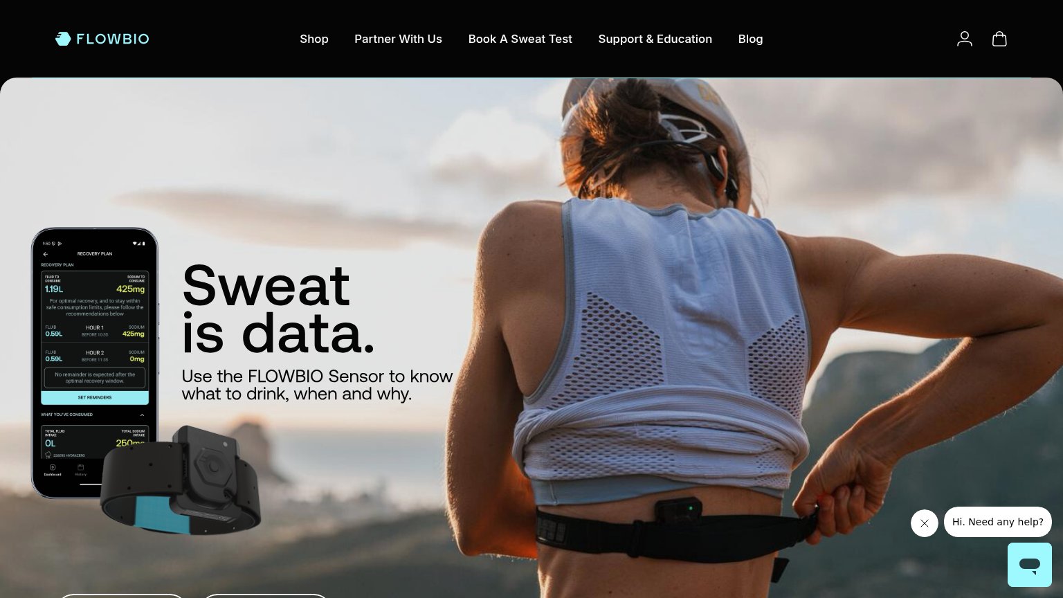
| FLOWBIO | App screenshot showing a "Recovery Plan" with specific fluid and sodium data (1.19L, 425mg) next to the physical sensor |
| No visible trust signal identified. | |
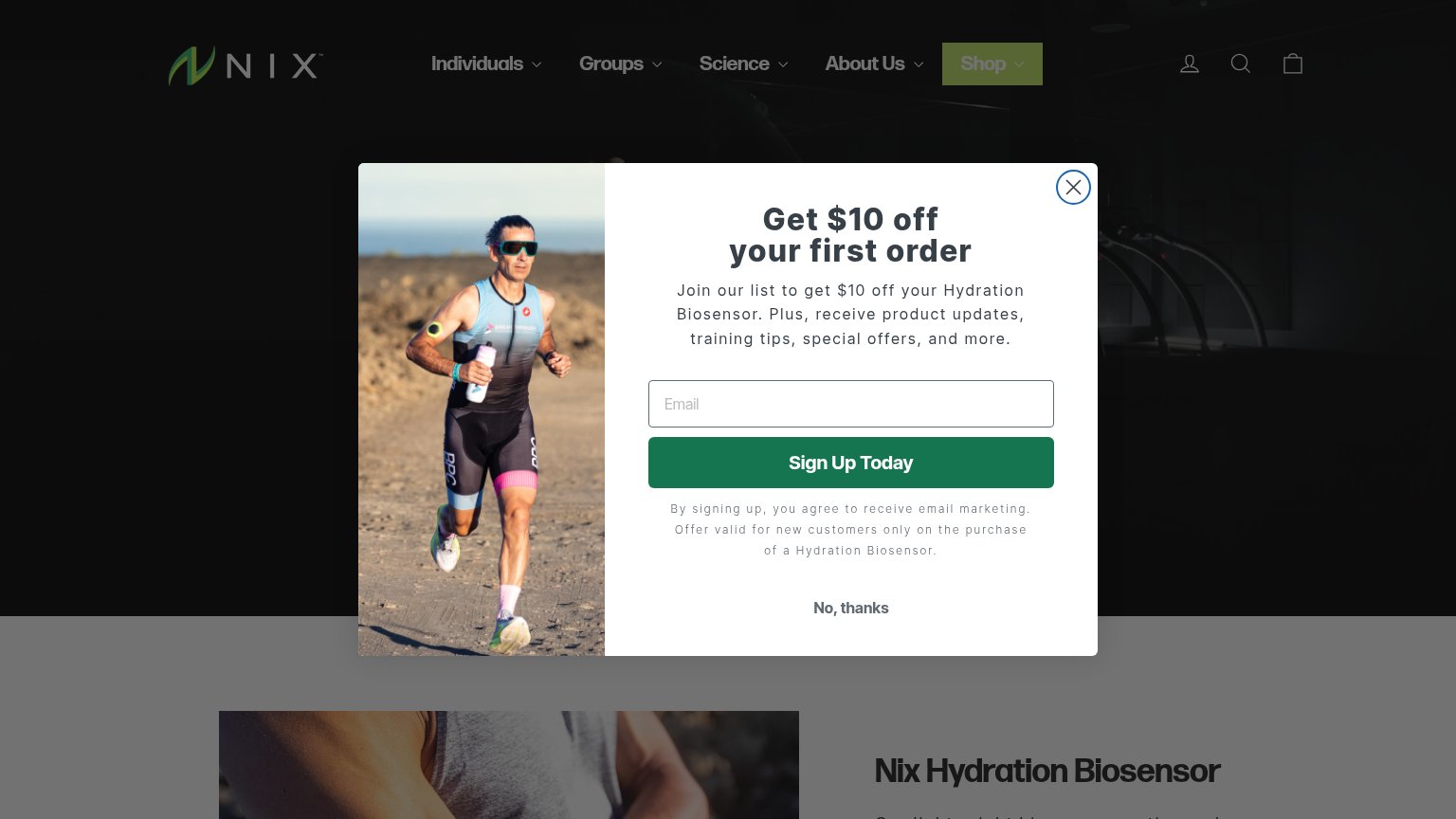
| Photo of a runner wearing the Nix biosensor on his upper arm in the popup | |
| Hero device render with hydration readouts: "SUGGESTED INTAKE — WATER 25.4 OZ / ELECTROLYTES 425 MG" | |
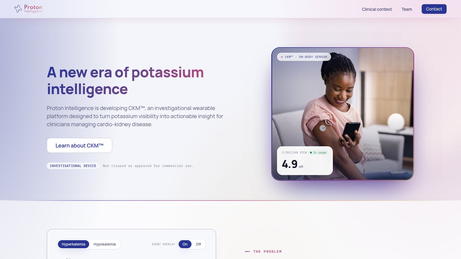
| "CLINICIAN VIEW · In range 4.9 mM" sensor reading UI on the hero image | |
| No visible trust signal identified. |
Information hierarchy
62FairDoes the design help or inhibit what the page is trying to say?
What works
What to improve
Mobile web
68FairThe phone experience as a first-class citizen.
What works
What to improve
Value props
78FairTitle, subtitle, hero — do they sell the product's true value?
FLOWBIO’s headline
Sweat is data.
Use the FLOWBIO Sensor to know what to drink, when and why.
Working
Could improve