
Your landing page’s weakest score is Trust.
How Meetup ranks
Trust
52FairProof that the product is real, competent, and safe to try.
| Trust read | |
|---|---|
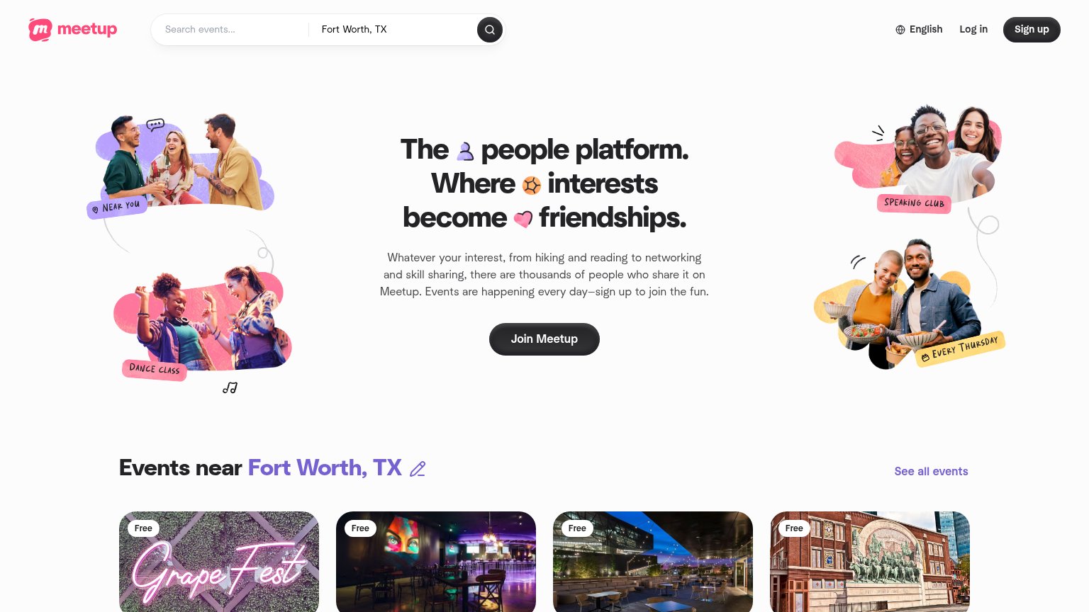
| Meetup | "Events near Fort Worth, TX" grid with real local event cards (e.g. Grape Fest, "Free") |
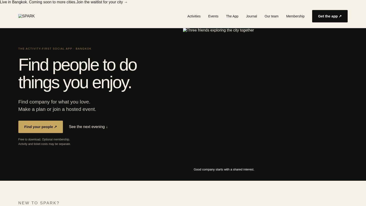
| "Free to download. Optional membership. Activity and ticket costs may be separate." disclosure under the CTA | |
| App Store and Google Play download badges | |
| Candid polaroid-style photos of members at 222 nights out | |
| No visible trust signal identified. | |
| "Browsing events in Cincinnati" localized event browser with All/For you/Today/This weekend filters |
CTA
68FairCopy, size, verb, cost-feel — does the primary CTA earn the click?
Problems
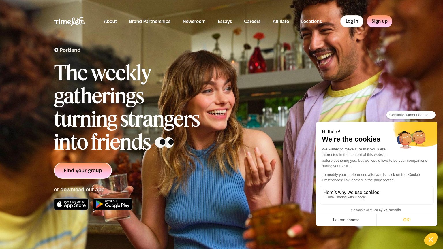
- no 'free' despite Free event badges
- 'join' feels like signup, not value
- label differs from nav 'Sign up'
- button small vs. hero art on desktop
Mobile web
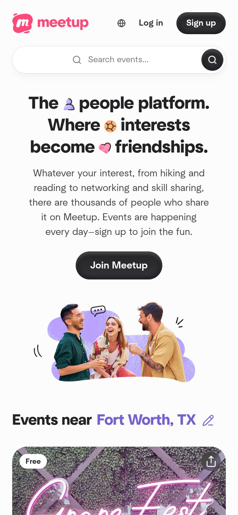
76FairThe phone experience as a first-class citizen.
What works
What to improve
Value props
78FairTitle, subtitle, hero — do they sell the product's true value?
Meetup’s headline
The people platform. Where interests become friendships.
Whatever your interest, from hiking and reading to networking and skill sharing, there are thousands of people who share it on Meetup. Events are happening every day—sign up to join the fun.
Working
Could improve
Information hierarchy
82StrongDoes the design help or inhibit what the page is trying to say?
What works
What to improve