
Your landing page’s weakest score is CTA.
How Mecone ranks
CTA
48PoorCopy, size, verb, cost-feel — does the primary CTA earn the click?
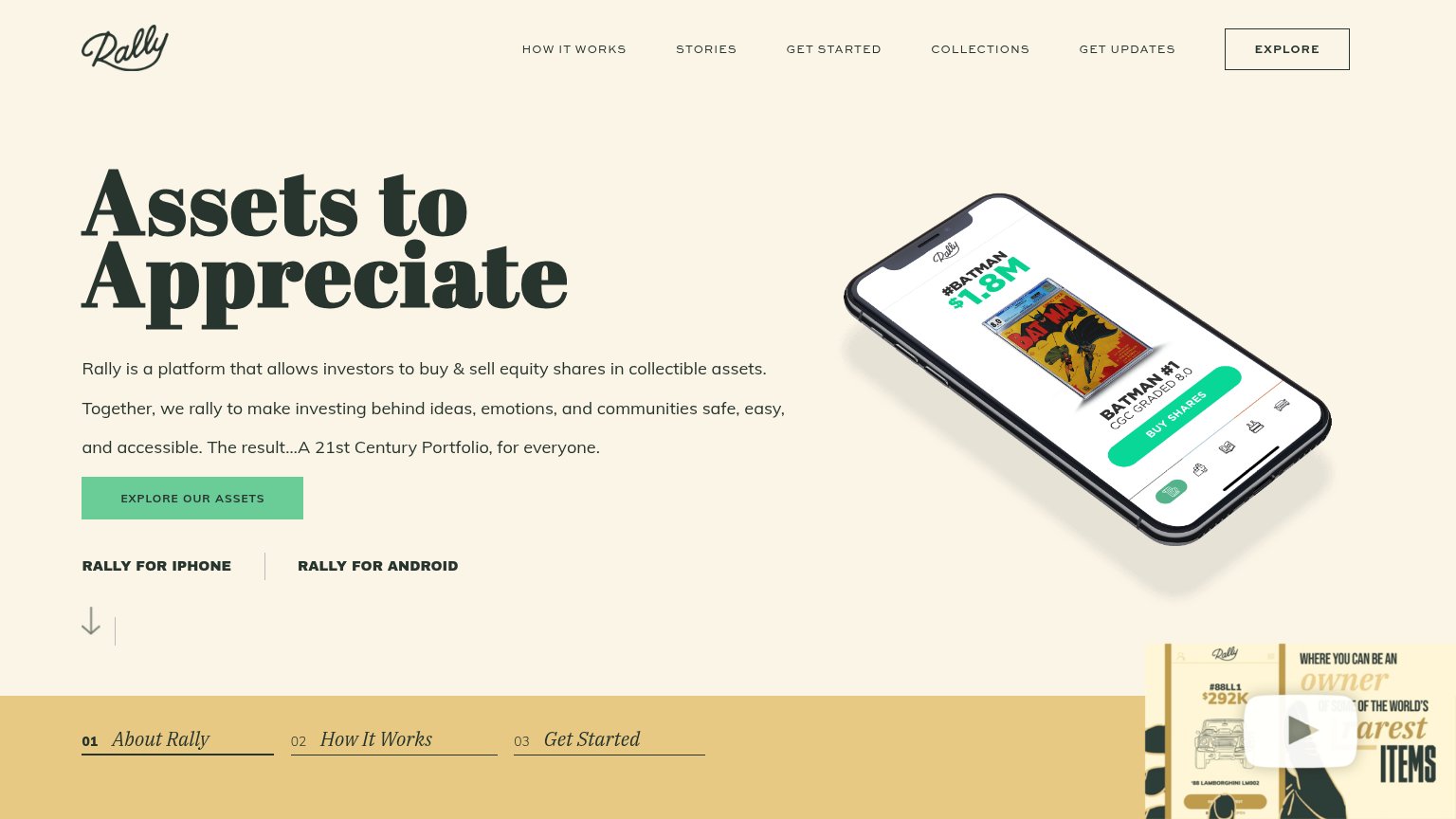
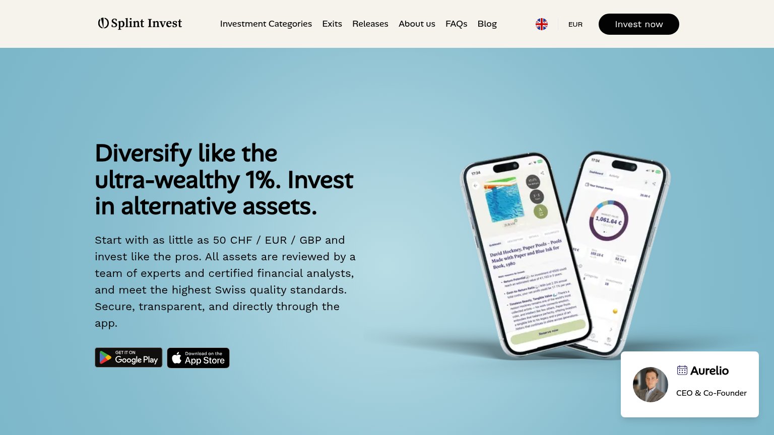
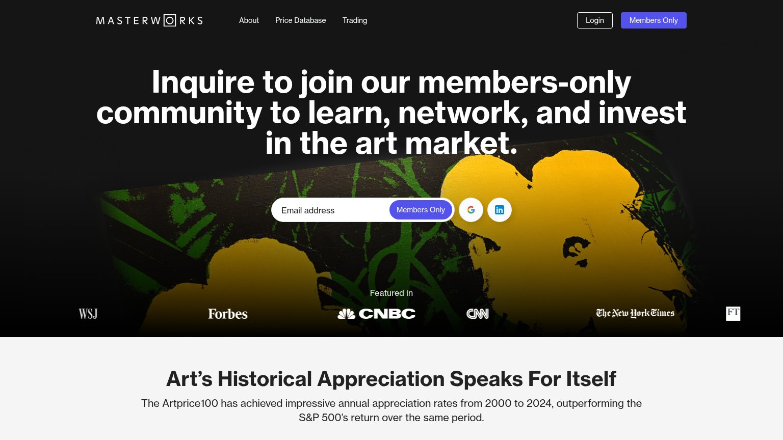
Problems
- high-commitment sales-call ask
- tiny nav button, no hero CTA
- absent on mobile fold (hamburger)
- mentions 'our team', not the visitor
Value props
48PoorTitle, subtitle, hero — do they sell the product's true value?
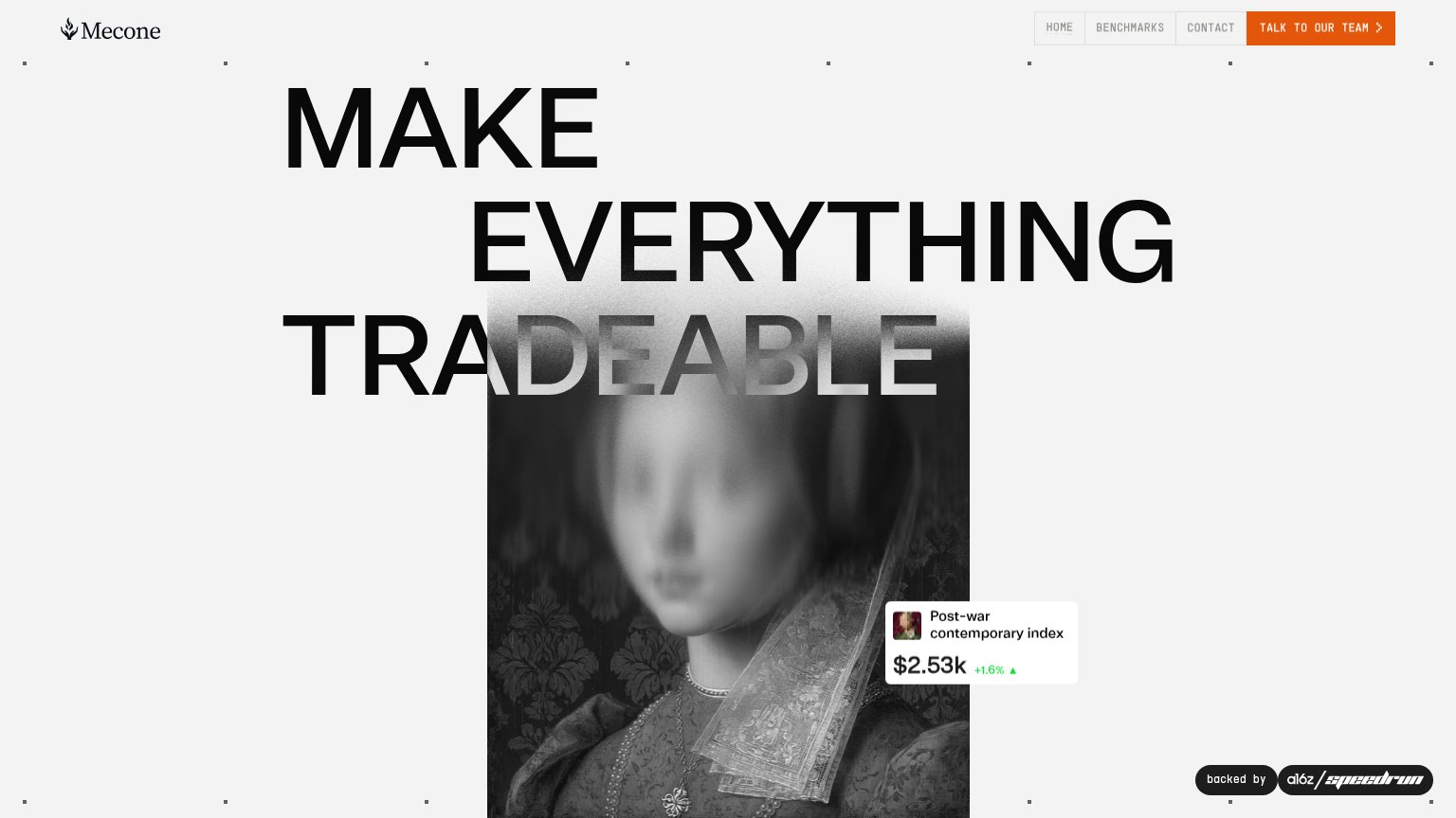
Mecone’s headline vague
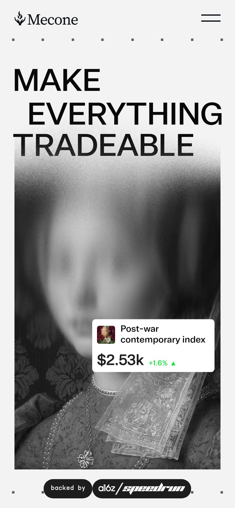
MAKE EVERYTHING TRADEABLE
Working
- Bold, memorable three-word manifesto
- Index widget shows real product data
- a16z speedrun badge adds credibility
Could improve
- No subhead explaining what Mecone is
- Headline could caption any marketplace
- Image chip carries all the specificity
Trust
52FairProof that the product is real, competent, and safe to try.
How Mecone compares
Trust read
Mobile web
56FairThe phone experience as a first-class citizen.
What works
What to improve
Information hierarchy
76FairDoes the design help or inhibit what the page is trying to say?
What works
What to improve