
Your landing page’s weakest score is Trust.
71Growth scoreupdated
category scores
category scoresShowHide
Trust
48PoorProof that the product is real, competent, and safe to try.
| Trust read | |
|---|---|
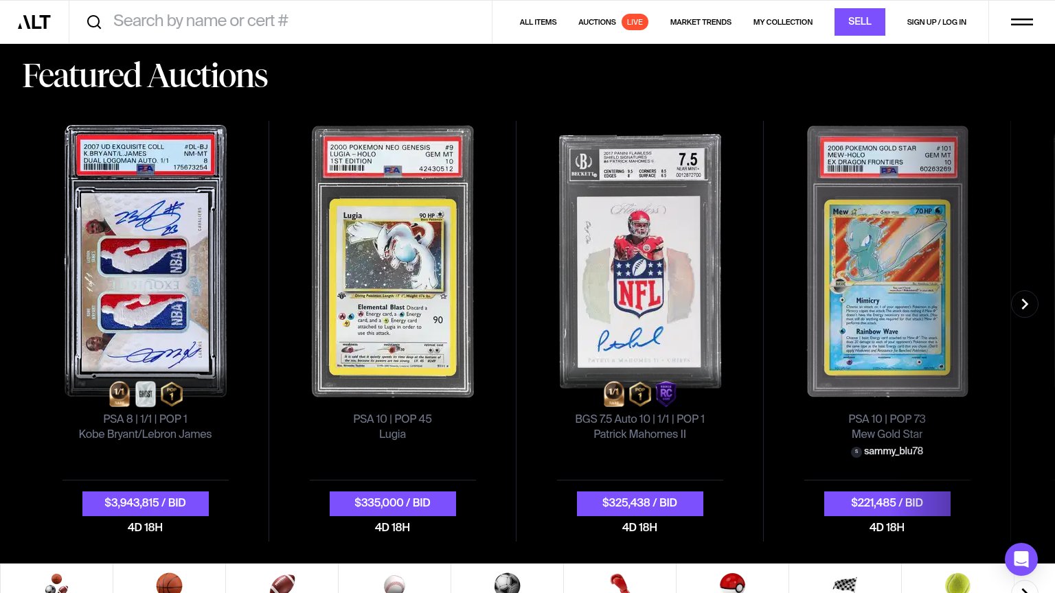
| Rally | No visible trust signal identified. |
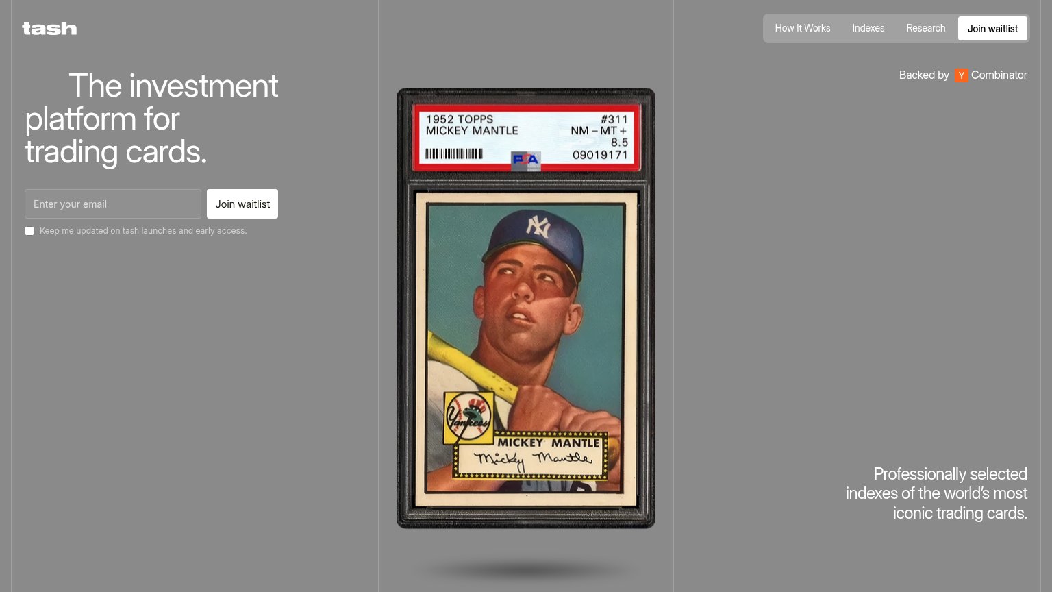
| "Backed by Y Combinator" badge | |
| PSA/BGS graded card listings with visible cert numbers, e.g. "PSA 8 | 1/1 | POP 1 Kobe Bryant/Lebron James" at "$3,943,8 |
Information hierarchy
71FairDoes the design help or inhibit what the page is trying to say?
 1234
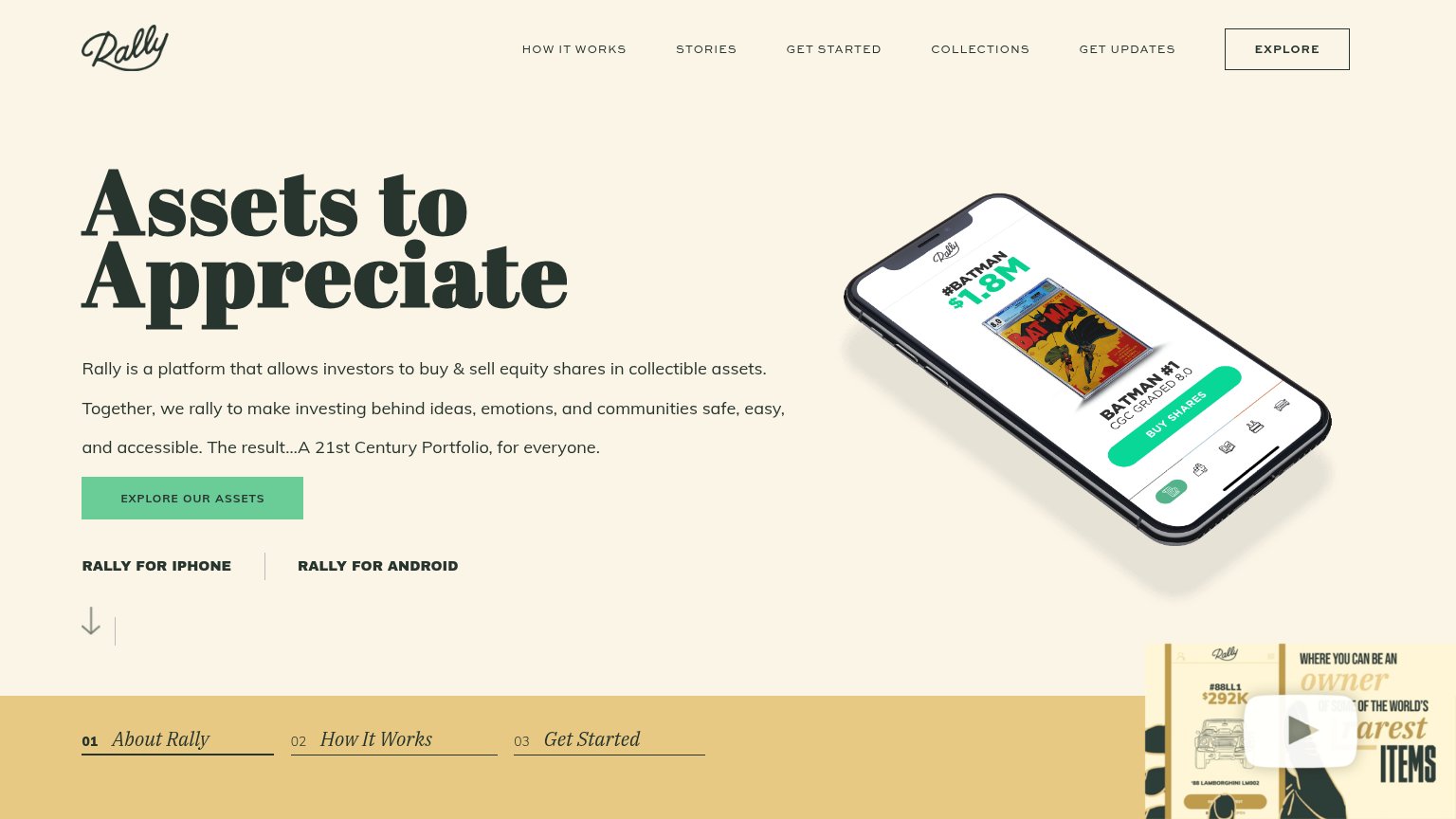
- Boxed Explore nav button — Outlined button styled as a peer to the primary CTA duplicates its job and pulls the eye to the nav first.
- Explore Our Assets CTA — Muted green on cream with a small footprint makes the primary action the least visually dominant element in its column.
- Corner video overlay — Autoplay video panel with a play button injects a second motion-heavy focal point that competes with the CTA and hero.
- App store links — Two equal-weight exit links sit directly under the primary CTA, splitting the next-step decision three ways.
Value props
72FairTitle, subtitle, hero — do they sell the product's true value?
Rally’s headline
Assets to Appreciate
Rally is a platform that allows investors to buy & sell equity shares in collectible assets. Together, we rally to make investing behind ideas, emotions, and communities safe, easy, and accessible. The result…A 21st Century Portfolio, for e
Working
Could improve
CTA
77FairCopy, size, verb, cost-feel — does the primary CTA earn the click?
How Rally compares
Recommended rewrites
Mobile web
87StrongThe phone experience as a first-class citizen.

What works
What to improve