
Your landing page’s weakest score is Information hierarchy.
How LightBox LandVision ranks
- 1.
Parca70
- 2.
Reonomy68
- 3.
LightBox LandVision53
- 4.
LandTech (LandInsight)53
- 5.
Deepblocks50
53Growth scoreupdated
category scores
category scoresShowHide
Information hierarchy
42PoorDoes the design help or inhibit what the page is trying to say?
 1234
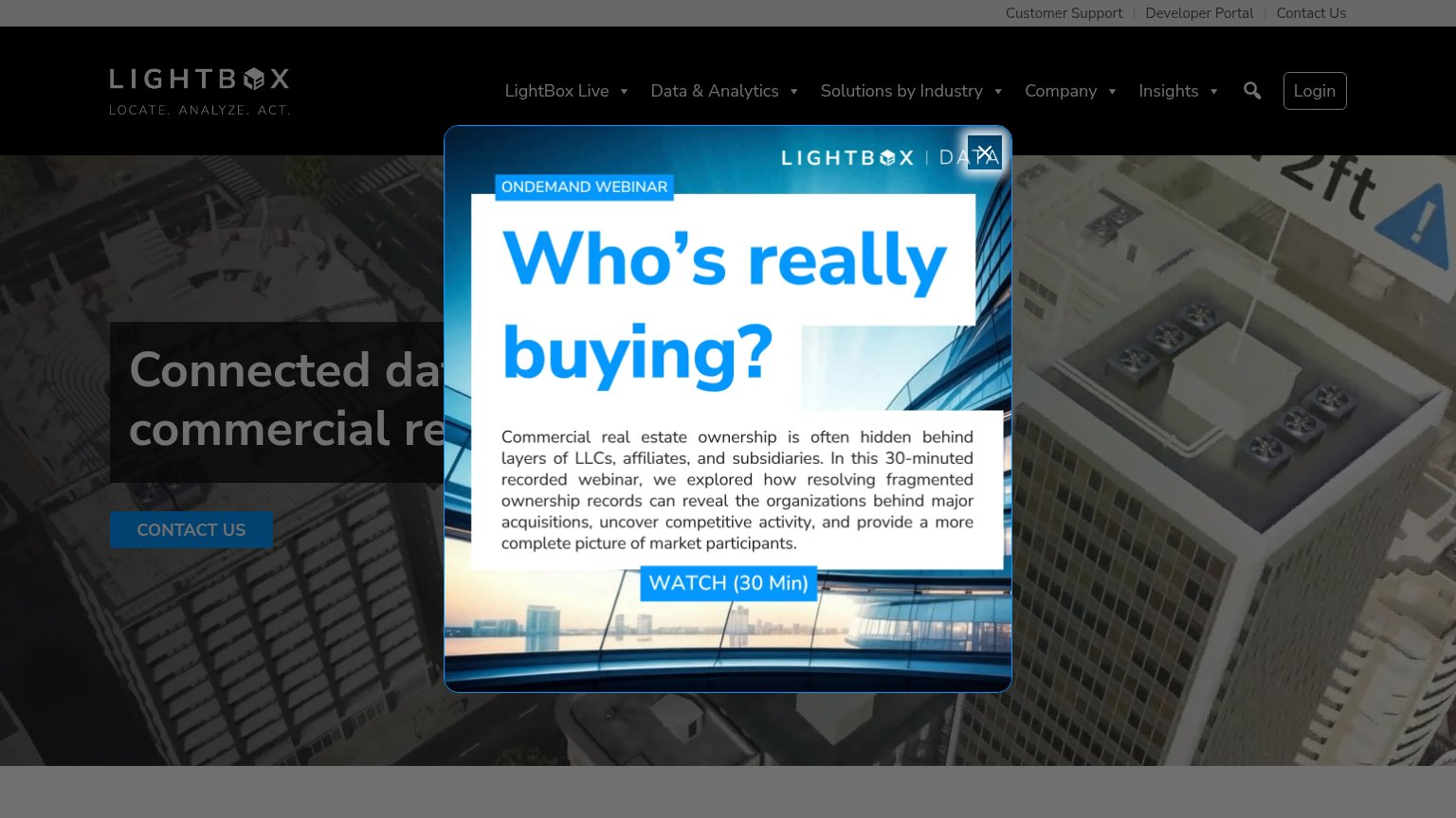
- Webinar popup modal — Entry interstitial covers the hero, hides the headline, and its WATCH (30 Min) button competes with the primary CTA.
- Truncated hero headline — The value proposition reads 'Connected dat... commercial re...' because the popup obscures it — the core message never lands.
- CONTACT US button — Dark navy button on a dark background is low contrast and easy to miss even without the popup.
- Utility link bar — Customer Support, Developer Portal, and Contact Us links add three exits before the nav's five dropdowns even start.
Trust
42PoorProof that the product is real, competent, and safe to try.
| Trust read | |
|---|---|
| LightBox LandVision | No visible trust signal identified. |
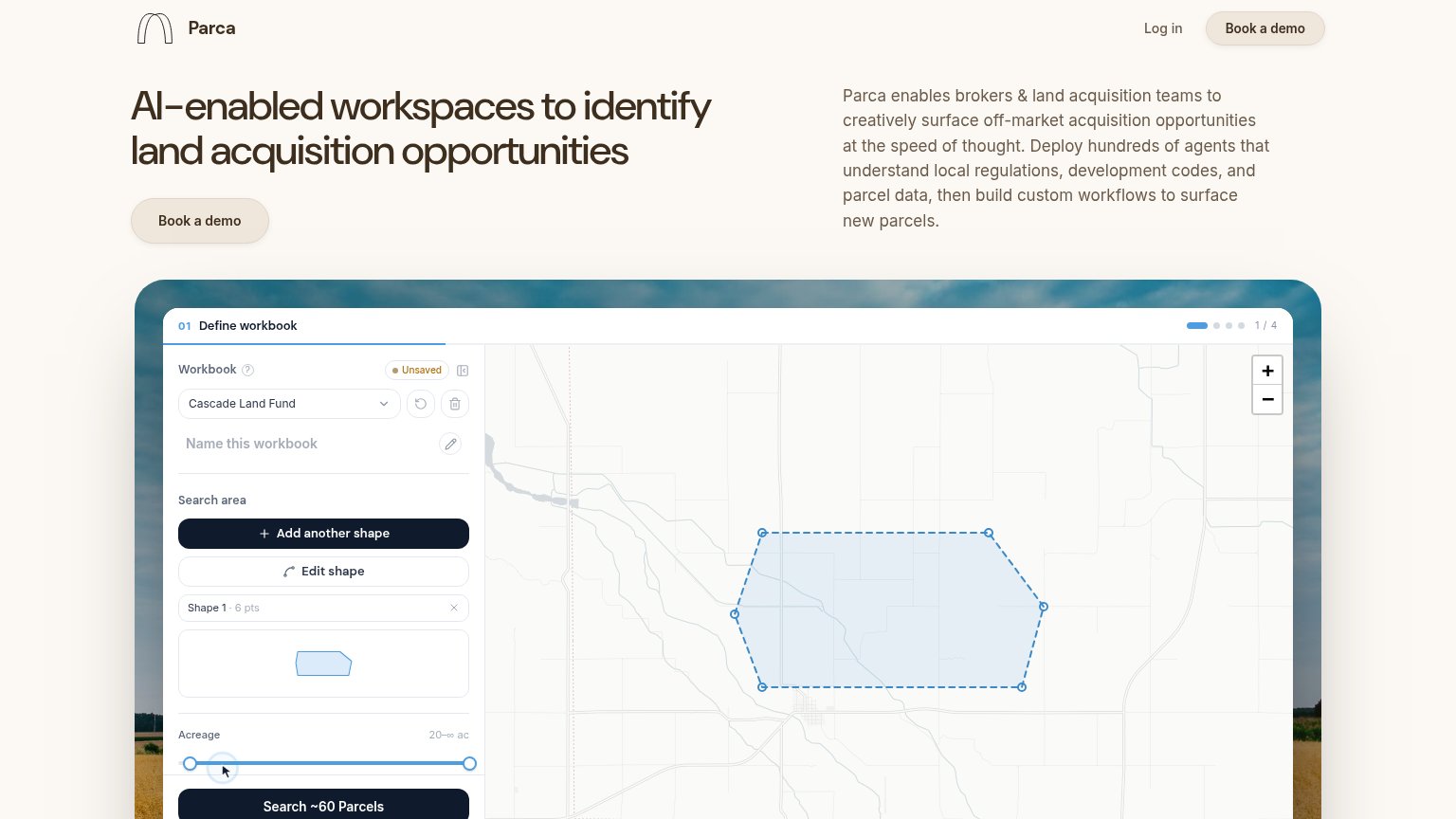
| Detailed product UI screenshot showing the workbook panel, map with drawn search polygon, and "Search ~60 Parcels" butto | |
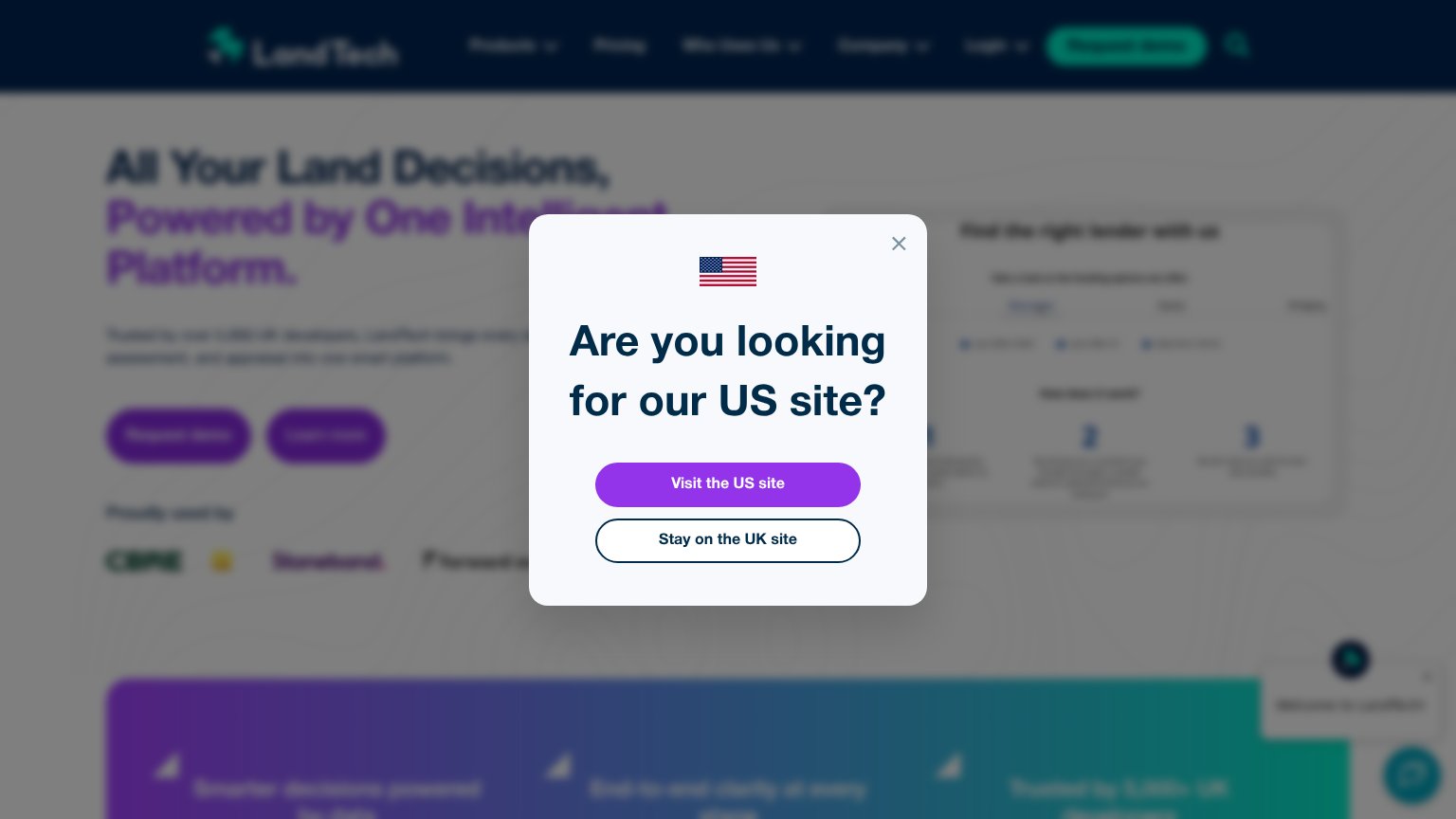
| "Proudly used by" customer logo strip including CBRE | |
| 3D feasibility map demo with highlighted parcels and a data chart panel (mobile) | |
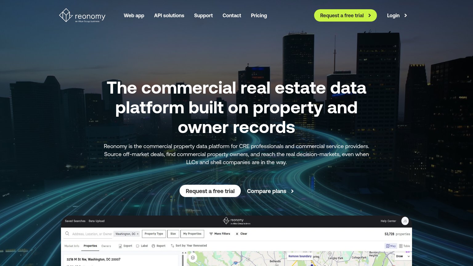
| Embedded product UI screenshot showing property search with map and "53,728 properties" |
Value props
44PoorTitle, subtitle, hero — do they sell the product's true value?
LightBox LandVision’s headline
Connected data for commercial real estate
Working
Could improve
CTA
58FairCopy, size, verb, cost-feel — does the primary CTA earn the click?
How LightBox LandVision compares
Recommended rewrites
Mobile web
80StrongThe phone experience as a first-class citizen.

What works
What to improve