
Your landing page’s weakest score is Information hierarchy.
How LandTech (LandInsight) ranks
- 1.
Parca70
- 2.
Reonomy68
- 3.
LandTech (LandInsight)53
- 4.
LightBox LandVision53
- 5.
Deepblocks50
53Growth scoreupdated
category scores
category scoresShowHide
Information hierarchy
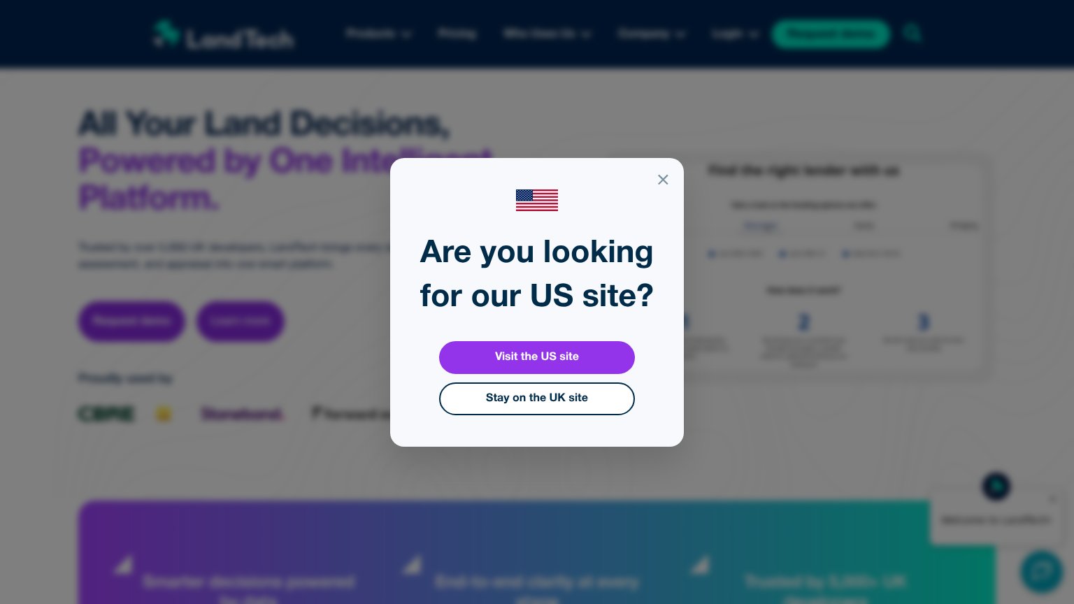
40PoorDoes the design help or inhibit what the page is trying to say?
 1234
- US site modal — Blocks and blurs the entire fold, hiding the headline and hero CTAs before a visitor reads anything.
- Visit US site button — The modal's only filled, high-contrast button routes visitors off this page instead of into it.
- Two purple hero CTAs — Both hero buttons share the same fill and weight, so neither reads as the one primary action.
- Nav Request demo button — Duplicates the hero CTA and sits beside five dropdowns and a search icon that all leak attention.
Mobile web
48PoorThe phone experience as a first-class citizen.
 1234
- Geo-routing modal — Full-screen overlay covers the entire hero and hides the primary CTA, forcing a routing decision before any value is shown.
- Modal headline — "Are LandTech (LandInsight) looking for our US site?" is set in oversized type across three lines, eating most of the viewport for a yes/no question.
- Chat launcher bubble — A second overlay competing for attention in the bottom-right corner while the modal is already blocking the page.
- Hero headline wrap — Behind the modal, the desktop-scale headline wraps into five-plus cramped lines, pushing the page CTAs down the phone column.
Trust
55FairProof that the product is real, competent, and safe to try.
How LandTech (LandInsight) compares
Trust read
CTA
60FairCopy, size, verb, cost-feel — does the primary CTA earn the click?
How LandTech (LandInsight) compares
Recommended rewrites
Value props
63FairTitle, subtitle, hero — do they sell the product's true value?
LandTech (LandInsight)’s headline
All Your Land Decisions, Powered by One Intelligent Platform.
Trusted by over 5,000 UK developers, LandTech brings every ... assessment, and appraise into one smart platform.
Working
Could improve