
Your landing page’s weakest score is Trust.
How Leeroo ranks
Trust
52FairProof that the product is real, competent, and safe to try.
| Trust read | |
|---|---|
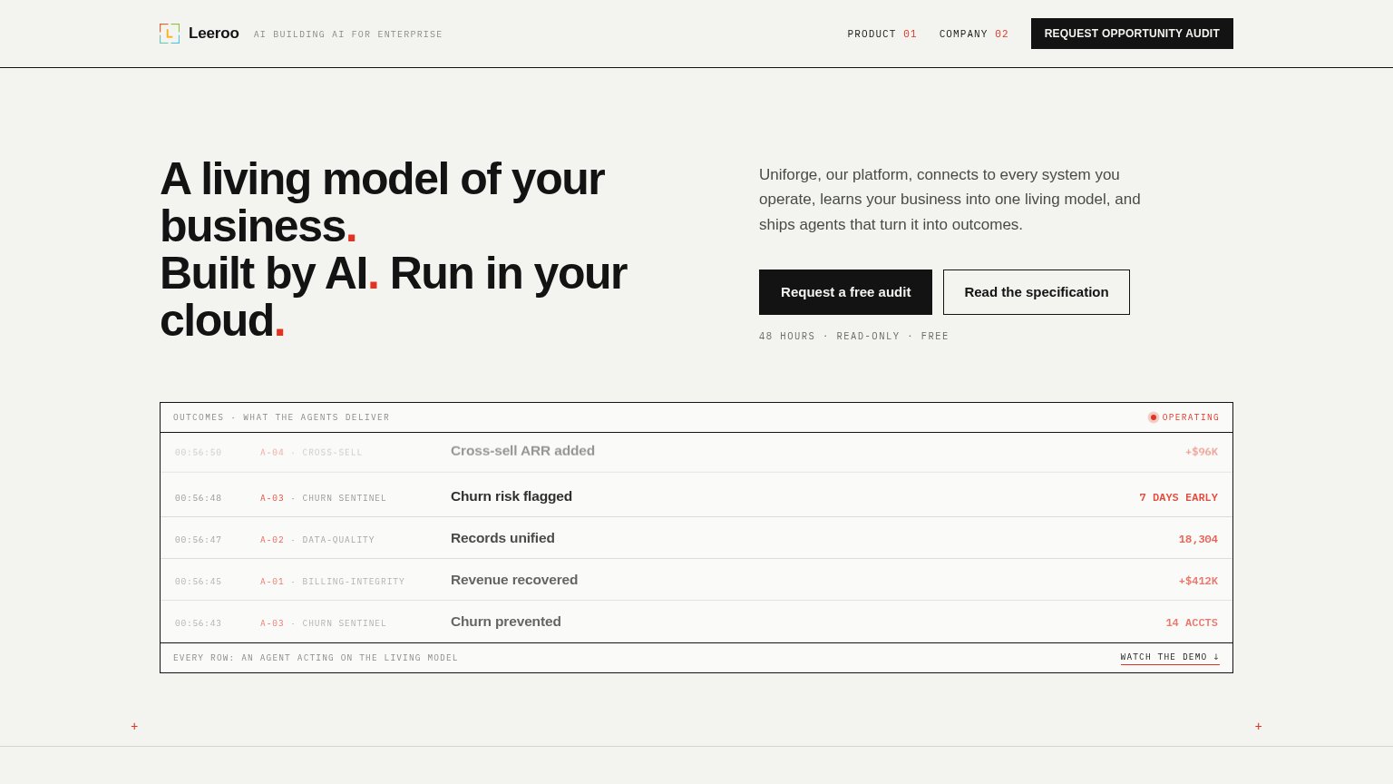
| Leeroo | "48 HOURS · READ-ONLY · FREE" risk-reversal line under the "Request a free audit" CTA |
| No visible trust signal identified. | |
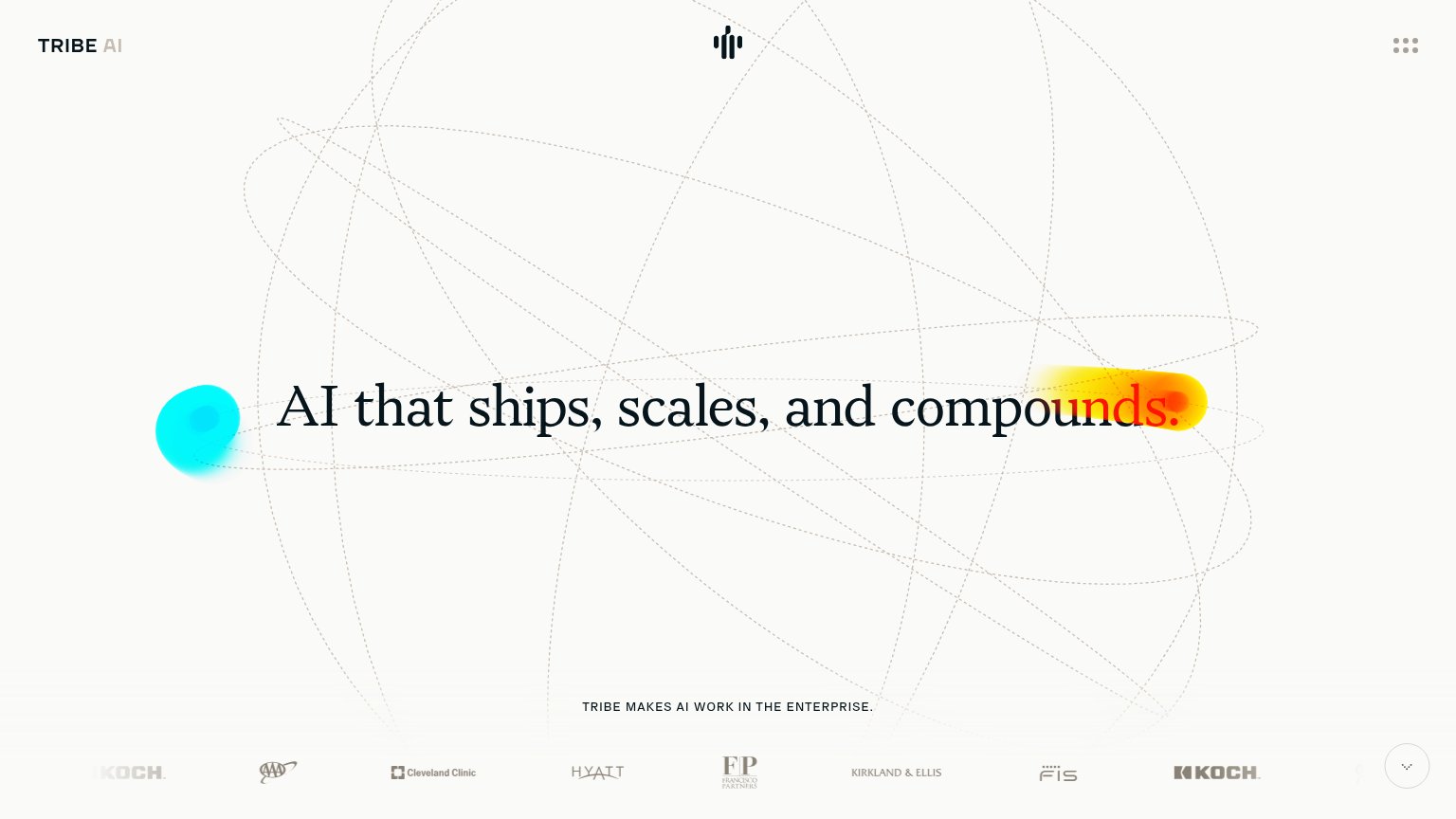
| Client logo strip featuring AAA, Cleveland Clinic, Hyatt, Kirkland & Ellis, Francisco Partners, FIS, and Koch | |
| Fractal's Vaidya.ai powers BMC Health AI Chatbot on WhatsApp for Mumbai | |
| Sierra Agent chat demo resolving "I don't recognize this $95 charge" and booking "Appointment booked" | |
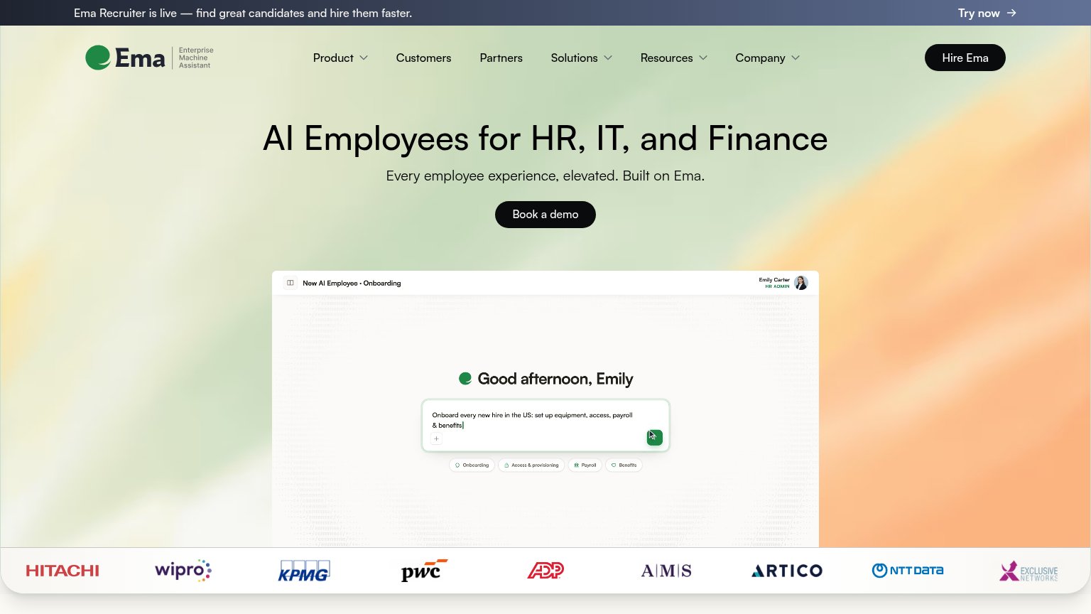
| Logo wall with Hitachi, Wipro, KPMG, PwC, ADP, AMS, Artico, NTT Data |
Mobile web
68FairThe phone experience as a first-class citizen.
 123
- Headline wrap — The desktop headline scales down into six cramped lines, pushing both CTAs and the outcomes table far down the page.
- Request a free audit — Primary CTA sits below the first viewport and is only ~half-width instead of a full-bleed, thumb-friendly button.
- Read the specification — Secondary button stacks directly under the primary at near-equal visual weight, competing for the tap.
CTA
78FairCopy, size, verb, cost-feel — does the primary CTA earn the click?
How Leeroo compares
Recommended rewrites
Value props
78FairTitle, subtitle, hero — do they sell the product's true value?
Leeroo’s headline
A living model of your business. Built by AI. Run in your cloud.
Uniforge, our platform, connects to every system you operate, learns your business into one living model, and ships agents that turn it into outcomes.
Working
Could improve
Information hierarchy
82StrongDoes the design help or inhibit what the page is trying to say?
What works
What to improve