
Your landing page’s weakest score is Trust.
How Lawtrades ranks
Trust
48PoorProof that the product is real, competent, and safe to try.
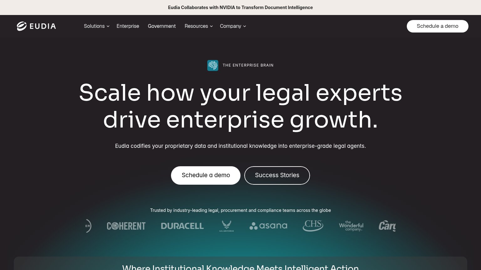
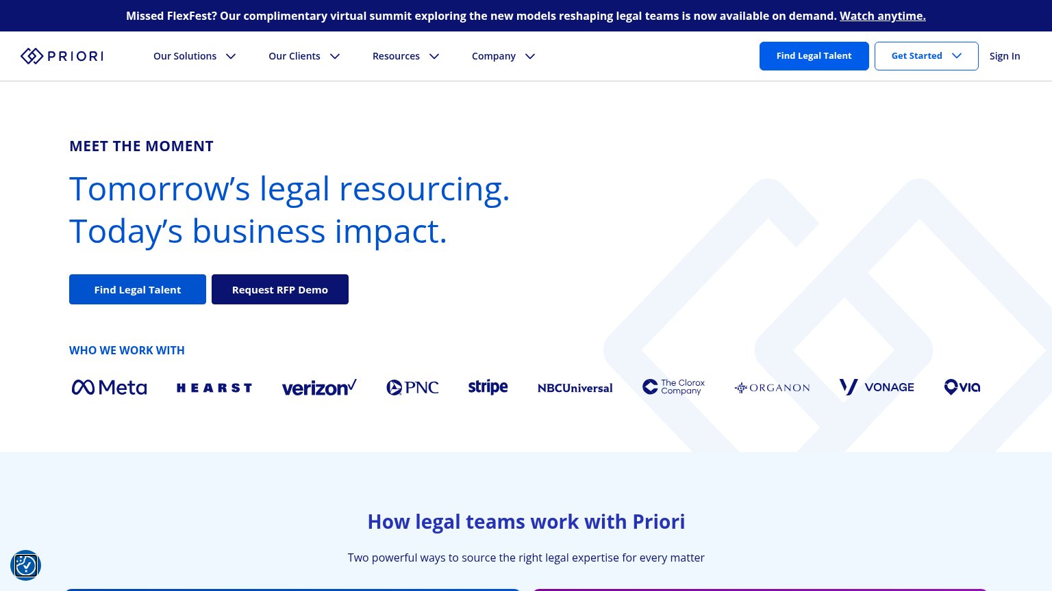
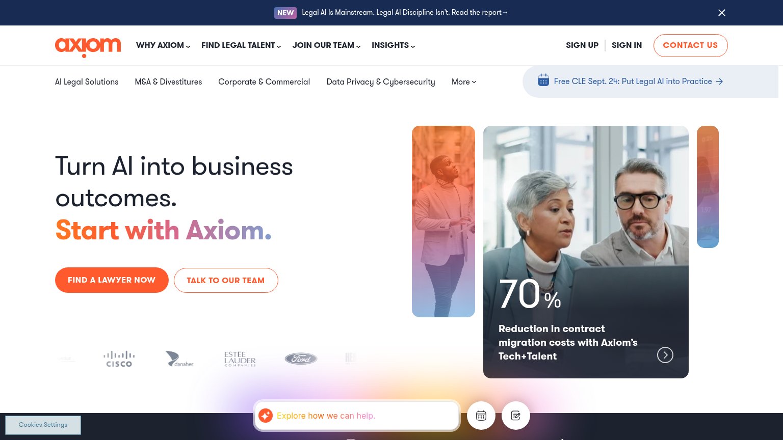
| Trust read | |
|---|---|
| Lawtrades | No visible trust signal identified. |
| Domain-specific document photography ("Stock Purchase Agreement", "SAFE Side Letter") signaling legal focus | |
| Customer logo strip (Duracell, Asana, U.S. Air Force, CHS, Cargill) under "Trusted by industry-leading legal, procuremen | |
| "Built By Lawyers, For Sales Teams, To Speed Up Time to Signature" | |
| "WHO WE WORK WITH" logo bar featuring Meta, Hearst, Verizon, PNC, Stripe, NBCUniversal, The Clorox Company, Organon, Von | |
| Customer logo strip (Cisco, Danaher, Estée Lauder Companies, Ford) |
Mobile web
63FairThe phone experience as a first-class citizen.
 1234
- Download Playbook banner — Sticky promo eats the top of the fold with a competing CTA before the hero even starts.
- Hero headline — Desktop-sized type wraps into five cramped lines and pushes the signup form to the fold's edge.
- Email input field — Placeholder truncates to 'Enter Lawtrades's email addres' — the field is too narrow to show its own prompt.
- Contact Sales link — Crammed beside the form card, it wraps awkwardly and squeezes the primary CTA column.
Information hierarchy
72FairDoes the design help or inhibit what the page is trying to say?

What works
What to improve
CTA
72FairCopy, size, verb, cost-feel — does the primary CTA earn the click?
How Lawtrades compares
Recommended rewrites
Value props
76FairTitle, subtitle, hero — do they sell the product's true value?
Lawtrades’s headline
Legal workload spinning out of control? We've got you.
Routine NDAs stacking up? Compliance piling on? Bandwidth stretched thin? Lawtrades instantly matches you with flexible, specialized legal talent—so you can breathe easier, deliver faster, and avoid costly overhead.
Working
Could improve