
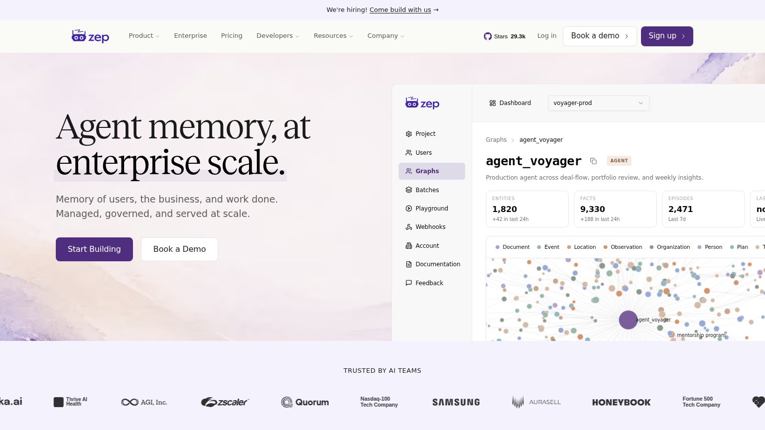
Your landing page’s weakest score is Information hierarchy.
How Zep ranks
78Growth scoreupdated
category scores
category scoresShowHide
Information hierarchy
71FairDoes the design help or inhibit what the page is trying to say?
 1234
- Header Sign up button — Filled purple at the same weight as the hero's Start Building, splitting the primary-CTA scan across two targets.
- Header Book a demo — Duplicates the hero's Book a Demo, adding a third conversion button in the fold and diluting the hero pair.
- Hiring banner link — An underlined outbound link is the first interactive element visitors meet, siphoning attention before the headline.
- Cropped dashboard metrics — The rightmost stat card is truncated mid-word at the viewport edge, making the product panel read as accidentally clipped.
CTA
78FairCopy, size, verb, cost-feel — does the primary CTA earn the click?
Problems
- no 'free' on the label
- nav says 'Sign up', hero says other
- no hint of what happens on click
Value props
78FairTitle, subtitle, hero — do they sell the product's true value?
Zep’s headline
Agent memory, at enterprise scale.
Memory of users, the business, and work done. Managed, governed, and served at scale.
Working
Could improve
Trust
80StrongProof that the product is real, competent, and safe to try.
How Zep compares
Trust read
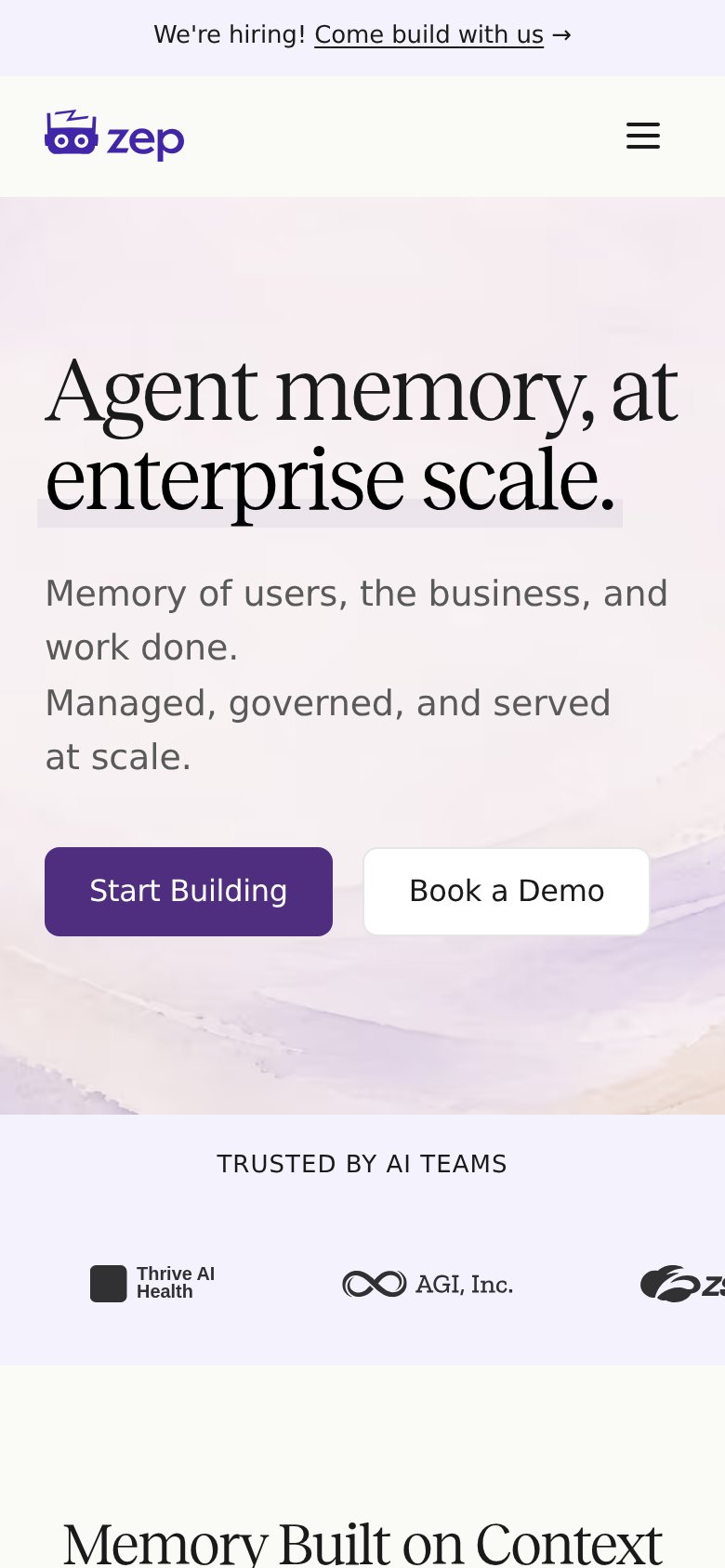
Mobile web
81StrongThe phone experience as a first-class citizen.
What works
What to improve