
Your landing page’s weakest score is Information hierarchy.
How Gembah ranks
- 1.
Cavela77
- 2.
Sourcify75
- 3.
Gembah67
- 4.
Pietra66
- 5.
Baro61
67Growth scoreupdated
category scores
category scoresShowHide
Information hierarchy
63FairDoes the design help or inhibit what the page is trying to say?
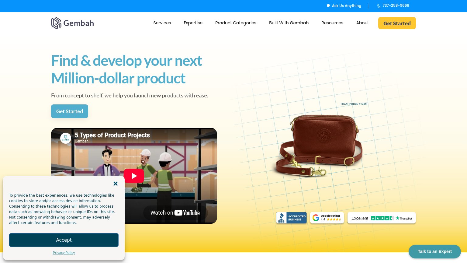 1234
- Hero Get Started button — Muted teal is visually outranked by the orange nav duplicate, splitting the primary action across two mismatched buttons.
- Cookie consent banner — Covers the video and lower-left scan path, burying supporting content right where the eye travels after the CTA.
- YouTube video embed — 'Watch on YouTube' branding invites an exit to YouTube before the visitor ever reaches the conversion.
- Six-item nav row — Six equal-weight links plus 'Ask Us Anything' and a phone number leak attention away from Get Started.
Mobile web
63FairThe phone experience as a first-class citizen.
 12
- Cookie consent panel — Dead blocker with no conversion CTA covers roughly 40% of the first viewport and buries the hero image.
- Get Started button — Desktop-proportioned button floats small in the column instead of a near-full-bleed thumb target.
Trust
66FairProof that the product is real, competent, and safe to try.
How Gembah compares
Trust read
CTA
68FairCopy, size, verb, cost-feel — does the primary CTA earn the click?
How Gembah compares
Recommended rewrites
Value props
74FairTitle, subtitle, hero — do they sell the product's true value?
Gembah’s headline
Find & develop your next Million-dollar product
From concept to shelf, we help you launch new products with ease.
Working
Could improve