
Your landing page’s weakest score is Trust.
How Cavela ranks
Trust
70FairProof that the product is real, competent, and safe to try.
| Trust read | |
|---|---|
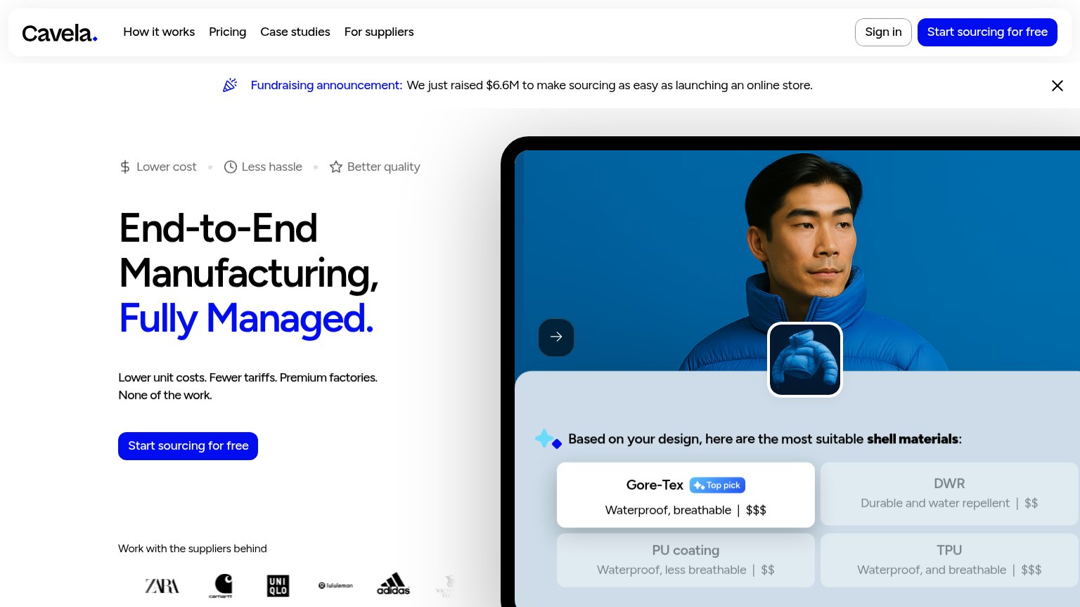
| Cavela | "Work with the suppliers behind" logo strip (ZARA, Carhartt, UNIQLO, lululemon, adidas) |
| Detailed container-quote product UI showing "Lock this price for 48 hours" with itemized tariffs, ocean freight, and cus | |
| Customer logo strip (Swoon, SLG, Gelmart, Beauty Pie) on the mobile capture | |
| Dashboard UI showing 'Exceptions' (Mechanical Delay, Under FDA Review) and 'SKUs in Transit' table with amounts, destina | |
| Integration icon diagram showing Shopify, Google, Slack, TikTok and Meta connections |
Mobile web
70FairThe phone experience as a first-class citizen.
 123
- Benefit strip — Overflows the viewport and clips 'Better quality' to 'Better qu' — a visible layout bug at the top of the fold.
- Fundraising announcement banner — Three lines of investor news with no conversion CTA push the headline and primary button down the fold.
- Start sourcing button — Desktop-proportioned width floating in the column; a near-full-bleed button would be easier to thumb.
Information hierarchy
80StrongDoes the design help or inhibit what the page is trying to say?
What works
What to improve
Value props
80StrongTitle, subtitle, hero — do they sell the product's true value?
Cavela’s headline
End-to-End Manufacturing, Fully Managed.
Lower unit costs. Fewer tariffs. Premium factories. None of the work.
Working
Could improve
CTA
86StrongCopy, size, verb, cost-feel — does the primary CTA earn the click?
How Cavela compares
Recommended rewrites