
Your landing page’s weakest score is Trust.
How Cherish Health ranks
55Growth scoreupdated
category scores
category scoresShowHide
Trust
36PoorProof that the product is real, competent, and safe to try.
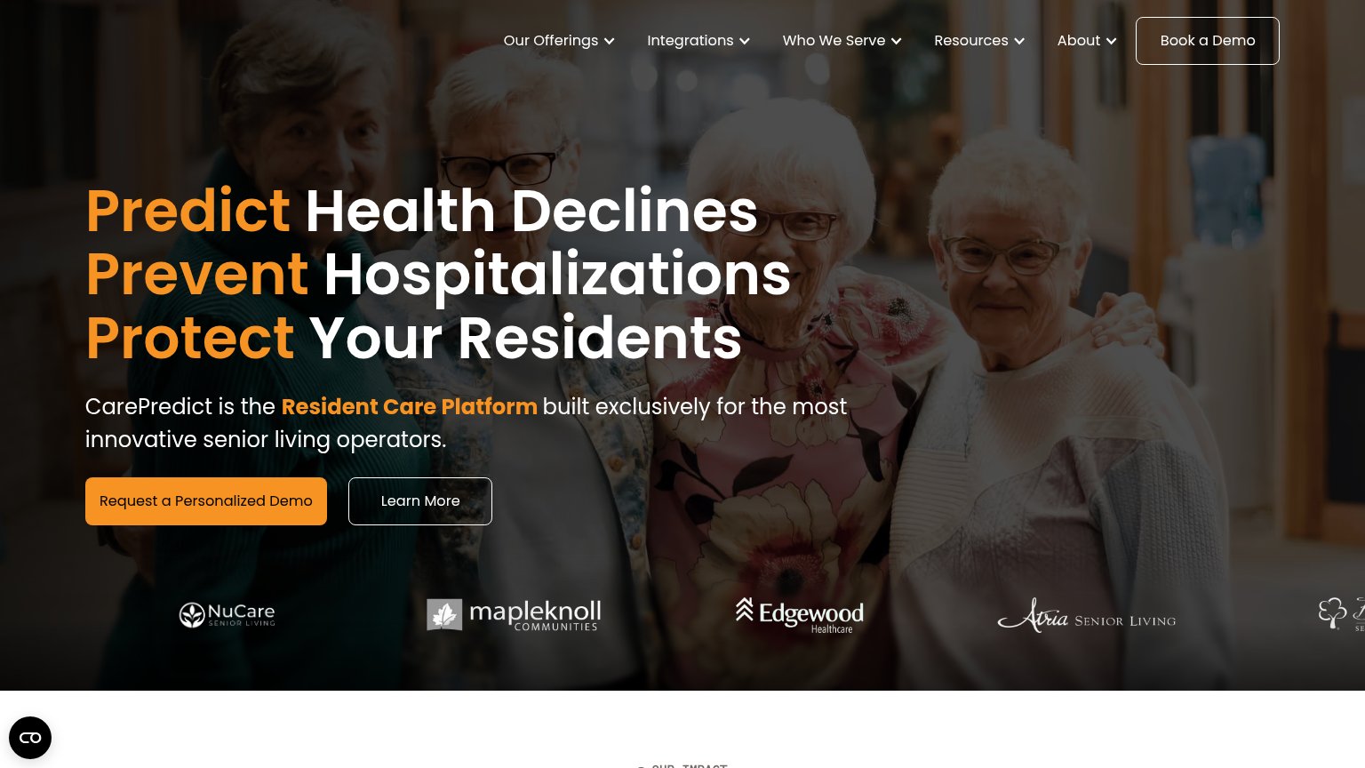
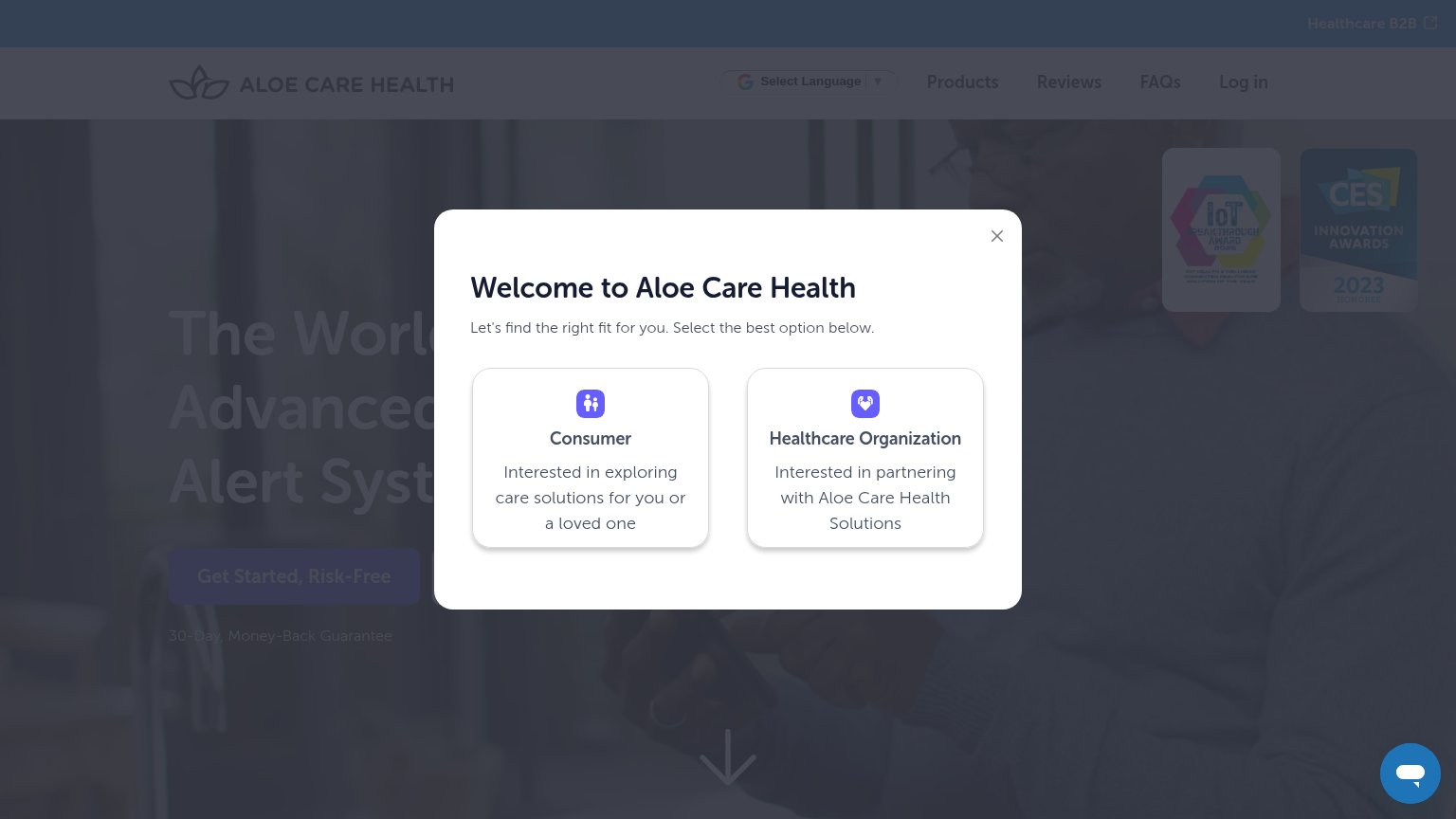
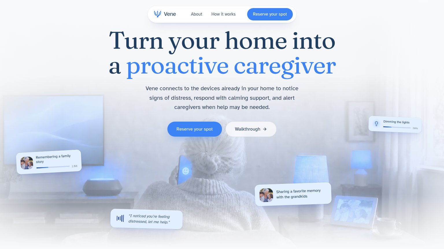
| Trust read | |
|---|---|
| Cherish Health | No visible trust signal identified. |
| Feature-UI card quoting the assistant: "I noticed you're feeling distressed, let me help." | |
| CES Innovation Awards 2023 badge (with adjacent IoT Breakthrough Award badge) | |
| No visible trust signal identified. | |
| Customer logo strip: NuCare Senior Living, Mapleknoll Communities, Edgewood Healthcare, Atria Senior Living |
Value props
46PoorTitle, subtitle, hero — do they sell the product's true value?
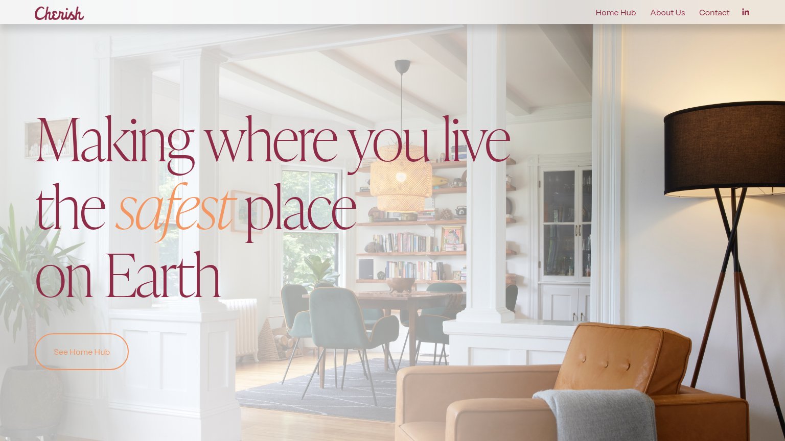
Cherish Health’s headline vague
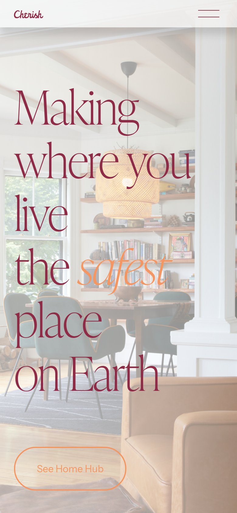
Making where you live the safest place on Earth
Working
- Taps safety emotion for aging-in-place buyers
- Warm, human home imagery sets the right tone
- "safest" emphasis signals the core promise
Could improve
- Never names the product or how it works
- No subhead, numbers, or proof points
- Hero photo decorates, doesn't demonstrate
CTA
62FairCopy, size, verb, cost-feel — does the primary CTA earn the click?
How Cherish Health compares
Recommended rewrites
Mobile web
63FairThe phone experience as a first-class citizen.
What works
What to improve
Information hierarchy
68FairDoes the design help or inhibit what the page is trying to say?
What works
What to improve