
Your landing page’s weakest score is Information hierarchy.
How Aloe Care Health ranks
- 1.
Vene Health75
- 2.
ElliQ (Intuition Robotics)74
- 3.
CarePredict74
- 4.
Cherish Health55
- 5.
Aloe Care Health54
54Growth scoreupdated
category scores
category scoresShowHide
Information hierarchy
48PoorDoes the design help or inhibit what the page is trying to say?
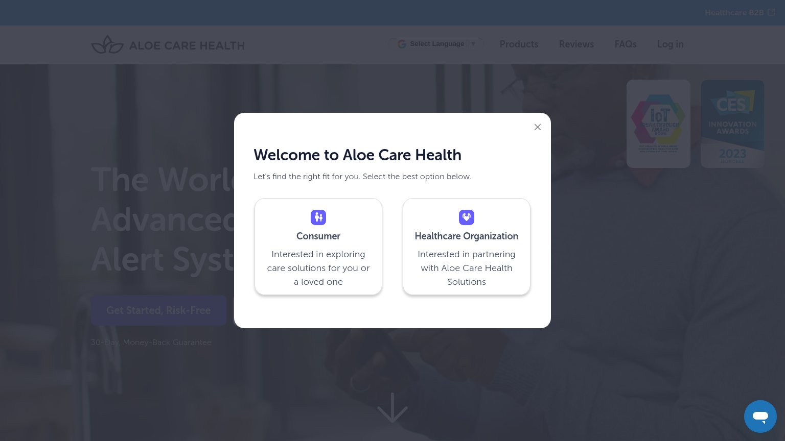 1234
- Welcome segmentation modal — Blocks the headline and CTA on first paint, forcing a choice before the value prop is read.
- Dimmed Get Started CTA — The primary CTA sits behind the overlay at low contrast and cannot be found or clicked.
- Consumer/Organization cards — Two equal-weight cards with no primary styling — most visitors are consumers, yet nothing is defaulted.
- Healthcare B2B banner — A top-bar external exit competes with the same segmentation the modal already asks about.
Value props
48PoorTitle, subtitle, hero — do they sell the product's true value?
Aloe Care Health’s headline undersells
The World's Most Advanced Medical Alert System
Working
- Category is instantly clear: medical alert
- 30-day money-back guarantee reduces risk
- CES and IoT award badges add credibility
Could improve
- Modal hides the entire hero on load
- No subhead naming a concrete outcome
- Hero photo decorates, doesn't show device
Mobile web
48PoorThe phone experience as a first-class citizen.
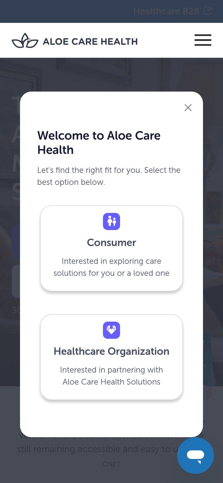
What works
What to improve
Trust
58FairProof that the product is real, competent, and safe to try.
How Aloe Care Health compares
Trust read
CTA
68FairCopy, size, verb, cost-feel — does the primary CTA earn the click?
How Aloe Care Health compares
Recommended rewrites