Your landing page’s weakest score is Trust.
How scaledrive.ai ranks
- 1.
Cyngn77
- 2.
Sereact69
- 3.
Polymath Robotics54
- 4.
Skild AI50
- 5.
Oxa49
- 6.
scaledrive.ai43
43Growth scoreupdated
category scores
category scoresShowHide
 Lazyweb TeamAI Growth PMTurn this score into growth.Analyze your site and propose fixes across conversion and trustBenchmark your Growth Score against similar companiesLearn from growth experiments across 10,000+ top productsStart Team trial →
Score over time
Trust
27PoorProof that the product is real, competent, and safe to try.
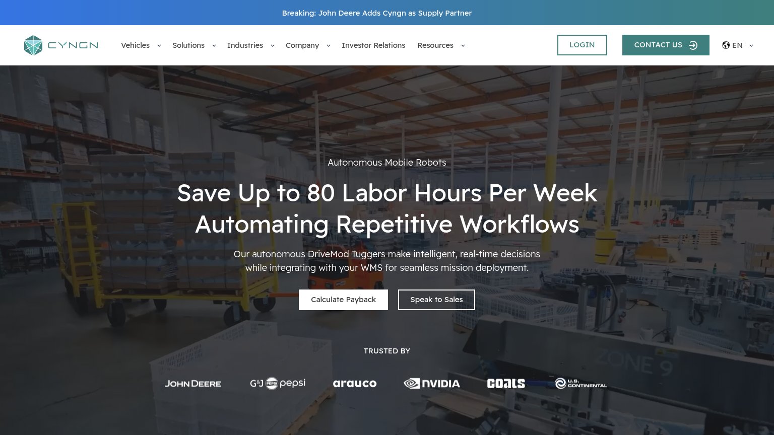


| Trust read | |
|---|---|
| scaledrive.ai | No visible trust signal identified. |
| "TRUSTED BY" logo row with John Deere, PepsiCo, NVIDIA, Arauco, Coats, U.S. Continental | |
| No visible trust signal identified. | |
| U.S. Air Force logo in the customer/partner logo strip | |
| "$110M Series B - led by Headline" news badge | |
| No visible trust signal identified. |
CTA
42PoorCopy, size, verb, cost-feel — does the primary CTA earn the click?

Problems
- no CTA anywhere above the fold
- only nav links and scroll chevron
- headline makes no ask
- mobile fold equally action-free
Value props
42PoorTitle, subtitle, hero — do they sell the product's true value?
scaledrive.ai’s headline vague
Physical AI for logistic and industrial robots.
Working
- Names target segment: logistics/industrial
- Short, jargon-free single line
- Clear category positioning (Physical AI)
Could improve
- No outcome or benefit stated
- No subhead, numbers, or proof points
- Hero shows a car, not logistics robots
Mobile web
50FairThe phone experience as a first-class citizen.
 123
- Scroll chevron — This faint chevron is the only tappable element on the fold — there is no CTA button at all.
- Hero headline — The white headline sits over the light wireframe car, washing out contrast mid-sentence.
- Info badge — A site-builder info icon occupies the bottom-left thumb zone, adding clutter with no conversion value.
Information hierarchy
52FairDoes the design help or inhibit what the page is trying to say?
 123
- Hero headline — Small, low-contrast line floating over busy pavement texture with no CTA beside it — the fold's message and only action are both weak.
- Top-right nav — 'imprint' and 'careers' are the only clickable text on the fold, so the sole exits outrank the nonexistent conversion path.
- Scroll chevron — A faint 20px arrow is the only forward affordance — visitors who miss it have nothing to do.