
Your landing page’s weakest score is Mobile web.
How Cyngn ranks
77Growth scoreupdated
category scores
category scoresShowHide
Mobile web
68FairThe phone experience as a first-class citizen.
 1234
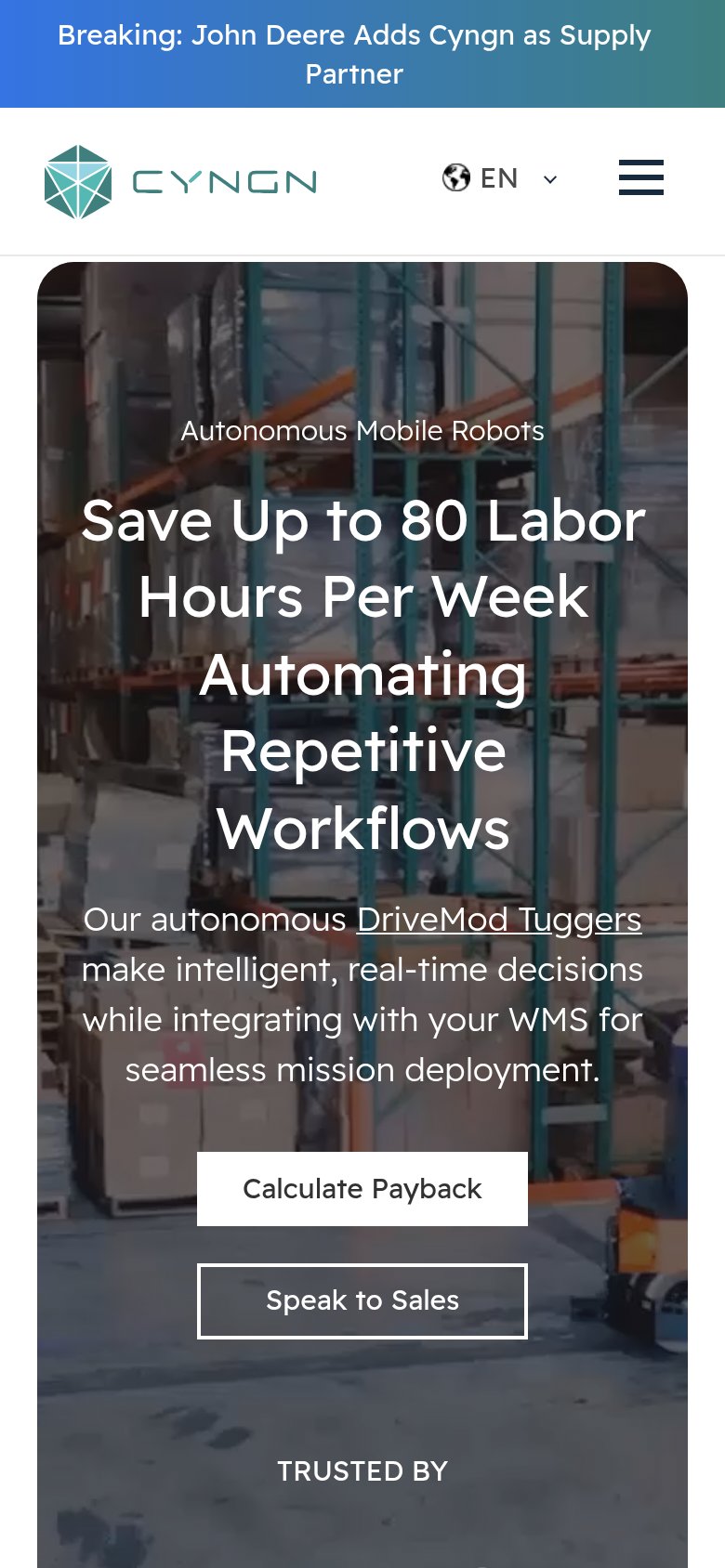
- Six-line hero headline — Desktop headline scaled down too little and wraps into six lines, consuming most of the fold before the CTA.
- Calculate Payback button — Desktop-proportioned button floats at half the column width instead of a full-bleed, thumb-friendly tap target.
- Speak to Sales button — Transparent outline over the busy warehouse image gives it weak contrast and it competes with the button above.
- Breaking news banner — Two-line sticky promo bar with no conversion CTA burns the top slice of the first viewport.
Information hierarchy
76FairDoes the design help or inhibit what the page is trying to say?
 1234
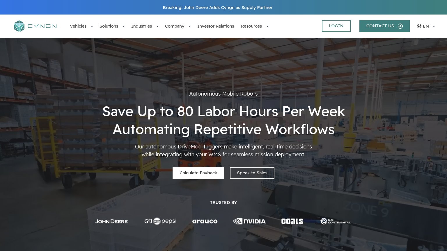
- Speak to Sales button — Styled at near-equal weight beside 'Calculate Payback', splitting the primary action into two competing targets.
- Navigation bar — Six dropdowns plus Login, language switcher, and Contact Us create ten exit paths before the hero CTA.
- DriveMod Tuggers link — Underlined inline link inside the subheadline invites an exit mid-pitch, before the visitor reaches the CTAs.
- Contact Us button — Filled teal nav button outweighs the hero's white CTAs, pulling the sales action out of the scan path.
CTA
77FairCopy, size, verb, cost-feel — does the primary CTA earn the click?
How Cyngn compares
Recommended rewrites
Trust
80StrongProof that the product is real, competent, and safe to try.
How Cyngn compares
Trust read
Value props
86StrongTitle, subtitle, hero — do they sell the product's true value?
Cyngn’s headline
Save Up to 80 Labor Hours Per Week Automating Repetitive Workflows
Our autonomous DriveMod Tuggers make intelligent, real-time decisions while integrating with your WMS for seamless mission deployment.
Working
Could improve