Your landing page’s weakest score is Trust.
How Collaborators Inc. ranks
- 1.
Replit82
- 2.
Devin (Cognition)77
- 3.
Cursor75
- 4.
Warp73
- 5.
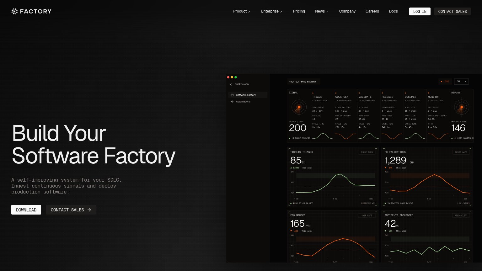
Factory68
- 6.
Collaborators Inc.60
60Growth scoreupdated
category scores
category scoresShowHide
 Lazyweb TeamAI Growth PMTurn this score into growth.Analyze your site and propose fixes across conversion and trustBenchmark your Growth Score against similar companiesLearn from growth experiments across 10,000+ top productsStart Team trial →
Score over time
Trust
28PoorProof that the product is real, competent, and safe to try.
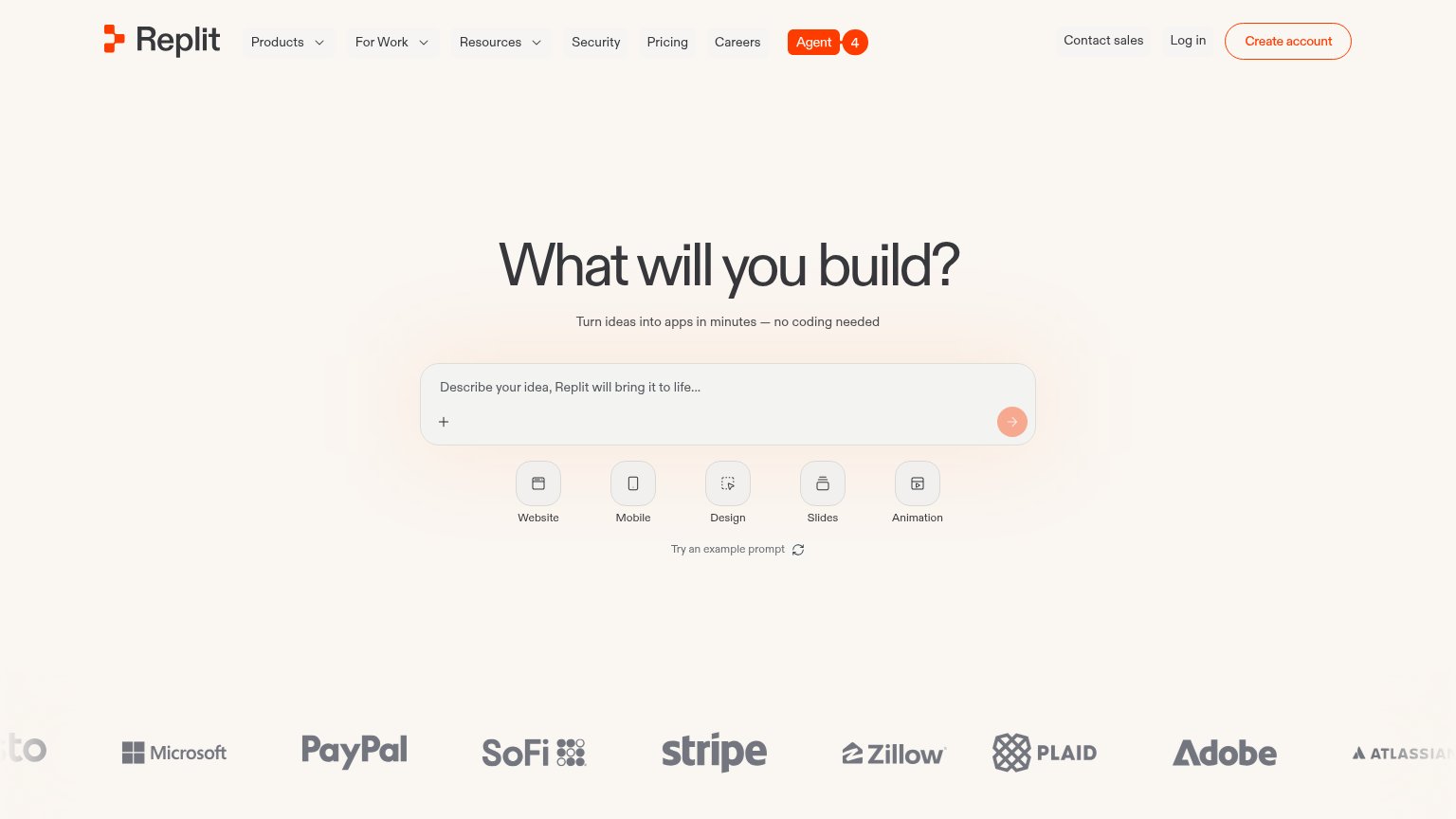
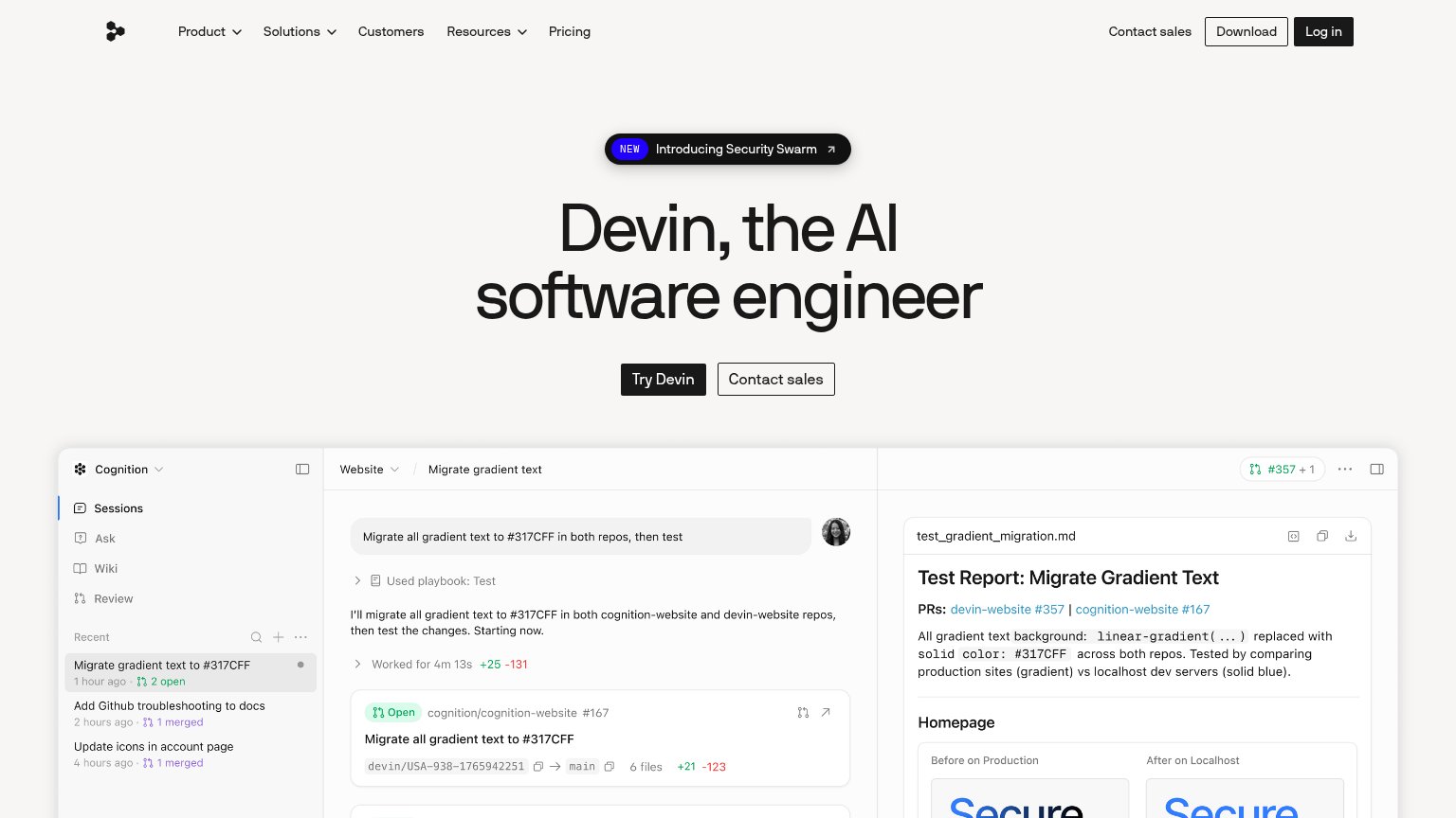
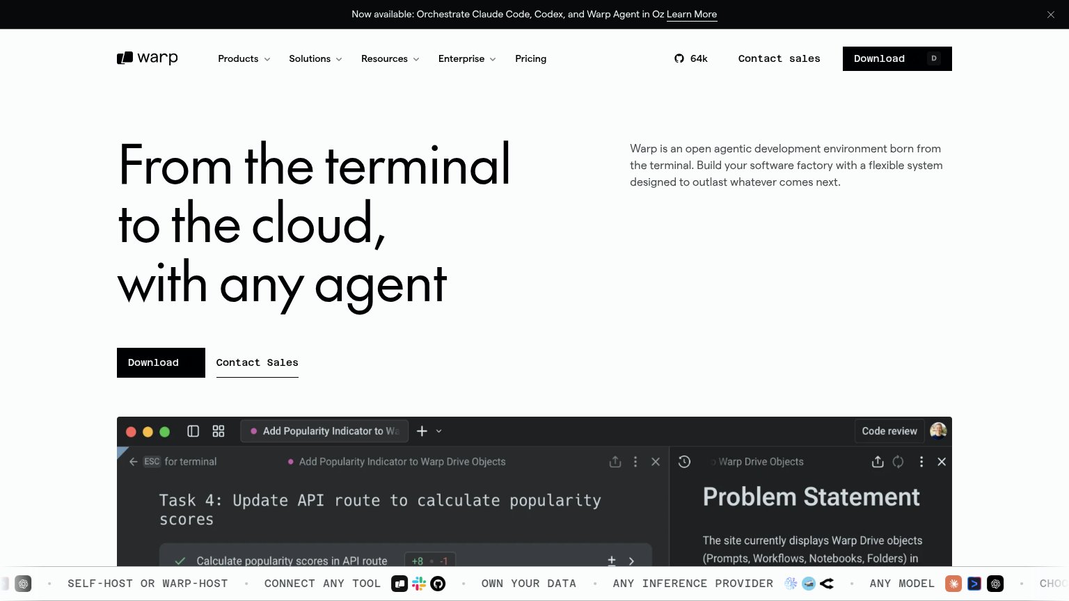
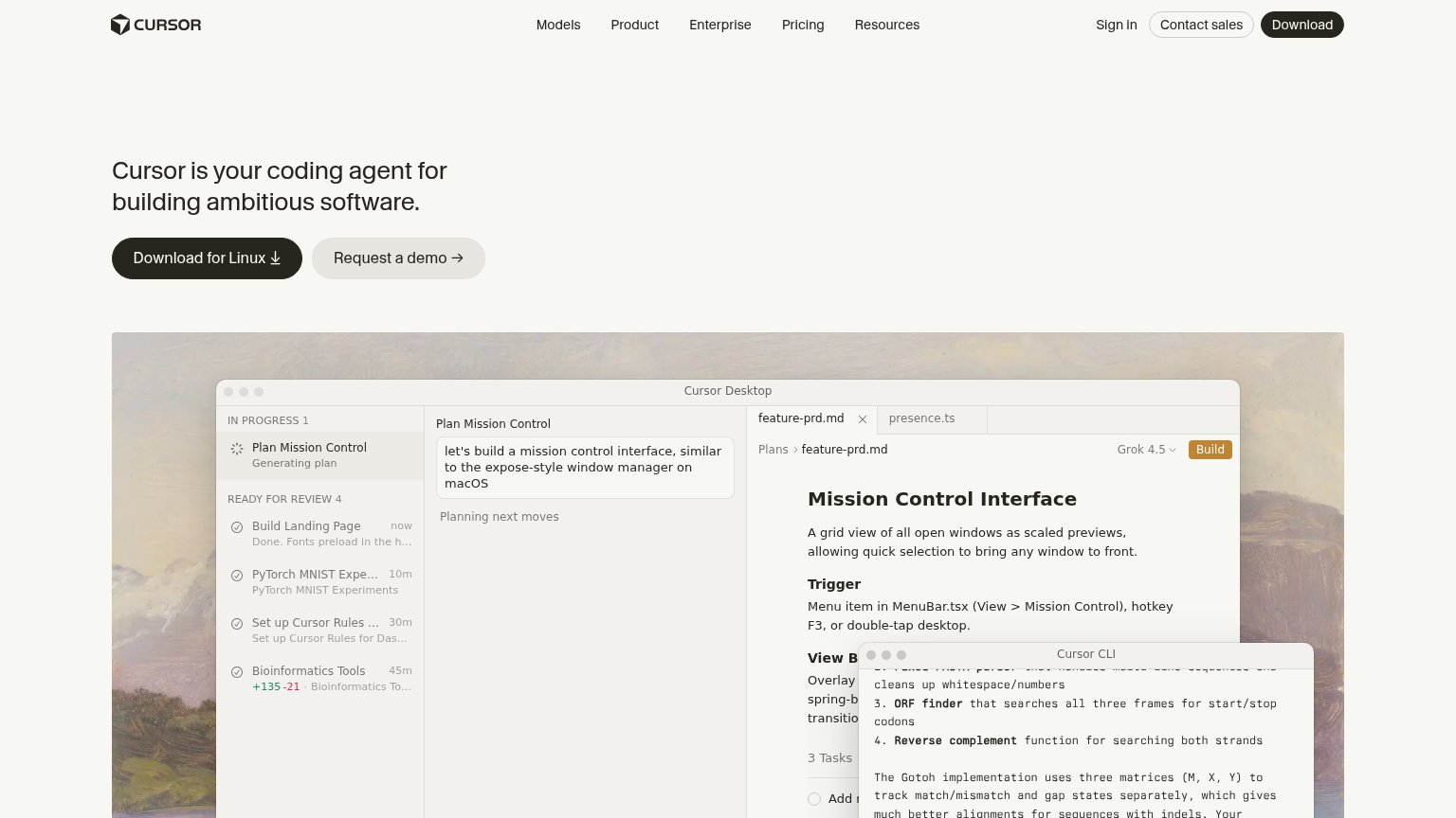
| Trust read | |
|---|---|
| Collaborators Inc. | No visible trust signal identified. |
| Detailed 'Cursor Desktop' product UI showing the 'Plan Mission Control' agent workflow and Cursor CLI output | |
| Embedded Devin session demo showing the task "Migrate all gradient text to #317CFF in both repos, then test" with real P | |
| No visible trust signal identified. | |
| "64k" GitHub star count in the desktop nav | |
| Customer logo wall featuring Microsoft, PayPal, SoFi, Stripe, Zillow, Plaid, Adobe, and Atlassian |
Value props
40PoorTitle, subtitle, hero — do they sell the product's true value?
Collaborators Inc.’s headline vague
Collaborator
A place to build with agents.
Working
- Clean, memorable one-line premise
- Zero jargon or buzzword stacking
- Dual CTA covers waitlist and download
Could improve
- No outcome or use case named
- No visual showing the product working
- 'A place' could caption any tool
CTA
72FairCopy, size, verb, cost-feel — does the primary CTA earn the click?
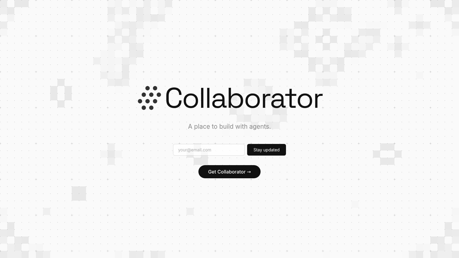
Problems
- competes with equal-weight 'Stay updated'
- payoff unclear: download or signup?
- no 'free' or price signal
Information hierarchy
74FairDoes the design help or inhibit what the page is trying to say?
12- Stay updated button — Same black weight as Get Collaborator and higher in the scan path, so the visitor cannot tell which action is primary.
- Get Collaborator button — The presumed primary action sits last, floating alone with no visual cue that it outranks the email capture above it.
Mobile web
84StrongThe phone experience as a first-class citizen.
 123
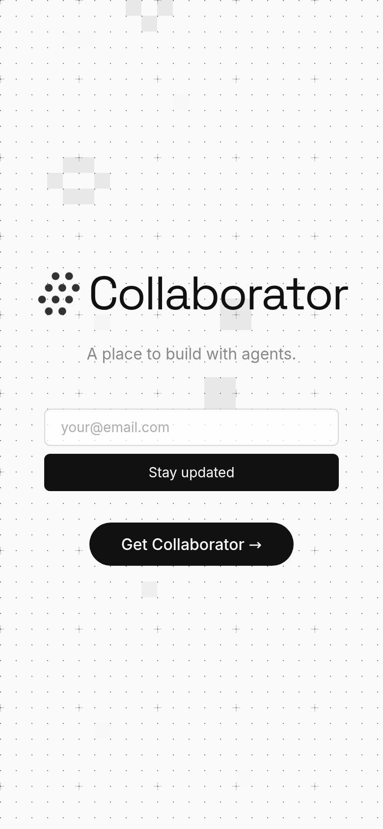
- Stay updated button — Full-width black styling makes the newsletter capture look like the primary action, outranking the product CTA.
- Get Collaborator button — The real primary CTA is narrower and pushed below the email form, inverting the tap hierarchy.
- Email input placeholder — Light-gray placeholder is the only label; it disappears on focus and is hard to read at arm's length.
Competitors
inferred from product, audience, and value prop#1Replitreplit.com82
#2Devin (Cognition)devin.ai77
#3Cursorcursor.com75
#4Warpwarp.dev73
#5Factoryfactory.ai68
#6Collaborators Inc.60