
Your landing page’s weakest score is Trust.
How Replit ranks
82Growth scoreupdated
category scores
category scoresShowHide
Trust
74FairProof that the product is real, competent, and safe to try.
| Trust read | |
|---|---|
| Replit | Customer logo wall featuring Microsoft, PayPal, SoFi, Stripe, Zillow, Plaid, Adobe, and Atlassian |
| From University of Oxford / Backed by Y Combinator badge strip | |
| Functional AI prompt box with Figma and GitHub import options showing real product entry points | |
| Template gallery with real community usage counts — "Image Generation Playground · 6.6K · 734" | |
| Gallery of generated example websites (e.g. "PICKLA" storefront) beneath the Apps/[Websites]/Games/Tools filter |
Information hierarchy
80StrongDoes the design help or inhibit what the page is trying to say?
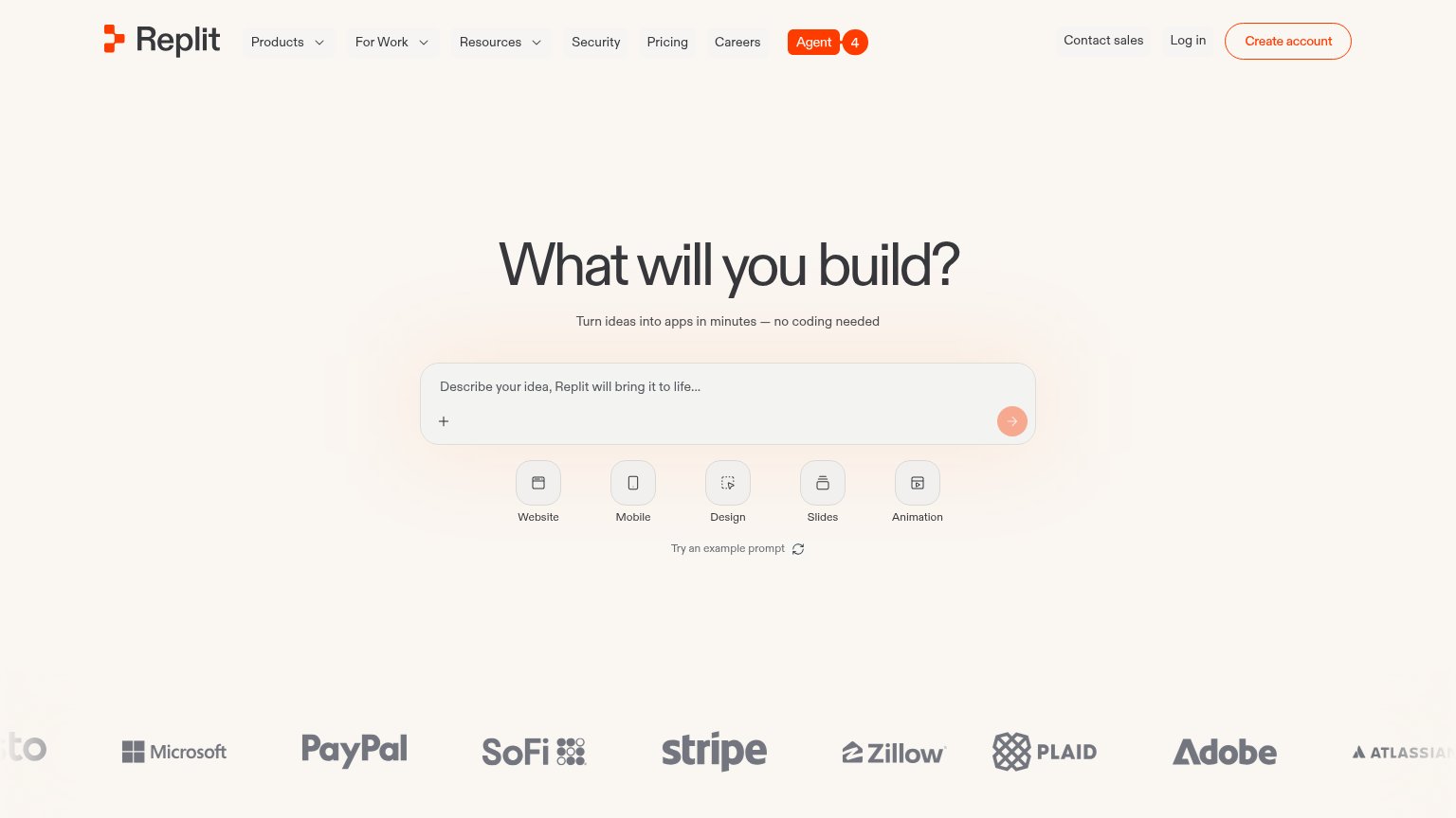 1234
- Nav link row — Nine equal-weight exits sit above the prompt box, leaking attention before the one action the page wants.
- Submit arrow button — The pale peach arrow inside the prompt reads as disabled, hiding the affordance that completes the primary action.
- Agent nav pill — The only saturated orange fill in the fold is a nav link, so the brand's action color points away from the conversion surface.
- Five mode chips — Five same-weight chips beneath the input add a choice step before typing, diluting the single-prompt invitation.
Value props
82StrongTitle, subtitle, hero — do they sell the product's true value?
Replit’s headline
What will you build?
Turn ideas into apps in minutes — no coding needed
Working
Could improve
CTA
85StrongCopy, size, verb, cost-feel — does the primary CTA earn the click?
How Replit compares
Recommended rewrites
Mobile web
90StrongThe phone experience as a first-class citizen.

What works
What to improve