
Your landing page’s weakest score is Trust.
How Voze ranks
Trust
52FairProof that the product is real, competent, and safe to try.
| Trust read | |
|---|---|
| Voze | No visible trust signal identified. |
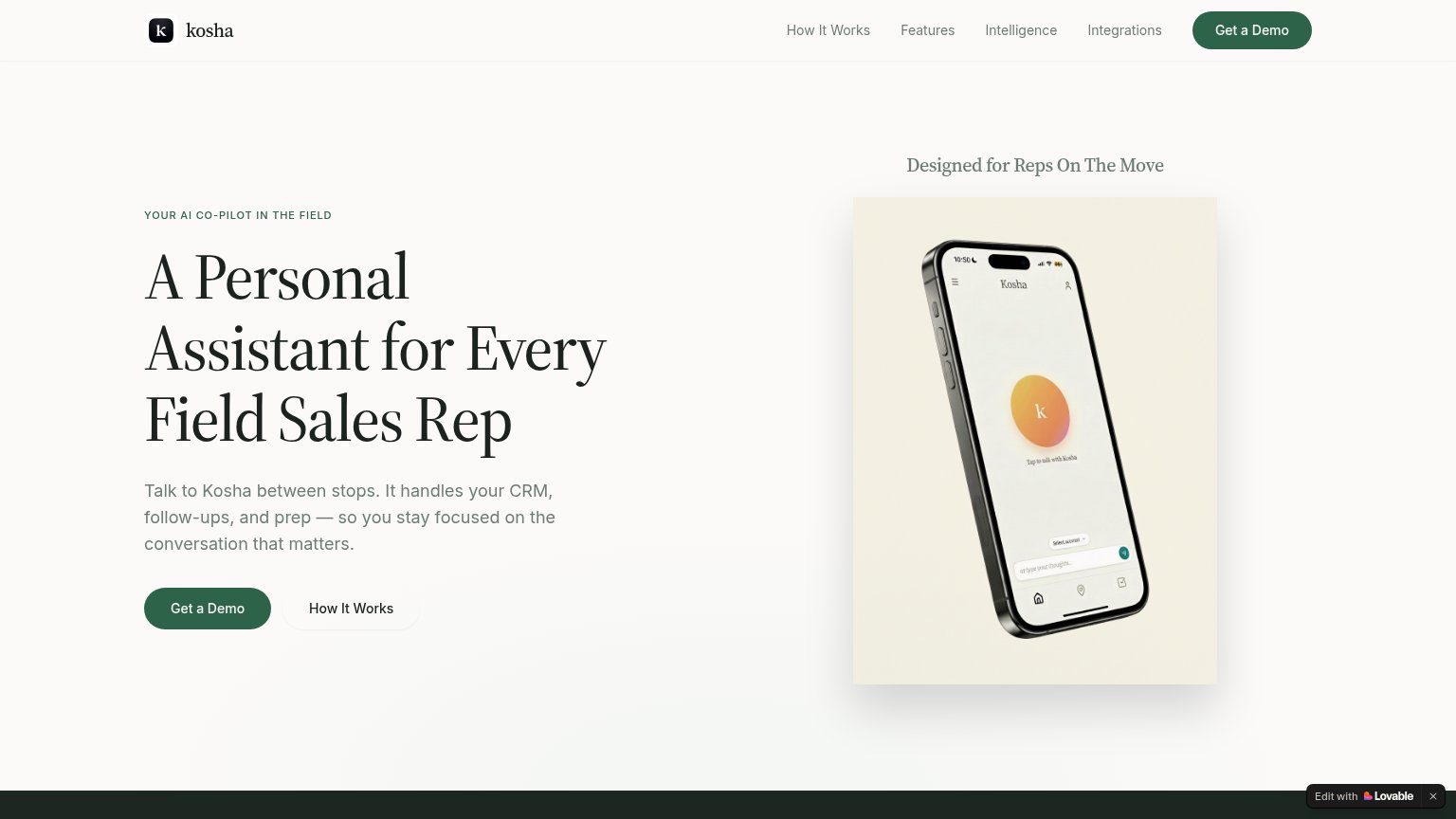
| Phone mockup of the Kosha app showing "Tap to talk with Kosha" | |
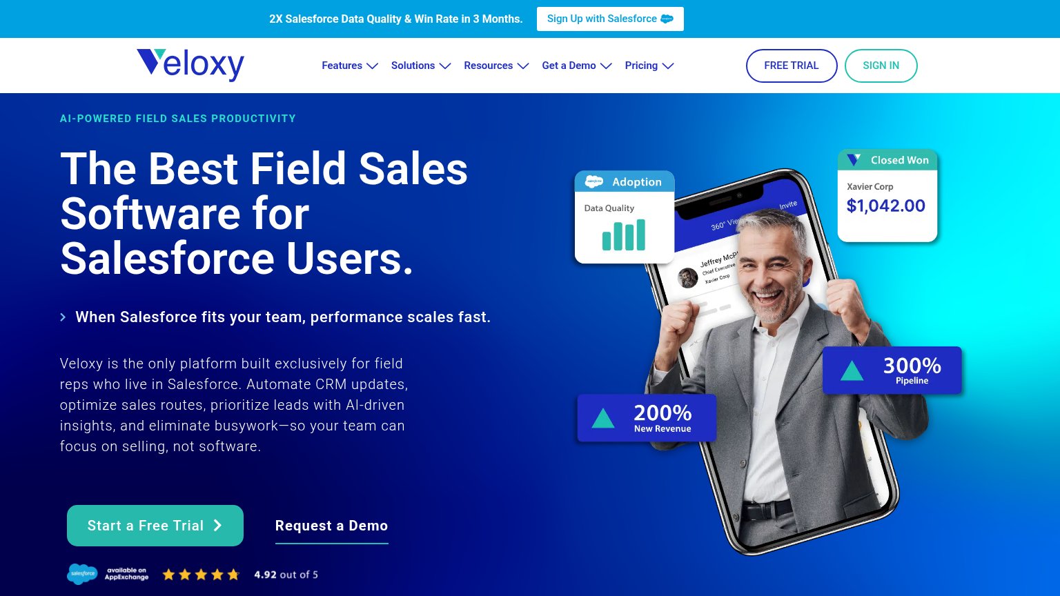
| Salesforce AppExchange rating "4.92 out of 5" with five stars below the CTA | |
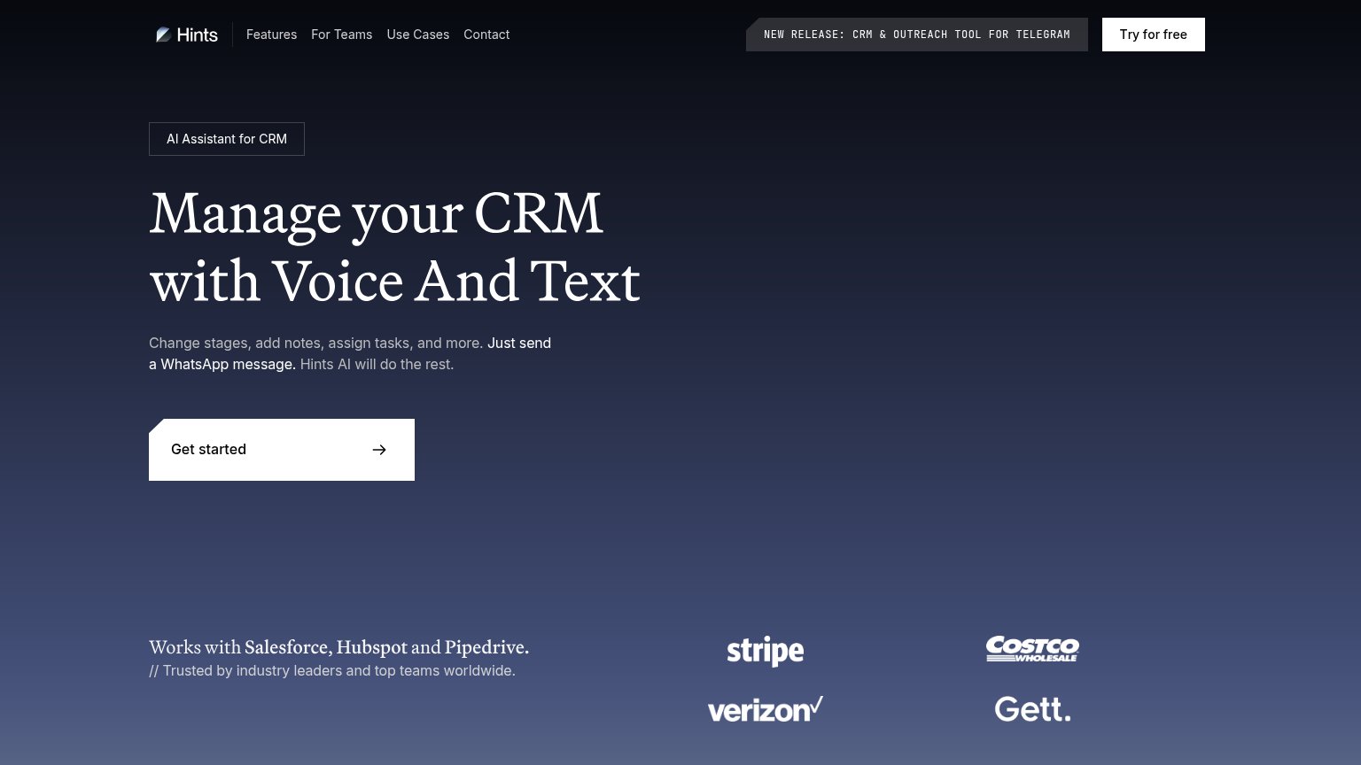
| Customer logo wall (Stripe, Verizon, Costco Wholesale, Gett) under "Trusted by industry leaders and top teams worldwide. | |
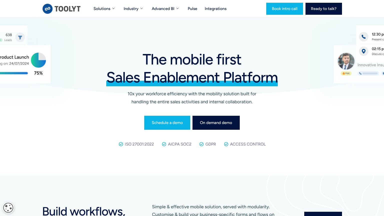
| ISO 27001:2022 / AICPA SOC2 / GDPR / ACCESS CONTROL badge row beneath the CTAs |
CTA
68FairCopy, size, verb, cost-feel — does the primary CTA earn the click?

Problems
- booking a call feels costly
- no hero CTA in desktop fold
- no low-friction path on desktop
Information hierarchy
72FairDoes the design help or inhibit what the page is trying to say?
What works
What to improve
Value props
86StrongTitle, subtitle, hero — do they sell the product's true value?
Voze’s headline
The system every rep opens before the visit. And talks into after.
Because the only software reps use is the software they want to.
Working
Could improve
Mobile web
86StrongThe phone experience as a first-class citizen.

What works
What to improve