
Your landing page’s weakest score is Trust.
How Trellus ranks
Trust
56FairProof that the product is real, competent, and safe to try.
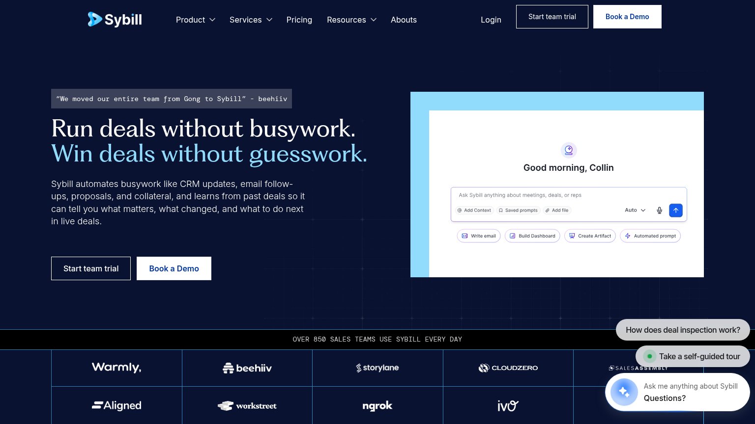
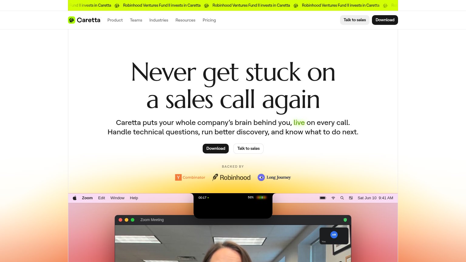
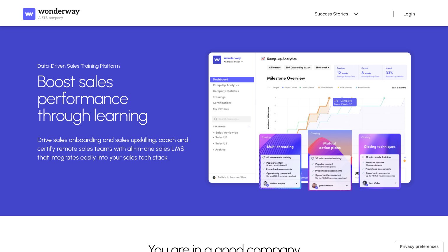
| Trust read | |
|---|---|
| Trellus | No visible trust signal identified. |
| "BACKED BY" row with Y Combinator, Robinhood, and Long Journey logos | |
| “We moved our entire team from Gong to Sybill” - beehiiv | |
| Detailed product dashboard screenshot showing "Ramp-up Analytics" with milestone charts and training cards ("Multi-threa | |
| Product UI mockup showing "Conversation Data Sources" with Gmail, Slack, and Teams integrations and an opportunity panel | |
| "4.9 stars G2.com" rating badge in the desktop hero |
Mobile web
68FairThe phone experience as a first-class citizen.
 123
- Integration logo grid — Eleven stacked tiles consume most of the fold and push the subhead and CTA to the bottom edge.
- Hero headline — Ends mid-sentence at 'inside of' — the rotating word from desktop never renders on mobile.
- Try for free CTA — Clipped at the bottom of the first viewport, so the primary action is barely tappable without scrolling.
Information hierarchy
72FairDoes the design help or inhibit what the page is trying to say?

What works
What to improve
Value props
80StrongTitle, subtitle, hero — do they sell the product's true value?
Trellus’s headline
Power & Parallel Dial directly inside of →
4x your conversations, drill down deeper into call analytics, and practice with AI.
Working
Could improve
CTA
88StrongCopy, size, verb, cost-feel — does the primary CTA earn the click?
How Trellus compares
Recommended rewrites