
Your landing page’s weakest score is Information hierarchy.
How Transect ranks
76Growth scoreupdated
category scores
category scoresShowHide
Information hierarchy
72FairDoes the design help or inhibit what the page is trying to say?
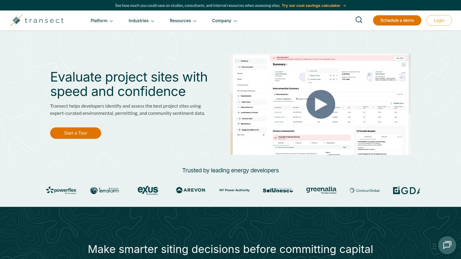 1234
- Schedule a demo button — Solid dark button reads as a second primary CTA, splitting attention with 'Start a Tour' in the hero.
- Cost savings banner — Orange 'Try our cost savings calculator' link is the first clickable element and routes visitors away before they read the value prop.
- Video play button — Muted gray-blue play circle over a dense screenshot barely reads as clickable, weakening the fold's second engagement path.
- Right-edge logo cropped — The GDA logo is cut off mid-letter at the viewport edge, making the trust strip look broken.
Trust
72FairProof that the product is real, competent, and safe to try.
| Trust read | |
|---|---|
| Transect | "Trusted by leading energy developers" logo strip with Arevon, NY Power Authority, ContourGlobal, TerraForm Power |
| "We raised $1.3 million from a16z Speedrun to build the execution layer for large-load energy" | |
| "Trusted by" logo wall with Ørsted, ENGIE, Invenergy, Brookfield, Pattern, Doral, Avangrid, Scout Clean Energy | |
| "MISO COLLABORATION" navigation item | |
| Banner: "Access the webinar on demand: AI in energy development." |
CTA
78FairCopy, size, verb, cost-feel — does the primary CTA earn the click?
How Transect compares
Recommended rewrites
Mobile web
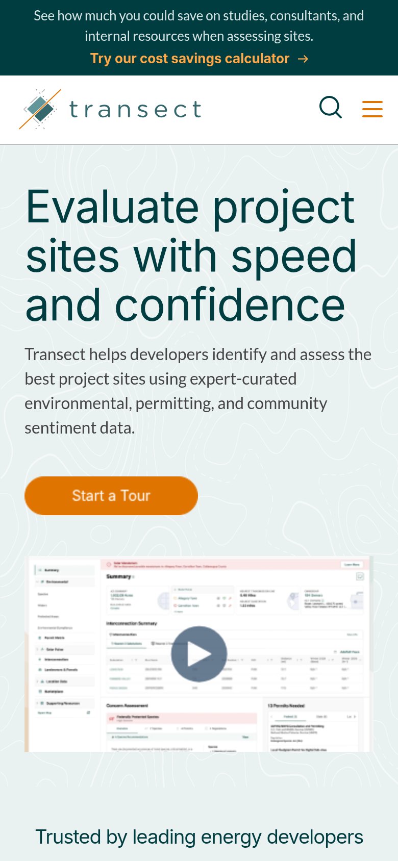
78FairThe phone experience as a first-class citizen.
What works
What to improve
Value props
80StrongTitle, subtitle, hero — do they sell the product's true value?
Transect’s headline
Evaluate project sites with speed and confidence
Transect helps developers identify and assess the best project sites using expert-curated environmental, permitting, and community sentiment data.
Working
Could improve