
Your landing page’s weakest score is Value props.
How Together AI ranks
73Growth scoreupdated
category scores
category scoresShowHide
Value props
56FairTitle, subtitle, hero — do they sell the product's true value?
Together AI’s headline vague
Build what's next on the AI Native Cloud
Full-stack AI platform, powered by cutting-edge research.
Working
- Elite logo strip: Cohere, DeepMind, ElevenLabs
- Graphic labels name real capabilities
- 'AI Native Cloud' stakes a clear category
Could improve
- Zero numbers or concrete outcomes in copy
- 'Build what's next' fits any dev product
- Hero art decorates, never shows product
Information hierarchy
72FairDoes the design help or inhibit what the page is trying to say?
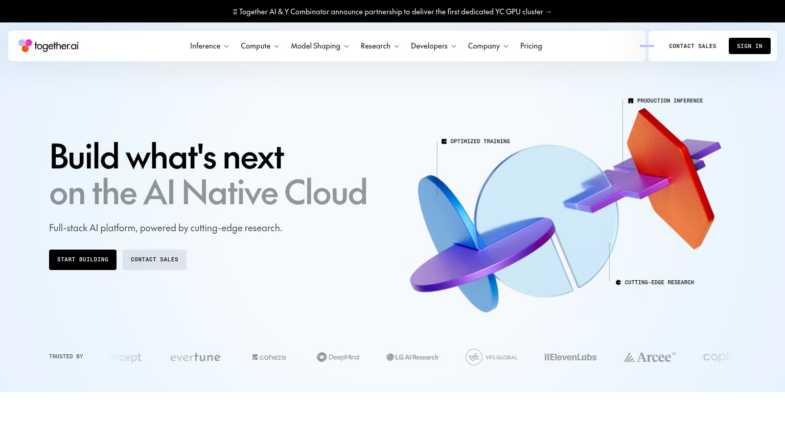 1234
- Nav dropdown row — Seven dropdown menus plus Pricing offer more exits than the hero offers actions, leaking attention before the headline lands.
- Sign In button — Filled black styling matches the primary "START BUILDING" button, splitting the visual hierarchy between two competing black buttons.
- Hero Contact Sales — Duplicates the "CONTACT SALES" already in the nav, doubling the same exit within one viewport.
- Announcement banner — The YC partnership link is the first clickable element on the page and pulls visitors off-page before the value prop is read.
Trust
72FairProof that the product is real, competent, and safe to try.
How Together AI compares
Trust read
CTA
81StrongCopy, size, verb, cost-feel — does the primary CTA earn the click?
How Together AI compares
Recommended rewrites
Mobile web
84StrongThe phone experience as a first-class citizen.

What works
What to improve