
Your landing page’s weakest score is Value props.
How Talkie ranks
52Growth scoreupdated
category scores
category scoresShowHide
Value props
44PoorTitle, subtitle, hero — do they sell the product's true value?
Talkie’s headline vague
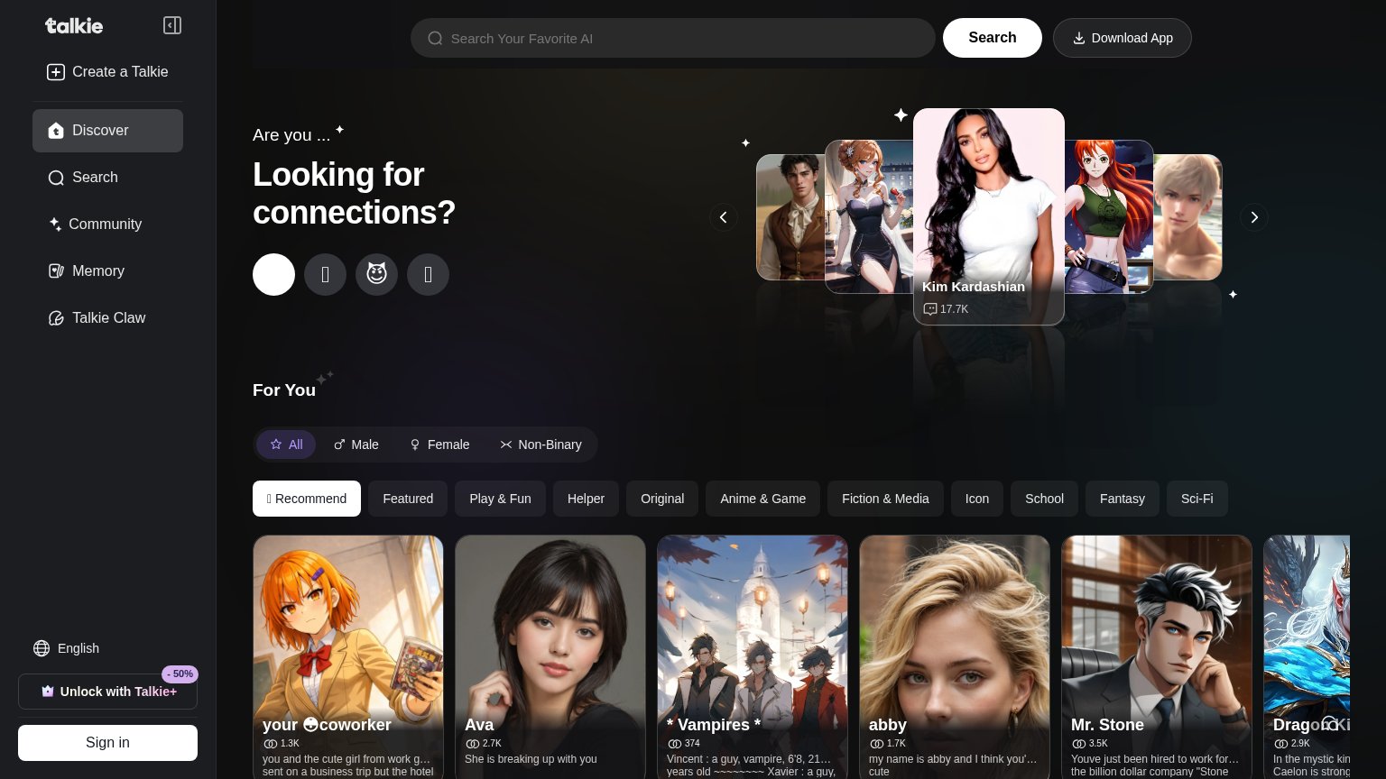
Are you ... Looking for connections?
Working
- Carousel shows real characters doing the job
- Chat counts (17.7K) add proof on cards
- Emotional hook toward loneliness/connection
Could improve
- Headline never says AI or chat
- No subhead to add specifics
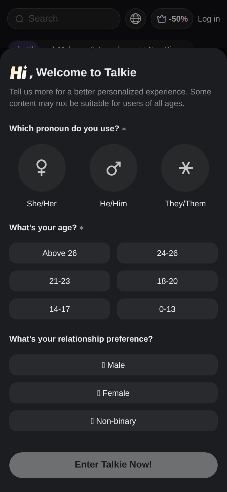
- Mobile fold hides value behind signup gate
Information hierarchy
47PoorDoes the design help or inhibit what the page is trying to say?
 1234
- Download App button — The closest thing to a primary CTA is a low-contrast pill in the corner, indistinguishable in weight from 'Search' and 'Sign in'.
- Sidebar navigation — Six always-visible links (Discover, Search, Community, Memory, Talkie Claw, Create) drain attention before any action is taken.
- Category chip row — Eleven same-weight filter chips stack under four gender tabs, forcing a taxonomy decision before the value prop lands.
- Hero headline block — 'Looking for connections?' has no button beneath it, so the fold's one message dead-ends with nothing to click.
Trust
50FairProof that the product is real, competent, and safe to try.
How Talkie compares
Trust read
Mobile web
55FairThe phone experience as a first-class citizen.
What works
What to improve
CTA
63FairCopy, size, verb, cost-feel — does the primary CTA earn the click?
How Talkie compares
Recommended rewrites