
Your landing page’s weakest score is Trust.
How PreMan ranks
68Growth scoreupdated
category scores
category scoresShowHide
Trust
62FairProof that the product is real, competent, and safe to try.
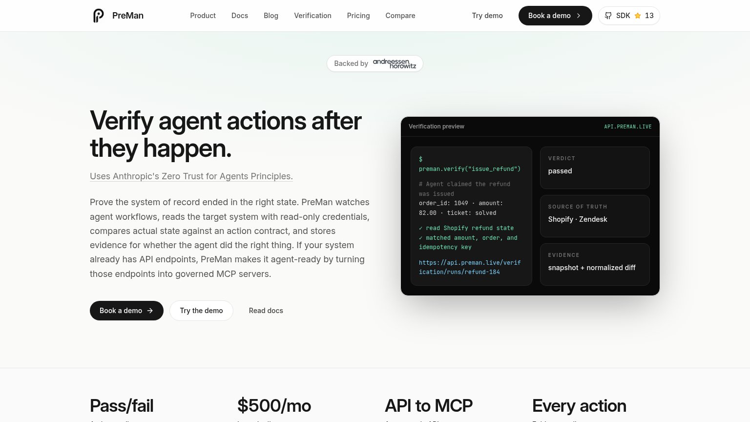
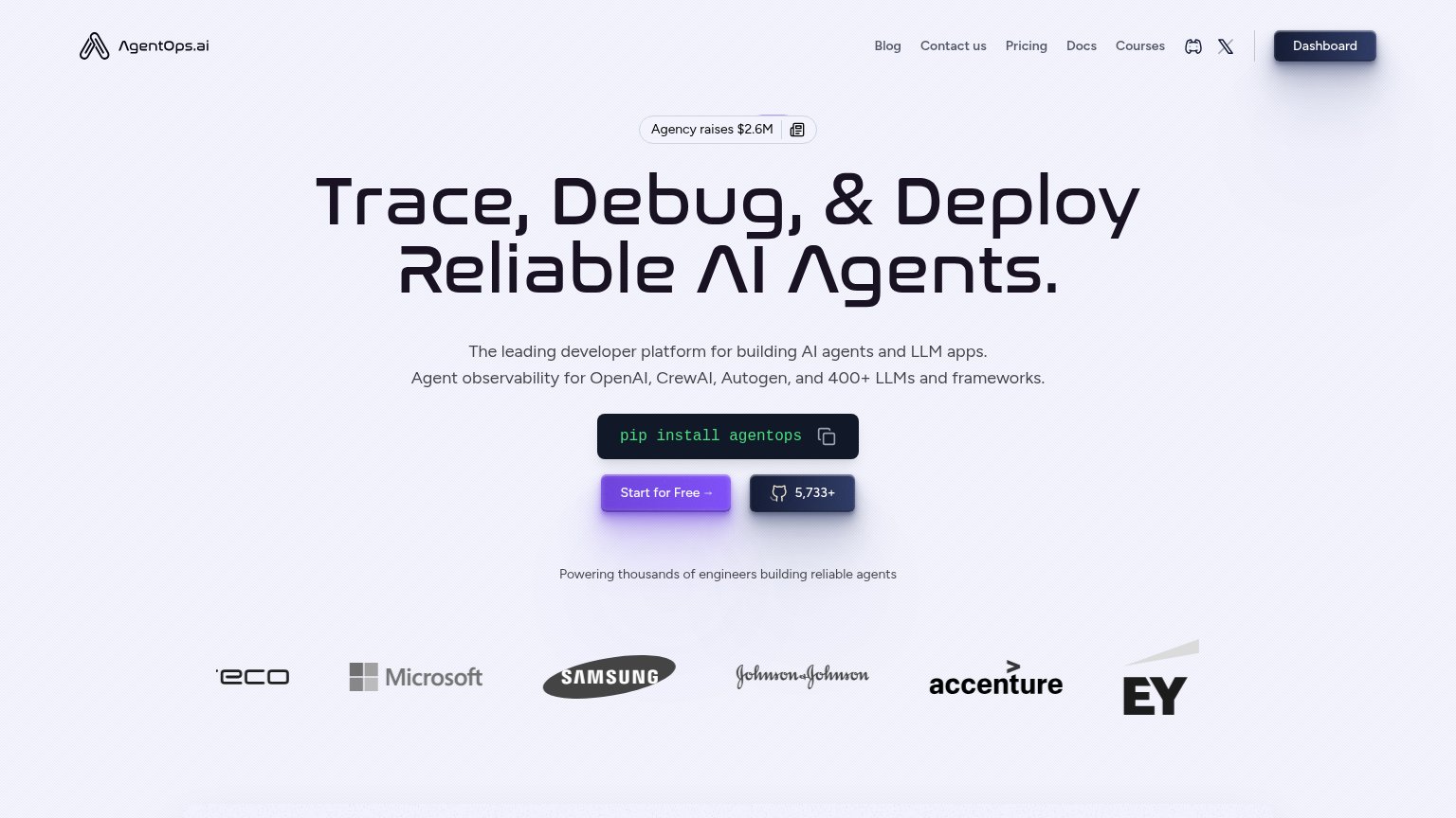
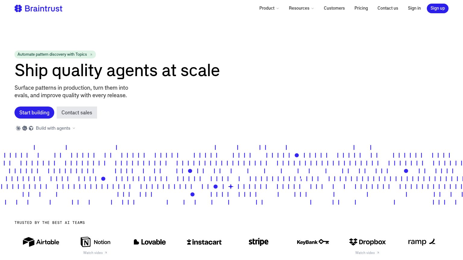
| Trust read | |
|---|---|
| PreMan | "Backed by Andreessen Horowitz" badge above the hero |
| 'Interrupt is coming to London & NYC in the fall!' conference banner | |
| Logo bar with Microsoft, Samsung, Johnson & Johnson, Accenture, and EY under "Powering thousands of engineers building r | |
| "TRUSTED BY THE BEST AI TEAMS" logo wall (Airtable, Notion, Stripe, Instacart, Dropbox, Ramp) | |
| "Galileo is now part of Cisco" banner with Cisco logo |
Information hierarchy
64FairDoes the design help or inhibit what the page is trying to say?
1234- Navigation link row — Six links plus Try demo and the SDK badge give attention nine exits before the hero CTA is even read.
- Hero body paragraph — Six lines of unbroken prose is a text wall that buries the argument the headline just made.
- Triple CTA cluster — Book a demo, Try the demo, and Read docs sit side by side, splitting intent three ways at the decision point.
- Feature header row — Four same-weight headlines (Pass/fail, $500/mo, API to MCP, Every action) shout at once inside the fold.
CTA
68FairCopy, size, verb, cost-feel — does the primary CTA earn the click?
How PreMan compares
Recommended rewrites
Mobile web
68FairThe phone experience as a first-class citizen.
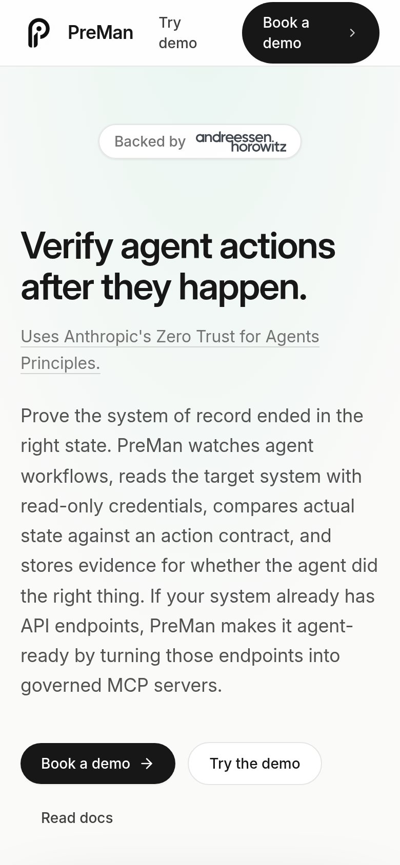
What works
What to improve
Value props
79FairTitle, subtitle, hero — do they sell the product's true value?
PreMan’s headline
Verify agent actions after they happen.
Uses Anthropic's Zero Trust for Agents Principles.
Working
Could improve