
Your landing page’s weakest score is Trust.
How Mountain Duck ranks
Trust
48PoorProof that the product is real, competent, and safe to try.


| Trust read | |
|---|---|
| Mountain Duck | "Trial version… No admin privileges required for installation." note beneath the download buttons |
| No visible trust signal identified. | |
| "Instant access to large files" product panel showing the LucidLink workspace and Drives UI with file sizes (7 GB, 16 GB | |
| implicit context Dropbox may benefit from pre-existing familiarity among its target audience. | |
| implicit context Google Drive for desktop may benefit from pre-existing familiarity among its target audience. | |
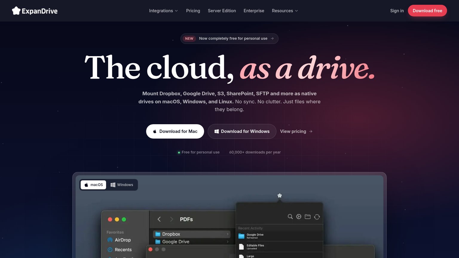
| 60,000+ downloads per year |
Mobile web
52FairThe phone experience as a first-class citizen.
 123
- Giant duck icon — Fills most of the first viewport and pushes the Download CTA fully off-screen.
- Mountain Duck headline — Desktop-scale type wraps to two cramped lines and shoves the value line to the fold edge.
- Yellow switcher bar — Three product badges consume the top of the viewport before any Mountain Duck content.
CTA
60FairCopy, size, verb, cost-feel — does the primary CTA earn the click?
How Mountain Duck compares
Recommended rewrites
Information hierarchy
62FairDoes the design help or inhibit what the page is trying to say?
What works
What to improve
Value props
64FairTitle, subtitle, hero — do they sell the product's true value?
Mountain Duck’s headline
Mountain Duck
Cyberduck for mounting volumes in the file explorer.
Working
Could improve