
Your landing page’s weakest score is Information hierarchy.
How LabelCalc ranks
48Growth scoreupdated
category scores
category scoresShowHide
Information hierarchy
42PoorDoes the design help or inhibit what the page is trying to say?
 1234
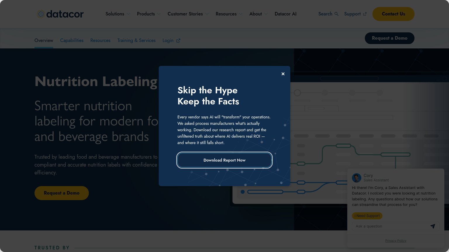
- Report download modal — Covers the headline and makes 'Download Report Now' outrank the demo CTA on first paint.
- Cory chat widget — Auto-opens alongside the modal, creating a third competing surface in the same viewport.
- Dual navigation rows — Two stacked navs expose ~13 links (Login, Support, Search) that leak attention before the demo CTA.
- Duplicate demo buttons — 'Request a Demo' appears twice at equal weight plus 'Contact Us', splitting the primary action.
Mobile web
42PoorThe phone experience as a first-class citizen.
 1234
- Skip the Hype modal — Covers the entire hero and fully hides the 'Request a Demo' primary CTA on the first screen.
- Welcome to Datacor chat — A second auto-opened overlay stacks on the modal, adding pure friction with no conversion CTA.
- Floating chat bubble — Third simultaneous interruption fights the modal and chat card for the visitor's thumb.
- Double-decker header — Hamburger bar plus the 'Overview' dropdown consume a large slice of the viewport before any hero content.
Trust
44PoorProof that the product is real, competent, and safe to try.
How LabelCalc compares
Trust read
Value props
52FairTitle, subtitle, hero — do they sell the product's true value?
LabelCalc’s headline
Nutrition Labeling
Smarter nutrition labeling for modern food and beverage brands
Working
Could improve
CTA
61FairCopy, size, verb, cost-feel — does the primary CTA earn the click?
How LabelCalc compares
Recommended rewrites