
Your landing page’s weakest score is Trust.
How Foxglove ranks
73Growth scoreupdated
category scores
category scoresShowHide
Trust
48PoorProof that the product is real, competent, and safe to try.
| Trust read | |
|---|---|
| Foxglove | Hero photo of a real robotic-arm workcell with the platform visible on a monitor |
| No visible trust signal identified. | |
| No visible trust signal identified. | |
| No visible trust signal identified. | |
| Hero top-down warehouse visualization showing robots and orchestration routing paths | |
| No visible trust signal identified. |
Information hierarchy
76FairDoes the design help or inhibit what the page is trying to say?
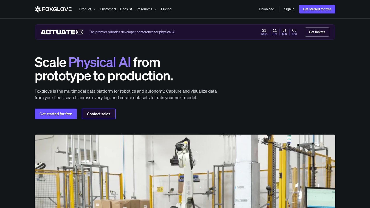 123
- Actuate 26 banner — A competing CTA with a live countdown sits above the headline, recruiting visitors to a conference before the value prop lands.
- Get tickets button — The only bordered button in the top band, it outranks the nav's primary CTA in the initial scan and points away from signup.
- Nav link row — Seven exits (Product, Customers, Docs, Resources, Pricing, Download, Sign in) dilute attention before the single desired action.
Value props
76FairTitle, subtitle, hero — do they sell the product's true value?
Foxglove’s headline
Scale Physical AI from prototype to production.
Foxglove is the multimodal data platform for robotics and autonomy. Capture and visualize data from your fleet, search across every log, and curate datasets to train your next model.
Working
Could improve
Mobile web
79FairThe phone experience as a first-class citizen.

What works
What to improve
CTA
84StrongCopy, size, verb, cost-feel — does the primary CTA earn the click?
How Foxglove compares
Recommended rewrites